Pattern Pulp

Fashion: African Kimonos


Our collective fascination with culture crossing is nothing new, though every now and then it’s important to sit up and take note of new projects. Serge Mouangue is an artist worthy of this attention, as proven by his Wafrica collection, a breathtaking cultural shakeup. This styled photoshoot combines the strength of bold and bright African textiles with the grace of the traditional Japanese Kimono. Strength and grace. Two contrasts united in women. They may appear different on the surface but they do share some cultural similarities. Both societies are very tribal and have a respect for hierarchy and an appreciation of the power of silence,” says Mouangue when asked about the theme of this project. “And then there are the differences. In Japan there is no improvisation. Here, improvisation can mean trouble, shame, difficulties. But in Africa, it means life, renewal, health and spirit.”

Coverage by: Emily Gup

New York: Creative Textile Design


Every time there’s a print-related trade show in New York, I make every effort to go. This season’s no different and if you’re local, work in the business of prints + patterns and are curious about market influences for the coming year, I recommend popping into the Altman Building for the Direction Show by Indigo. As I weaved through the isles yesterday morning, a few things caught my eye. In no particular order, here goes:

  • 1. Animal prints merged with lace
  • 2. Cityscapes, windows and urban landscapes
  • 3. Vibrant watercolors
  • 4. Coral Coral Coral
  • 5. Cute French conversational prints
  • 6. Monochromatic metallics accents,  gray + silver/gold + amber
  • 7. Digital camo with stain glass effects
  • 8. Ikat interpretations via embroidery, watercolor and embellishments

Today’s your last day to check out the floor and if you happen to swing by, do linger at the Garreau Designs, Fortier Price and Westcott Design tables, as their print libraries are wonderful.

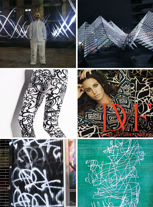
Trend: Global Lightscapes


lightscape-patterns

All creatives know that doodling leads to ideas. Ideas lead to innovation, and innovation keeps culture flowing. Interestingly, we’ve been noticing unruly markings in everything from media and textiles to graffiti and print. Some of our favorite adaptations of this trend come in the form of video.

Bruno Levy of New York City and Nimrod Weis of Melbourne, Australia are two multimedia artists at the forefront of motion graphics. This Modeselektor Deboutonner video incorporates thousands of photographs taken in Patan, Nepal over the course of a week. Using flashlights and long exposures, Levy was able to capture a truly magical landscape using simple tools and the notion of chance. Using a stationary, yet monumental sculpture, Lightscraper, Weis’ latest creation with Eness, is a light show projected onto a custom built aluminum structure, fabricated with a layer of semi translucent mesh.

Jumping into the realm of fashion, These Costume Department leggings are quite inspirational and we can see them easily being translated into a variety of commercial home goods. Tapping similar inspirations, Diane Von Furstenburg’s Fall windows are filled with graphic prints galore.

This collection wouldn’t be complete without a picture of graffiti in it’s rawest form. This snapshot captures a wall in Greenpoint and shares a striking resemblance to this advertisement for IDA Ireland. The slogan appropriately reads, “Ireland. Where Innovation Comes Naturally.”

By: Shayna Kulik

Quick Links: Weekly Notables


6-19wrapup1

1. Stunning nautilus home by Javier Senosiain, via Inhabitat.

2. Wendy Plomp’s “Message in a box” cardboard carpet at the 400 years later – cite goes dutch exhibition, via Design Boom.

3. Brokenfab’s intricate beaded geometric patterned jewelry, via The Pipeline.

6-19wrapup2

4. Lizzy House’s latest fabric collection, Red Letter Day, has adorable color combinations and whimsical geometrics, via PrintPattern.

5. Beautiful and compelling info graphics, via Abduzeedo.

6. Stephen Meisel is an inspiration and a puzzle, via Pattern People.

6-19wrapup3

7. Nooka’s Summer ’09 collection uses bold graphics inspired by triangles, via High Snobiety.

8. Watch as Invader creates one of his trademark mosaics out of Rubick’s Cubes, also known as Rubickubism, via Moco Loco.

9. Love the bold packaging of Bold City Brewery, via The Dieline.

6-19wrapup4

10. Wonderful wallpapers from Intrade, a Swedish wallpaper supply company, via Decor8.

11. Wearable gifts for hip dads, including some interesting renditions of the typical necktie, via If its Hip it’s Here.

12. Beautiful paper cut maps by Famille Summerbelle, via Joanna Goddard.

By: Emily Gup

Street Finds: Urban Palettes


urbanflowers1

May has arrived and flowers are in full bloom this spring season.  In an effort to mix things up a bit, we’ve decided to collect floral imagery representative of spring and create ad hock color palettes with the pixels provided.  As designers, we’re inspired by nearly everything we consume, so it’s quite natural to repurpose when given direction.   Here are four palettes that could easily translate to summer prints, inspired by wall stencils in Allston, weeds in Brooklyn, flowerpots in Gramercy and a home garden in San Francisco.

urban-flowers2

For additional palettes that are strikingly beautiful and paired up with interesting photography, check out Kris’s Color Stripes.

Interview: Beci Orpin


beci-orpin1

The creative work flowing from Beci Orpin’s Melbourne studio is incredible.  Just click on Orpin’s site and you’ll understand that her world of graphic design is more magical than most.  A menagerie of colorful mushrooms and fantasy-inspired silhouettes march across the screen with unabashed purpose, preparing the user for a unique mix of commercially friendly, widely applicable artwork.  While many are familiar with Orpin through her women’s clothing line, Princess Tina, she has recently closed the doors on this decade long endeavor in an effort to focus on other creative pursuits.  Check out our Q+A for a glimpse at Orpin’s creative process in addition to where you can find her creations in the coming season.

*            *            *

PP:  What websites do you generally start your day with-do you have a daily routine for news/blog/information consumption?

BO: I don’t usually have time to check blogs on a daily basis, I would says it is probably more of a weekly occurrence but when I do, the some ones I like are:

reference library
stork bites man
lena corwin
loobylu
meet me at mikes
fine little day
design sponge
the design files

PP: How did you discover your talent and how has it evolved over your career?

BO: I am not sure I discovered it – I had some sort of weird tunnel vision – there was nothing else.  Drawing and creating is all I ever wanted to do.  I remember 2 defining moments – one when i was 6 and drawing a picture of a wedding, and one when I was about 14 and drawing a cat. I cant remember exactly what happened, but while doing those 2 drawings something clicked and it confirmed that being creative was what I loved, and wanted to do with my life.

PP: Do you discuss your work with other designers?  If so, how does that impact your creation process?

BO: Most of my friends are in creative industries, so I guess as part of our general conversation we talk about work.  If I am stuck on something and need advice, I know I can always get honest and useful opinions from my partner/husband Raph and my assistant Leah. I think its a very valuable thing to get others opinions, especially when  you work for yourself – its easy to get trapped in your own world.

PP:  Where do you usually work on your patterns and what is your preferred method of creation + execution?

BO: I work with patterns in many forms, although a lot of my pattern work is for textiles.  I have also created patterns for wallpaper, murals, stationery and packaging.  As far as method,  it depends on what the pattern is for.  I don’t have a preferred method and will just do whatever is appropriate for the job. I am really liking hand-collaged paper mixed with computer lately.

PP:  When is the last time you took a professional/creative risk?

BO: Last November I decided to stop creating the women’s clothing line, Princess Tina.  After 8 years I had just had enough and felt it wasn’t relevant to my life anymore and decided to put all my energy into freelancing, my kids line (tiny mammoth), and a new line I am doing under my own name.  It was a risk because Princess Tina was still generating income for us and giving it up meant that income was no longer going to be there.  Though from the beginning, Raph and I decided that we don’t run our own business just to make money, we have to love all the projects we work on 100%.  I have never regretted leaving for one second and think by dedicating more time to other things, they will in turn replace some of the income Princess Tina brought in…. or maybe i will have to get real job instead!

PP:   Do you incorporate commercial trends into your work and if so, is this a factor that drives your design?

BO: I try not to follow trends as such, but I think it does happen sub-consciously sometimes. Obviously when you are following a brief from a client, sometimes you have to follow trends.  If I do, I at least try and interpret them in new ways.

Tracking Repetitive + Awesome.
On Instagram.