Pattern Pulp

Fashion: Bold and Optimistic?


diane-von-furstenburg2

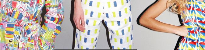
Diane Von Furstenberg’s latest window display showcases mismatched patterns and fabric textures throughout her dress and bag collections.  Referencing bright and iconic summer shapes, reminiscent of j.crew flip flops and Tory Burch tunics, DVF’s approach to the upcoming season is blaringly optimistic.  That being said, I’d be curious to see how the recession translates into next year’s spring/summer collection, as today’s economical dip was hardly a factor when these ensembles were designed over a year ago.

L.A. Styles

halsea21

While in Silverlake last month, I stumbled across Sally Bartz’s collection of handbags under her newly founded company, Halsea.  Inspired by west coast colors and summer icons, Bartz’s crab monograms and bamboo squares decorate luggage, tote and weekend bags, providing a breath of fresh air from LA’s hipster styles.

London Styles

jensen-getwellman

UK designer, Peter Jensen has a playful eeriness to his work.  While he’s an acquired taste for some, his playful pairing of graphics and tailoring requires introspective buying on the customer’s part. This parrot pattern is representative of Jensen’s homage to the animal kingdom.  Carl M. Wellman infuses Brazilian, Italian, English and Japanese floral themes with biodegradable packaging for Le Marchand Du Cacao.  A stunning combination of high and low materials.

Artist Interview: Julia Rothman


julia-rothman

Julia Rothman is one of the most talented and original pattern designers in today’s marketplace.  I had the pleasure of catching up with her at “Design by the Book,” a collaborative event hosted by The New York Public Library and Grace Bonney of Design*Sponge.  Rothman has a the ability to beautify ordinary objects, using her unique style of illustration and layout to create whimsical repeats.  Her work has been featured in countless publications and dons home goods of every variety.  Check out our Q+A for a glimpse into her daily routine.

*            *            *

PP: What websites do you generally start your day with-do you have a daily routine for news/blog/information consumption?

JR: Design Sponge, Print&Pattern, Poppytalk, Oh Joy!, The Post Family, Grain Edit always start my day. And the NYTimes for news of course.

PP: Do you discuss your work with other designers?  If so, how does that impact your creation + execution process?

JR: I am on the video phone with Jenny Volvovski and Matt Lamothe, my Also partners all day every weekday. They see everything I am working on and give a constant critique on my work. That is always helpful. Sometimes they notice ways to improve my design that I would have never thought of. I think it’s always helpful to have designers you trust giving you feedback. You don’t always have to listen, but at least you are presented with other points of view.

PP: Where do you usually work on your patterns and how much time is devoted to illustration vs computer layout?

JR: I start with drawings I make with a pen in my sketchbook. I usually work on those hanging around my house, usually lounging on my couch. The time I spend making drawings varies but it’s usually the majority of the work. After the drawings are all done I go to my office and scan them in at high resolution. After that I manipulate and color the drawings using Adobe Illustrator.

PP: How has your work evolved over your career?

JR: In the beginning I was making drawings and then scanning them in and trying to make them into patterns. Over time when I decided making patterns was where I wanted to focus, I made drawings keeping in mind how they would later repeat. And then eventually when I started making specific products- wallpaper, mugs, stationery, it had to evolve one step even further. I had to give scale, colors and subject matter even more consideration for how it would specifically look on that object. For example, when I was making patterns to build up a portfolio I wasn’t worrying about the amount of colors. I put in as many as I wanted. But working recently on my wallpaper designs for Hygge&West, I had to limit my colors to three or less which was a fun challenge.

PP: What are some of your favorite creations/mediums/color palettes?

JR: I recently worked on a project organized by Design Sponge and the New York Public Library and made a very detailed navy men pattern. I was inspired by a book of uniforms and symbols of navy officers from around the world. I really love how it came out. I also recently made two patterns of vintage office supplies for Galison, a stationery company. I am really excited to see how those patterns get applied to a variety of products. They come out this Spring!

When I am painting I always use gouache. I love how flat matte the paint gets. It’s also similar to the flatness in silkscreen, another favorite medium.

One of the most often criticisms I get is about my color palettes. I tend to use really muted colors. Often art directors ask me to brighten up my colors. I’m more attracted to subtle tones with pops of brightness here or there.

PP: How do you incorporate commercial trends into your work- is this a factor that drives your design?

JR: I try not to think about trends too much. I make designs I think will be interesting whether or not they are popular themes or palettes at that moment. I’m sure with the amount of designs I look at on blogs every day, trends affect what I do, but it’s not on purpose.

PP: Do you have any advice for younger designers who are just getting started?

JR: I always tell new designers to be pro-active about promoting themselves. Nothing is going to come to you. You can be an incredible designer, but nobody will know that until you show them. And if the first person doesn’t think you’re great, don’t get discouraged. Maybe the next person will, or the next one after that.

Fashion: David David's Geometric Extraveganza


[youtube=http://www.youtube.com/watch?v=VnHCAzlftsU]

Downtown Music has a knack for finding sound visuals to accompany their music.  One of their latest collaborations pairs Santigold’s “I’m A Lady,” a Diplo remix featuring Amanda Blank, with David David’s S/S 09 Fashion collection.  The resulting product is a masterful film, directed by London talent Zaiba Jabbar.  The film was created to showcase David Saunder’s latest collection and was inspired by the fantasy world of Busby Berkley. Berkeley was famous during the 1930’s for his elaborate musical productions that often involved complex geometric patterns.  The parings all seem to make sense, as the mélange of brightly patterned tops and accessories coupled with heart shaped arm choreography is just the right dose of brightness to motivate us during these rough times.  “This season, like the rest of my work, is about complementing geometry and giving it fresh energy,”  a moto Saunders lives by.

david-david

Patternizing Maps


vitra-map

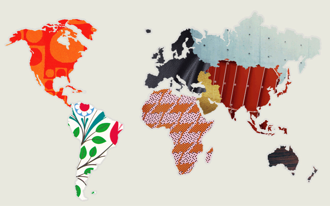
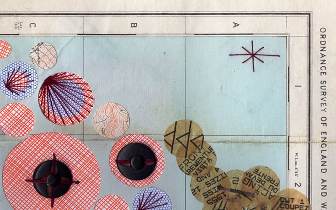
Oftentimes I am hired to beautify info graphics.  For any designer tasked with such an assignment, there is always an underlying urge to challenge the guidelines with as much flair as possible.  Striking the perfect balance between translatable content that evokes human nostalgia is every designer’s goal- or at least mine.  Here are a few creative approaches to this idea.  Vitra recently redesigned their website, filling their homepage with fabric samples sectioning off continents within the world.  A valid attempt to display product and distribution, though I wonder if there is any underlying symbolism in the placement of patterns- at first glance the assortment is a bit jumbled.  Duck Down Designs takes a more DIY approach to map-making with illustrated paper cut-outs on a metaphorically inspirational treasure map.

downduckdesigns2

Home: Insect Kingdoms in Paris


insect-kingdoms-2

If you pay attention, you’ll almost always notice art imitating life and vice versa. I find this most exciting when unexpected trends weave their way through a city I am unaccustomed to. This was the case on a recent trip to Paris. While exploring the Marais, I stumbled across the most beautiful collection of hand painted silk pillows. The beetle toss was a high-end approach to playful décor. This beetle theme consistently reappeared in various stores – most interestingly as a woven monogram at Printemps. Later on in the day, on a more guided stroll through the Museum National d’Histoire Naturelle, I stumbled upon a beautiful collection of preserved butterflies. The color, composition and collection were impeccable. A commercial version of this natural wonder is translated well as individually printed insect candles from Elizabeth’s Embellishments.
butterflies

Tracking Repetitive + Awesome.
On Instagram.