Pattern Pulp

Clever Seating for Creatives


I’m constantly reviewing photos from past travels. Whether I’m pulling a story together related to art, mosaics or trends, everything’s mentally cataloged. Today I figured it was time to do a stool round up.

Lately, cushions from the US seem to fall into one of two categories: neutral and organic or vibrant and geometric.

If you hop across the Atlantic (or perhaps the Pacific) though, you’ll notice that designers abroad are a bit more playful.

From this clever needlepoint top at Milan’s La Rinascente department store to these glitter-covered tree stumps at Bensimmon in Paris to this sad emoticon in Tokyo, to this Helsinki technicolor stool, all examples illustrate how to brighten up a home with a little unexpected character.
 

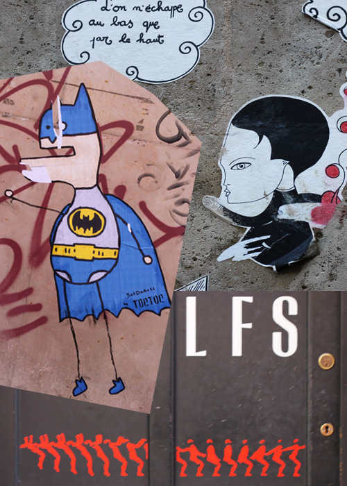
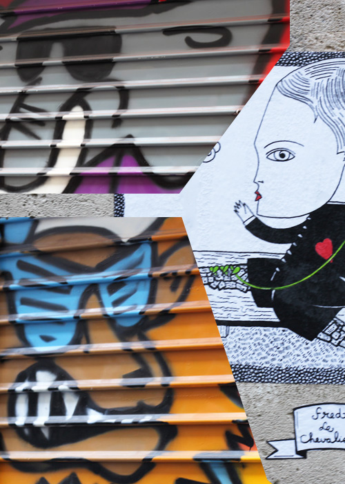
Around the Globe: Graffiti in Paris


Learning to appreciate a city beyond it’s tourist attractions is a liberating thing. While in college, I remember reading a New Yorker article and this one line really stuck. It had to do with everyone flocking to nothingness and finding each other – which seemed like the funniest and saddest visual- particularly in relation to tourist itineraries.

When you travel, I think there’s real value in exploration. While the Louvre or the Eiffel tower is certainly rewarding, I don’t believe there’s anymore happiness to be found in checking that off the list, than finding the Django jazz bar woven between the Sunday flea market in Paris. It’s all part of the experience of discovering a new city.

When I explore, I generally keep the attractions in mind, but put greater emphasis on the surrounding neighborhood. I like to devote half days to weaving up and down new streets, looking for cafes, concert stickers, door patterns, gardens and random construction projects.

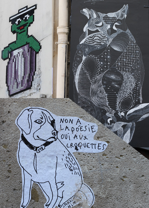
Here’s some graffiti I’ve been sitting on for a while- it’s from Paris, primarily the Marais. It’s animal and super-hero-centric. Enjoy!


Circumsolar and Fragments of Dying Light


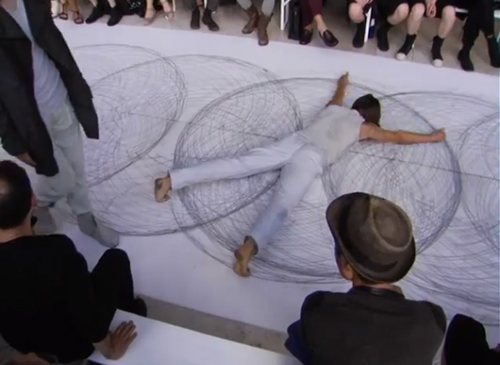
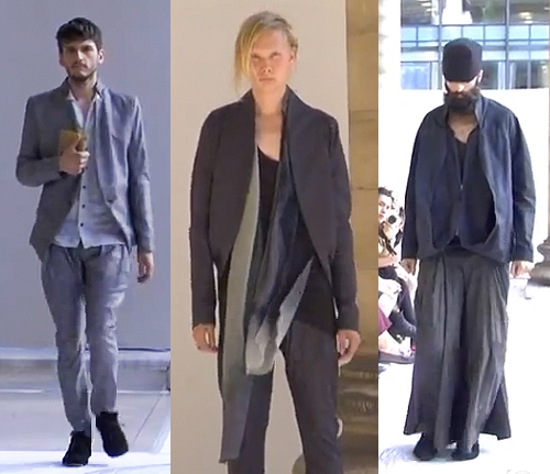
On a personal level it’s very exciting to share this video. We’re always rooting for our friends to succeed and when collaborations occur combining various parts of our past and present lives, it’s all-the-more charged. In this case, I’m completely blown away by the moving parts from Sruli Recht‘s SS2013 presentation, Circumsolar and Fragments of Dying Light which debuted in Paris in late June.

Combining the talents of his friends and colleagues, Recht’s show is scored by Nico Muhly and the live penwald drawings are by artist (and model) Tony Orrico. The execution is beautiful and a balance of complimenting components.

His menswear line feels appropriately Icelandic, using a natural palette and complex engineering- evident in the folds, fabric and draping. A commanding effortlessness, you might say, something we all strive for. Congrats to all involved!


Color Studies from Europe


Here’s an interesting study (and promo) of a realtime color study conducted by the forecasting company, Pimkie. Have a watch, they’ve set up an honest, playful approach to observing European streetwear. The colors are then plugged into infographics for easy consumption.


Graphical Homegoods with 56thStudio


Meet 56thStudio. The newest player to the field and the pickings are wondrous. An email recently found it’s way into my inbox decked with adjectives such as “luxe-personified yet kitschy, neo-ethnic, eclectically bold and youthful.” Off the bat, it’s hard not to agree!

Mixing graphic collage, vintage themes and old-school chairs (don’t they remind you of the 80’s? ) a fresh coat of paint paired with a textile refresh has produced a product line of note.

The collection includes chairs, pillows, wall decor, fabric, totes and customized orders and focuses on the caricature as furniture, familiar faces and is a tribute to The Beatles and Hollywood culture.

If you’re in Milan this week, stop by Spazio Rossana Orlandi for their debut exhibition.

So…which one’s your favorite?


Arty Farty Walls with Minakaniwalls


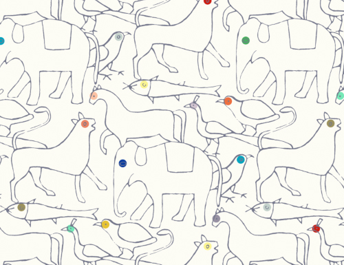
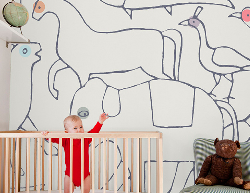
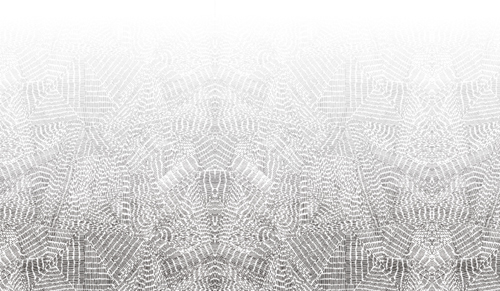
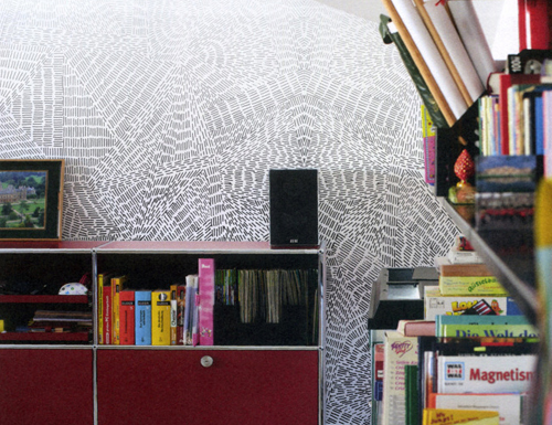
Forever a fan of wallpaper, this afternoon we’re sharing a few favorites from the Paris-based studio, Minakaniwalls.

This is the animal edition. It reminds us of an evolved version of Wee Gallery’s stationary. It also might feel like you’re on a prolonged visit to the zoo.

This Copenhagen edition translates busy city living and almost looks like layers of windmills from afar.

Up close though, the lines simulate aviation flight patterns.

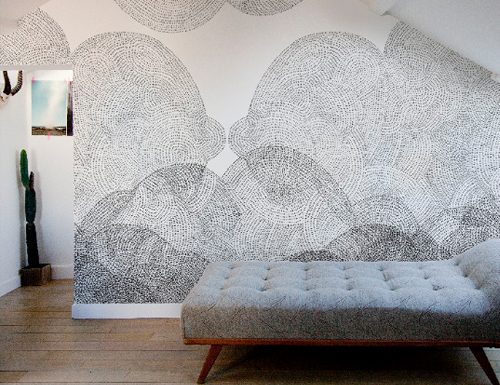
Combining what looks like charcoal and tracing paper effects, the Cloudy edition could double as an xray of the sky.

However, up close, the pointillism is breathtaking.

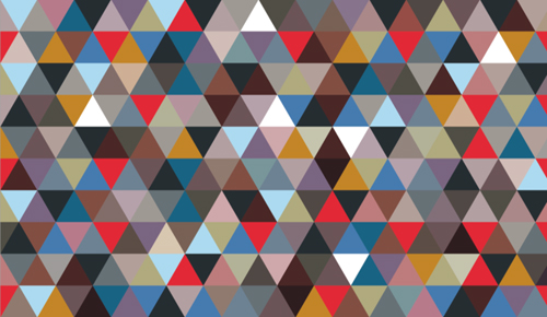
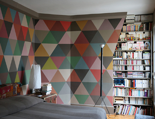
No collection’s complete without a vibrant tanagram set, otherwise known as the Mosaic edition.

So…which one’s your favorite?


Tracking Repetitive + Awesome.
On Instagram.