Pattern Pulp

Street Finds: Urban Palettes


urban-colorpalettes1

There’s no shortage of inspiration when you live in a city that celebrates beauty and revels the grotesque. Today’s highlight captures the natural colors around town that can be used as a source of inspiration.  From Vutera’s speakeasy neon lighting in Williamsburg, Brooklyn to this glass mosaic on New York City’s newest elevated park, The Highline, summer’s color combos are just as vibrant in nature as they are in city dwelling.

urban-colors2

This wall in Brooklyn speaks  to several months of messaging.  Once symbolic of a crumbling part of town, imagery such as this now serves as marketing inspiration for retailers such as Barneys and Urban Outfitters.  Veering away from the grunge factor, this doorbell and name plate from San Francisco’s Russian Hill district, is both an amusing display of typography and a beautiful combination of warm muted tones.

Additional contributions by: Emily Gup

Trend: Diamonds are Forever Changing


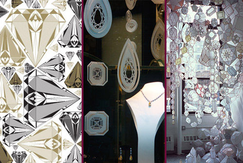
Apparently, diamonds don’t have to sparkle in order to shine. Diamond contours are surfacing everywhere. We first noticed interesting uses of the infamous pyramid on the streets of Paris back in November and have continued to spot creative variations across the Atlantic.  From Mike Perry’s vector repeat to this Parisian jewelery display to this remarkable 3D installation by Kirsten Hassenfeld, all of these interpretations glorify the geometric intricacies of the world’s most famous carbon.

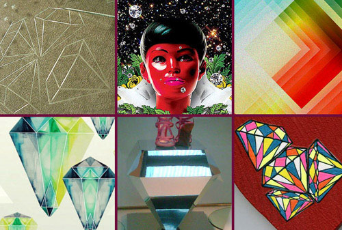
While shopping in the trendy Palermo Hollywood district of Buenos Aires (yes, it’s named after Hollywood, California), we sensed this trend emerging on the tails of ArteBA. The graffiti-culture shop, Sixfeet, is covered in diamonds, most notably on the back wall, which is strategically complimented by several colorful diamond hoodies for sale on the floor.  Back in Boston, the creative geniuses at AdamnCompany designed this abstract illustration, replacing stars with sparkling diamonds.  Focusing solely on angle and color, Susann Johansen’s color prisms celebrate light and repetition.

This watercolor repeat by Eika Dopludo is a beautiful departure from it’s angular counterparts, while this metallic Moschino display in New York’s meatpacking district currently presents a mirrored platform for their summer shoe collection.  Moving into the realm of online retail, we quickly discovered this trend’s reach on etsy.com. The artist, lanydevening, creates small heart-shaped wooden wall hangings covered in a similar diamond motif. The heart paired with vibrant diamonds is a fresh take on an otherwise clichéd romantic combination.

BA coverage by: Rebecca Silver

Interview: Dan Funderburgh


Dan Funderburgh

Every now and then you stumble upon work that is so creatively fascinating that it moves and inspires you.  Today we’re highlighting Dan Funderburgh, as his library of meticulous wallpaper falls into this awe-inspiring category.  Each of Funderburgh’s repeats draws upon historical references, be it Moorish mosaics, American op art, or simple tools humans use in everyday life.  Marrying commercial materials with modern day thought, Funderburgh’s art has seeped into several pockets of society, making significant waves throughout overlapping creative communities.  From 5Boro skateboards to the walls of Cooper-Hewitt’s Design Museum and the Miami’s Museum of Contemporary Art, Funderburgh continues to merge art, living and attitude.  Check out our Q+A for a glimpse into his daily routine.

*            *            *

PP: Do you have a daily routine for news/blog/information consumption?  What are your favorite publications?

DF: I start my day listening to public radio but usually glance over the NYTimes and BBC websites. As far as the bloggysphere there is far too much stuff to take in daily. I figure my friends will send me something if it’s really important. I do like my friend Kelly’s blog, Nothing is New.

And of course Arkitip and 12oz. where kindred spirits Cody Hudson, Grotesk, Ryan Geezer, and The Chinatown Soccer Club post.

PP: How did you discover your talent and how has it evolved over your career?

DF: I don’t know so much about a talent, but I discovered I have an acute appreciation for intricate ornamental arts about the same time that I discovered I have a limited patience for non creative corporate logo re-sizing. So I quit my job and tried to make my way as a wallpaper maker and artist.

PP:  Do you discuss your work with other designers?  If so, how does that impact your creation process?

DF:  All the time! Not too many other wallpaper designers, but I’m surrounded by smart artists and designers and photographers that help me tremendously. Not so much on the minutia of a specific piece, but more for larger questions about direction and concept.

PP: Where do you usually work on your patterns and what is your preferred method of creation + execution?

DF: Usually rough sketches in pencil and then redrawn from scratch in the computer. I try to always be open to other options –> painting and photography in case the idea calls for it.

PP:  When is the last time you took a professional/creative risk?

DF: Too long ago. It’s probably time I should take some more.

PP:  Do you incorporate commercial trends into your work and if so, is this a factor that drives your design?

DF: Of course not ! That was a trick question. I suppose a few years perspective will be the judge of whether I’m apart from the flock or just fooling myself.

Follow-up: Mandatory Headgear


tripleeight-helmet

In our continued advocacy of helmet wearing, we’re spotlighting an age appropriate option for the young rider today.  This 5Boro Pigeon League helmet incorporates iconic New York imagery, specifically highlighting urban street life.  While this two color pattern translates perfectly for headgear, we strongly believe it could be used on other branded items if Triple Eight were open to expanding their product line.  We first noticed this helmet while waiting for a tune up at Metro Bikes, but it can also be found on Triple Eight’s website.

Artist Profile: Aimée Wilder


aimee-wilder

Aimée Wilder is a pattern designer to watch.  Her prints can be found throughout the homegoods and fashion worlds, adorning pillows, walls, diaper bags and most recently, footwear.  Each of Wilder’s repeats are beautifully sophisticated with commercial appeal that raises the mass market ante.  Applying a refined color palette, Wilder veers away from sugary pastels that are category specific.  As a native New Yorker, Wilder spent her school holidays exploring fashion showrooms where both of her parents worked, soaking in trends and textiles, laying a foundation that would later influence her budding career.  Keep note of Wilder’s work, as we’re certain only good things will come from this Brooklyn wunderkind.

Additional contributions by Emily Gup.

Event: Show & Tell at the PSFK Conference


matt-moore

Tomorrow marks the 3rd annual PSFK Conference in New York City hosted by my good friend and colleague, Piers Fawkes and his team at PSFK.com.  I have been fortunate enough to attend every year and can soundly say that the event never fails to exceed expectations.  I’m particularly excited to hear Matt Moore of MWM Graphics speak about his working style and inspirations.  Moore has a portfolio of patterns that would make make any art director smile.  His seamless transition from crafty to commercial has pleased clients ranging from Nike and BMW to Burton and Oilily.  If you’re in tomorrow’s Battery Park crowd, swing by for a hello, I’ll be the one with the polka dot name tag.

Tracking Repetitive + Awesome.
On Instagram.