Pattern Pulp

Digesting & Designing Data


DataDesign

I’m a complete nerd when it comes to data design. It holds such high importance in communicating real-time facts, that it’s hard to ignore the visual trends of the category. If you take a gander at Pinterest, you’ll see endless styles that have emerged, to decipher the numerical chaos. This past weekend, Benedict Carey of The New York Times devoted a significant analysis to the topic, in relation to perceptual learning:

And so it is in many fields, whether predicting climate, flagging potential terrorists or making economic forecasts. The information is all there, great expanding mountain ranges of it. What’s lacking is the tracker’s instinct for picking up a trail, the human gut feeling for where to start looking to find patterns and meaning.

As we become more attuned to mapping data and translating it for the masses, we’ll be more equipped to embrace and evolve into the future. Never before has the art of tracking patterns been this important.
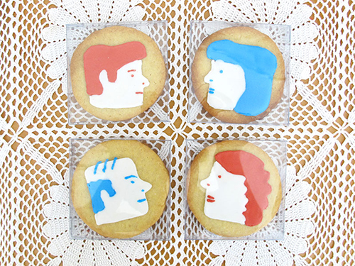

Focusing on the Female Form


Rachel Levit3Rachel Levit1Rachel Levit2

Rachel Levit is an illustrative force you should all be aware of. Her drawings are simple, yet carry immense storytelling through line, pose and profile. Her repetition feels a bit like modern day hieroglyphics as she swings from professional realms. One day she’s producing artsy leggings and the next, an illustration for the New York Times. Have a look at her blog, you’ll find delight in the scroll.


The Art of Illustrative Journalism


Illustrative journalism is a pretty big deal in my playbook. When I was a kid, my grandfather would subscribe to a different magazine every year and I’d fall in love again every January.

Art directing a story isn’t a simple task and the creative minds in charge of hiring talent  always amaze me. Much like the power of a good book cover, a great illustration tells multiple narratives.

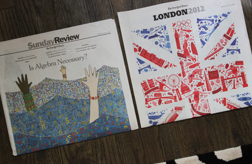
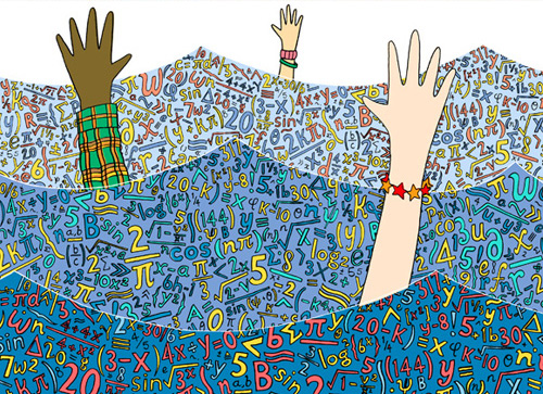
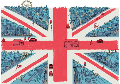
Above are a few selected images from last week’s New York Times. We have I Love Dust, Adam Hayes and Josh Cochran. These artists have created texture and depth using an assigned storyline. Personally I love the busyness of it all- do these work for you?


City Perspectives from Above


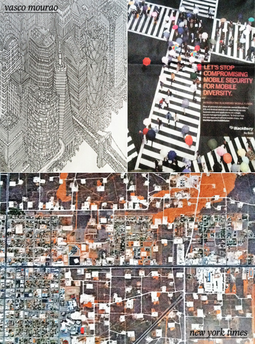
It’s always fascinating to see how illustrators, photographers and editors choose to portray a city. Recently a crop of overlapping interpretations have been surfacing online and in print. Vasco Mourao is an illustrator-turned-architect with an arsenal of highly detailed drawings. This Mourao image of Manhattan recently appeared in The New Yorker.

Stepping into a more commercial category, the Blackberry Bold campaign has chosen to express mobile diversity by taking an overhead shot of a city intersection on a rainy day. Rounding out the category with the overhead image frequent flyers are all too familiar with, we have a photograph that was recently published in The New York Times T Magazine (photographer unknown).


Shopping with the New York Times


So, this happened yesterday! The whole process was really fun and such a treat to be able to team up with the New York Times. Rima Suqi and I shopped for fair isle and dove into it’s history, it’s market presence, and how it’s adapting to industry trends. Click here to take the tour and read the article.


Tracking Repetitive + Awesome.
On Instagram.