Pattern Pulp

Street Finds: Typographic Textures


Today’s post is New York centric, typographic and choc full of texture. After coming down from the high that’s been New York Fashion week, I’m here to share a snapshot from Milk Studios‘ kick off event. I had the good fortune of tagging along with Stephen Budd, a friend who was over from London. In between hearing The National and looking for a lost jacket in coat check, one of my favorite moments of the night was laying eyes on the typographic decor.

Bringing type to life with knitting needles rather than life-sized decals, Donna Wilson, of the UK was commissioned to interpret the New York Times infamous logo this past October. The patterns are mismatched, colorful and perfectly combined. Keeping things fresh, monochromatic and theme-based, Jessica Hische, of Daily Drop Cap reminds us on a near-daily basis how to infuse life into text, an inspirational read for anyone looking to up their typographic ante.

The New York Times


A week ago I had the pleasure of speaking with Tricia Romano, a reporter for the New York Times on the topic of swimwear pricing. We covered everything from the marketing evolution of the bikini to the reasoning behind high and low price points for corporate and indie designers. The article appeared in the style section of the Sunday Times this past weekend. Check it out here.

Trend: Brands Burning


As 2010 rolls on ahead, artists, writers, designers are all pondering the future, and it seems that burning the past (esp. 2009) might be a way to move forward. Burning, a cathartic ritual for many religions, releases the energy of the past to spark new beginnings.

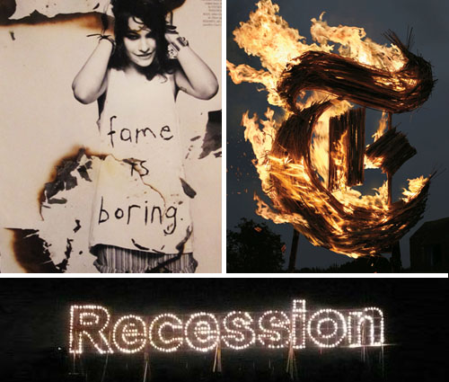
The New York Times Magazine recently featured a stunning cover with the “T” scorched and engulfed in flames. Pyromaniacs set designer, Gary Card and the photographer, Jacob Sutton, were inspired by the “Wicker Man” 1973 horror movie and commissioned a welder to fabricate a 10-foot-tall steel T. After layering it with sugar cane and soaking it in alcohol, they lit it with a blowtorch and “ran for their lives”. Although the T was intended for an Anglomania themed issue, you couldn’t help but feel it symbolized the current demise of the great newspaper in crisis to its internet nemesis.

Paralleling this theme, artist Karmelo Bermejo recently presented “The Grand Finale” at Art Basel Miami in December. The fireworks show ignited the word “Recession,” commemorating the failure caused by the worldwide economic crisis. Though controversial, this celebratory event emphasized art’s fleeting, yet explosive nature.

Using burn marks as a design element with a more lasting effect, the designers at LOVE Magazine recently styled Coco Sumner, incorporating past, present and future themes into the shoot, spread and article.
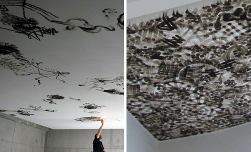
Art that isn’t so fleeting is best exemplified by Olivier Kosta Thefaine, who uses a cigarette lighter to burn his graffiti-inspired patterns into the ceilings of galleries. Inspired by Paris street culture, his illustrative strokes transform bare white rooms with complex smoke mosaics. Rather than desecrating to create the desired effect, the flame’s byproduct is in fact the “paintbrush.”
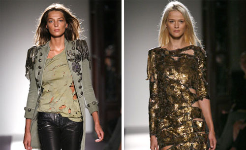
And lastly, burning has emerged as a tangible art in the fashion world. Balmain’s Spring 2010 Ready-to-Wear collection presents an array of tattered clothing with visible signs of distress. From beaded jackets to bullet strewn tees to ripped jeans. A tough sexy trend is already resonating with the fashion glitterati. Be ready to rock this look for major bucks or get inspired go DIY with your bleach, scissors and lighters. Layer up with skinny pants, embellished tops and jackets to complete the look. Tough girl attitude optional.

By: Angela Chen

Fashion: The New Face of Lace


faceoflace1

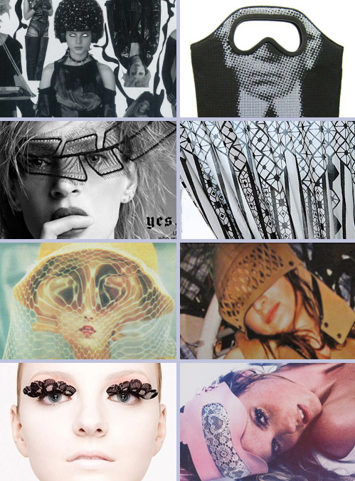
There’s true intrigue when it comes to lace.  Delicate and dainty, it both conceals and reveals. While we’re all accustomed to seeing its multitude of personalities in fashion, home goods and accessories, reoccurring ties to privacy and obscured visibility have been a constant theme over the past few seasons, making us wonder if everyone’s watching Eyes Wide Shut all over again.

The editors at Dazed and Confused are continuing to manipulate eyes in sadistically interesting layouts just as designers are racing to reinterpret them into tactile accessories.  This Karl Lagerfeld tote is brilliantly inaccessible and proves our point with it’s € 1500.00 price tag.

Uma Thurman’s styling on the May ‘09 NY Times Magazine cover adds a layer of intrigue just as the geometric lace pattern on these Urban Outfitter curtains convey feelings of graphic obscurity. Pulling from past influences, Aperture’s Weegee Spoofs the New Spring Hats spread by Michael Caccaro provides a playful window into the world of advertising and photography in 1957. Fast forward 52 years and Jean Paul Gaultier has created his own interpretation of hooded mystery.

Bringing beauty back to the forefront, this delicate Shu Uemura portrait paired alongside this seductive Dazed spread, reveals the ease with which we can jump mediums and industries, proving sexy or sweet, lace is truly a gatekeeper.

Coverage by: Emily Gup, Kelsey-Lee LeGassick and Shayna Kulik

Trend: Virtual Baggage


virtual-baggage

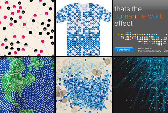
These days, who doesn’t live life on the go? The ease at which we consume information keeps us moving from one task to the next, allowing us to jump through ideas, facilitate conversations and share moments. With the use of our mobile devises and computers, we are able to navigate through unlimited technology with minimal strain on our physical being. Dr. Susan Blackmore describes this information transferral process in her TED presentation, touching upon evolutionary theory, consciousness, replication and idea convergence between humans and technology. Blackmore, like others, is part of a research movement that’s focused on studying how trends, ideas and epidemics spread throughout human and digital communities.

In visualizing these theories, we have pulled dot-inspired imagery from relevant print, fashion and web sources. Are Your Friends Making You Fat? is a recent NYTimes piece by Clive Thompson which focuses on social contagion in the world of networking.  Merging fashion with technology, Commes de Garcon embraces pointillism with this atom inspired undershirt. Cisco insinuates global communication using colorful dots while Stella McCartney pares down to blue and green with her Whatever It Takes tote. Nancy Macko adds a truly organic touch with her artful study of the honey bee and Tatiana Plakhova embodies the idea of networkism in her two-toned fiber optic-looking graphic.

Collaborative coverage by: Kelsey-Lee LeGassick and Shayna Kulik

Art: Wave Interpretations


waves

Reinterpretations of the wave are the norm every summer season, so in honor of the weather, we’re highlighting four artists and their unique approach to the surf.  Caitlin Hinshelwood, a textile designer and illustrator from the UK, explores nautical themes ranging from anchors and Hokusai-like waves to sea urchins and starfish in her 2D gouache creations. Riding a massive wave of foam (and irony), our hairy meets hip favorite, Alexandra Cassaniti, introduces her summer catalog, Summer Bummer, with a colossal, hovering, tooth-like swell.  Moving into the literary corner, Tamara Shopsin, a frequent illustrator for The New York Times, communicates political content using a googly-eyed shark fin in her effort to convey the art of political distraction. Using a similar blue and white palette, Geoff McFetridge expresses surf etiquette with his marker drawing, Your Wave, My Wave.

Tracking Repetitive + Awesome.
On Instagram.