Pattern Pulp

Interview: Matt W. Moore


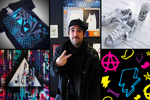
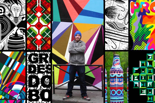
It’s no secret that Matt W. Moore’s vectorfunk graphics are single-handedly influencing an entire generation of artists. His fusion of graffiti, graphic design and watercolor are upbeat, intricate and extremely brand friendly. His work has appeared in countless magazines and print campaigns, from Nike and Burton to Wired and Mountain Dew. Moore’s Design and Illustration studio, MWM Graphics, is based in Portland, Maine and exhibits in galleries throughout the world, collaborating with clients from all sectors. Moore is also Co-Founder & Designer for Glyph Cue Clothing. Check out our Q+A for a glimpse into MWM’s daily routine!

*            *            *

PP:  What websites and news sources do you generally start your day with-do you have a daily routine for news/blog/information consumption?

MWM: I get at least an hour a day of Cyber Surfing in while I enjoy my morning coffee. Some of the websites I frequent:

PSFK
Format Magazine
FFFFOUND
Not Cot
Rojo Magazine
The KDU
Hype Beast

The list goes on. More and more lately, I find myself skimming my carefully curated list of Twits on Twitter. Less time scouring blogs, and more time surfing suggested links.

PP:  How did you discover your talent and how has it evolved over your creative career?

MWM: I’m not comfortable with the term “discover” when referring to talent. I’ve worked damn hard, and I have boxes full of sub-par art and design from my past to prove it. I prefer to think of it more as “nurturing” my vision and dreams. Hard work pays off. As for “evolution”, it is a constant evolution. Everything is always in flux. New ideas, new techniques, new knowledge, new dreams. This is why it is so exciting to be an artist and work as a creative. Everyday is a new adventure!

PP: Please explain your design process when approaching a new concept or product line.

MWM: My process is different for every single project, but a few things are constant. It always starts out with a dialog to make sure I understand the client’s objectives and vision. Then we draft a brief and timeline together. Then I do an exploration phase yielding multiple options. We review and open a new dialog. Then I continue working and refine, finesse, and finalize the design.

PP: What is your preferred method of design and how is it incorporated in your final product? (ie. collage, computer, handwork, etc.)

MWM: The majority of my commercial design work and apparel/textile/product graphics are created entirely with vectors in Adobe Illustrator. Some days I spend over 12 hours lost in this Vectorfunk World. It is my playground.

PP: When is the last time you took a professional/creative risk? Please explain.

MWM: Every single creative decision an artist makes should be a “risk”. If they aren’t taking risks, they are not an Artist, they are a Tradesperson. That said, a couple recent risky decisions that come to mind for me are: Launching my clothing company Glyph Cue during the Great Recession. Yikes! And last month I traveled to Paris for a month long residency at Since.Upian Gallery. I arrived with no artwork, no supplies, no sketches, no firm ideas for the new series of canvases. And my Exhibition was only 25 days away. Pressure makes diamonds!
Artist Profile: Patrick Moberg


PatrickMoberg

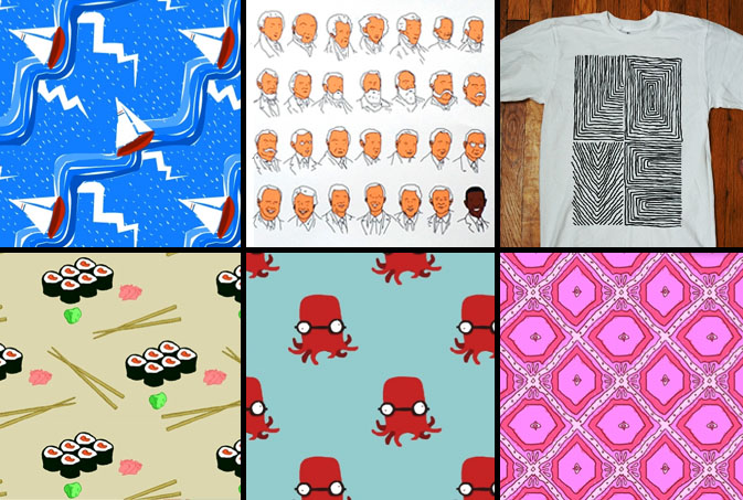
We were recently alerted to Patrick Moberg and his illustrative prowess by our dear friend Judy Prays. Moberg’s personality and point of view penetrates beyond his bright color palettes and lively illustrations. “He doesn’t seem to take himself too seriously and has a consistent output of cuteness that at times, like the November 4, 2008 piece, reaches heights of poignance while maintaining the simplistic charm that’s consistent throughout his work.” says Prays. Moberg has been on the New York media radar ever since his fearless feat of romance that brought him face to face with his MTA missed connection. Love life aside, we’re excited to see what’s next from this bright young artist, as the diversified and playful quality of his portfolio seems like a seamless fit for many mediums.

Trend: Digital Snacking


Digital Snacking

Lately it seems that for Americans, life is delivered “on the go”.  This style of living, most famously portrayed in the story, Fight Club, highlights the single serving lifestyle. “(The) Cordon Bleu hobby kit. Shampoo-conditioner combos, sample packaged mouthwash, tiny bars of soap, single serving friends.”  While this trend was once attributed to the traveler on the go, it now characterizes consumption trends for a broader base of the population.  Beyond the mini servings of cereal and 100-calorie packs of oreos, consumers are now snacking on their information as well.  RSS feeds, text messaging, mobile apps, Twitter, and iPods all represent information, products and services that come in bite-sized packages that have been designed for flexible living and even disposable consumption.

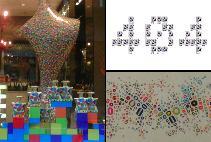
This concept of splintered technology is conveyed through color in Bond No. 9’s summer window display.  Each bottle of perfume is stacked in a tetris-like manner, reminding us of the infinite possibilities we must choose when devising a singular path. Jennifer Daniel, a graphic designer from the New York area is known for creating art as social commentary on the way we live our lives.  This 404 illustration is the result of 36 unloadable images. In keeping with the spirit of the stirring mind, Propeller Modern, a home goods store based in San Francisco, sells this local work of art that reminds us of a topographical landscape compiled of “O’s” from every form of print media.

Additional contributions by: Kelsey-Lee LeGassick

Interview: Nasa* We Love You!


nasa-patternpulp3

Street art, album covers, clothing, logo treatments, paintings, sneakers– what doesn’t Nasa* do? Nasa*, aka Hernan Mariano Lombardo, lives and works as a designer, store owner and creative collaborator in Buenos Aires, Argentina. Like so many of our favorites, Nasa*’s vast breadth of work is heavily influenced by street, skate and architecture. Pattern Pulp recently had the pleasure of catching up with this talented artist in his Palermo Hollywood boutique, Love You. The store, which doubles as an art gallery, was founded by both Nasa* and his partner Soma, and features work by several local artists. Check out our Q&A and get inspired by his endless energy!

*            *            *

PP:  Please describe your current work.

NASA: I just finished a solo exhibition called “Te Veo” in the Rojo Art Space in Rosario. It featured a series of my canvases and design objects from 2009. You can view the images here.

I am creating new cover art for the band Charlie3, a post punk band in Buenos Aires.

In collaboration with Vans, a sponsor of my art, I am designing a series of signature t-shirts.

Finally, I am branding and designing t-shirts for BlackFin, a street wear brand.

PP: What is your design process?

NASA: For me it begins as a mental process. I think of the message I want to convey and then I let it marinate in my head. Shapes, colors, textures and sounds start to appear. It is a very intimate process that can occur at any moment. It can happen drinking a coffee, skate boarding, showering, or at a concert. At all times I have paper and pencil with me. Depending on the specific project, the process changes. If it is a painting, the work is completely analog, if it is digital I scan drawings and work in Illustrator and Photoshop.

My tools are pencil, paper, markers, ink, camera, photos, scanner, wacom tablet and my laptop.

PP: You design artwork for so many different categories! What do you prefer and why?

NASA: I like to move throughout the creative realm. I really enjoy all that I do, so I can’t say I prefer one thing to another. I try to do projects that I enjoy and that will stimulate me as an artist. For example, I am beginning to work with motion graphics. I want to draw the movement with music.

PP: Describe your collaboration with other artists and how it impacts your work.

NASA: Working with other artists is always very interesting for me. It can take my work to a new level. Recently, I collaborated with Clorindo Testa a very important Argentine architect. He was a born into the local vanguard scene and is now 86 years old.

My assignment was a mural. We talked a lot about street art, Rome, and primitive painting. He gave me a sketch of his raw idea and allowed me to reinterpret it. That was very crazy for me. A real honor. I studied architecture and Clorindo Testa was always my idol. The mural can now be seen in the Buenos Aires Design Center in Recoleta.

PP: What challenges have you faced as an artist?

NASA: I see each work as a challenge. But of course some are more difficult than others. The mural I did together with Clorinda Testa was very important for me. It was a challenge.

Also, I consider it a challenge to show in galleries and cultural centers. Exhibiting my work I feel a lot of internal pressure, though I love it!

PP: What inspires you? Any specific websites or designers?

NASA: I am inspired by many artists of the past, such as Miro, Mondrian, Basquiat, Warhol, Perez Celis, Clorindo Testa, Le Corbusier, Mies van der Rohe and Pollock. I am inspired by the Bauhaus and the entire Modern European art movement of the 1940’s and 50’s.

Also, ancient art serves as a great source of inspiration, specifically from Egyptian, Chinese and Islamic cultures. Their calligraphy, alchemy, hidden sciences, and Freemasonry are extremely thought provoking.

I am addicted to music as an inspiration. The cure, stone roses, el punk, post punk, indie rock, record labels like warp records o fat cat records, French dub, etc.

I am inspired by skate and surf culture.

I am inspired by my 3-year-old daughter Donatella. She is such a source of pure energy.

I am fed up with the Internet. I try not to use the Internet as inspiration. It is difficult, but I try to look for inspiration in their roots, in old books, things of the past. Lately, I feel Internet is taking all my time with flickr and facebook. I spend too many hours online and it doesn’t inspire me at all.  However, I do recommend Rojo Magazine, where you can find high level emerging artists.

Compiled by: Rebecca Silver

Interview: Emil Kozak


Influenced by skateboarding culture, his homebase of Barcelona and a healthy dose of creative irony, Emil Kozak has become a leader of what’s relevant in today’s graphic market.  Devising obscure references through words, objects and codes, Kozak has produced artwork for clients ranging from Vans, Element, and Burton, to Nike, Lab Skateboards and Uniqlo. “I hope that my work can remind us that imagination can defy gravity and bend time.”  Kozak’s mantra is yet another example of trends in design bridging both space and time.  Check out our Q+A for a glimpse into the world of this vector wunderkind.

*            *            *

PP:  What websites do you generally start your day with?  Do you have a daily routine for news/blog/information consumption?

EK: I check the wave forecasts first thing when I wake up.  Sometimes I check the news, but usually i just get started on working.

PP: As a designer, how did you discover your talent and how has it evolved over your creative career?

EK: When i was a kid I was really into Lego and making things out of wood. At my parents house there is still all my homemade pinball machines, pirate ships and what not. When I got older, I started making tape-covers for mix tapes and the demo-tapes for our punk-band on the Xerox machine at my dad’s work. When I finished High School, my mom gave me the idea to try out a graphic design education. I did and was hooked.

PP:  Do you discuss your work with other designers?  If so, how does that impact your creation process?

EK: Yes, I have friends with similar professions and we always help each other out, when the eyes give up… It affects more of the final decision making concerning colorways or small variations. Conceptual work etc. is between my notebook and me 🙂

PP:  Where do you usually work on your patterns and what is your preferred method of creation + execution?

EK: First I sketch with pencil and paper. Then I scan and finish it on computer.

PP:  When is the last time you took a professional/creative risk??

EK: I guess I take small risks on a weekly basis, but the last major one was deciding to go freelance, and start up my own studio.

PP:   Do you incorporate commercial trends into your work and if so, is this a factor that drives your design?

EK: Sure, I’m just as much a product of my environment as anybody else.  Zeitgeist and the contemporary is a powerful thing. I actually think it’s kinda cool that we are all in this boat together somehow with shared beliefs and a collective consciousness.

Interview: Dan Funderburgh


Dan Funderburgh

Every now and then you stumble upon work that is so creatively fascinating that it moves and inspires you.  Today we’re highlighting Dan Funderburgh, as his library of meticulous wallpaper falls into this awe-inspiring category.  Each of Funderburgh’s repeats draws upon historical references, be it Moorish mosaics, American op art, or simple tools humans use in everyday life.  Marrying commercial materials with modern day thought, Funderburgh’s art has seeped into several pockets of society, making significant waves throughout overlapping creative communities.  From 5Boro skateboards to the walls of Cooper-Hewitt’s Design Museum and the Miami’s Museum of Contemporary Art, Funderburgh continues to merge art, living and attitude.  Check out our Q+A for a glimpse into his daily routine.

*            *            *

PP: Do you have a daily routine for news/blog/information consumption?  What are your favorite publications?

DF: I start my day listening to public radio but usually glance over the NYTimes and BBC websites. As far as the bloggysphere there is far too much stuff to take in daily. I figure my friends will send me something if it’s really important. I do like my friend Kelly’s blog, Nothing is New.

And of course Arkitip and 12oz. where kindred spirits Cody Hudson, Grotesk, Ryan Geezer, and The Chinatown Soccer Club post.

PP: How did you discover your talent and how has it evolved over your career?

DF: I don’t know so much about a talent, but I discovered I have an acute appreciation for intricate ornamental arts about the same time that I discovered I have a limited patience for non creative corporate logo re-sizing. So I quit my job and tried to make my way as a wallpaper maker and artist.

PP:  Do you discuss your work with other designers?  If so, how does that impact your creation process?

DF:  All the time! Not too many other wallpaper designers, but I’m surrounded by smart artists and designers and photographers that help me tremendously. Not so much on the minutia of a specific piece, but more for larger questions about direction and concept.

PP: Where do you usually work on your patterns and what is your preferred method of creation + execution?

DF: Usually rough sketches in pencil and then redrawn from scratch in the computer. I try to always be open to other options –> painting and photography in case the idea calls for it.

PP:  When is the last time you took a professional/creative risk?

DF: Too long ago. It’s probably time I should take some more.

PP:  Do you incorporate commercial trends into your work and if so, is this a factor that drives your design?

DF: Of course not ! That was a trick question. I suppose a few years perspective will be the judge of whether I’m apart from the flock or just fooling myself.

Tracking Repetitive + Awesome.
On Instagram.