Pattern Pulp

Morag Myerscough for J.Crew


Morag Myerscough_Jcrew

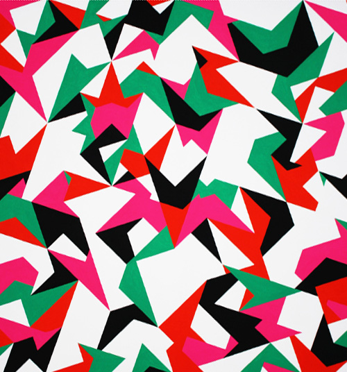
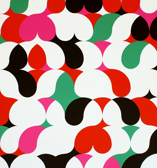
J.Crew recently teamed up with the talented Morag Myerscough to design their London storefront on Marylebone High Street. Here are a few images from their blog, shot by the talented Kasia Bobula, where Myerscough’s creative process is documented. As you can see, the colors bounce around with a vibrant fluidity. This piece is a playful exercise in color theory – one that has beautiful movement. Artistic brand partnerships are quite common these days – and a stellar one plays up to both strengths. We think this one falls under that category, what do you think?


Geometry & Spatial Design


Phuong Thuy nguyenEsther Stocker_Patternpulp

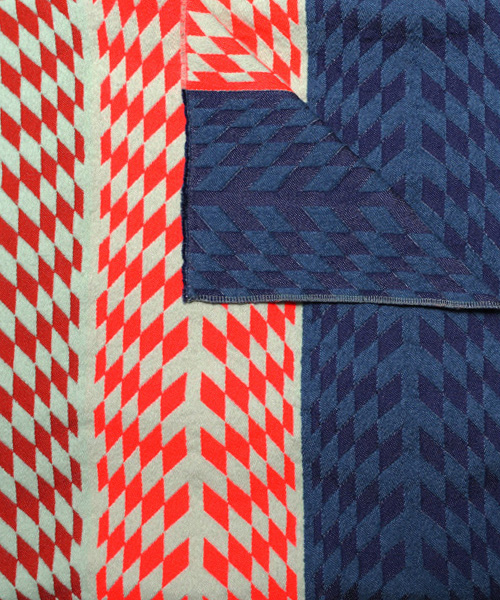
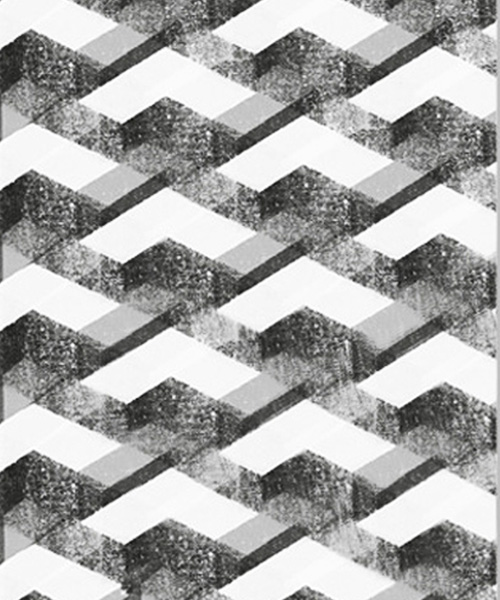
I recently stumbled upon two artists with parallels so strong, it seemed appropriate to write a piece about the similarities in their work. Meet Phuong Thuy Nguyen and Esther Stocker. Nguyen is from Budapest and works with woven objects and sculptural textiles, while Stocker is originally from Silandro, and is a master at perspective and spatial ambiguity.

Both work within the confines of a black and white palette and create illusionary geometry that manipulates the context of space. I find both of these bodies of work to be very inspiring- from the cast shadows and collaged lines to the intricate folding and origami-like repeats. It would be fun to see a grand collaboration between these two women, wouldn’t it?


Fused Geometry & Floating Shapes


trends_fusing_geometry_patternpulp

Trends are a funny thing to track. You can say that once they’ve gain momentum, they’re technically uncool and tacky (thank you Karl Lagerfeld for the insight), or that they’re simply an overarching theme hitting several sensory points. When you’re observing the things vibrating through culture, it’s important to look beyond the magazine headlines, as we all know that editors have word counts to fill and advertisers to please. It’s their job to sell quick digestible bites of content to keep us shopping…

When I wrap my head around a visual theme, I make sure to link as many worlds as possible…ranging from art and product to design, marketing and geography. Prisms have been an active element in the creative world for quite some time…they’ve gone from 3D to 2D and back again. This roundup highlights a mostly pink, red, mustard and blue palette of adjoined and floating shapes. Please have a look and share a few favorites of your own!

1. Elk Miracle Classic Pant 2. Work from Judy Kaufmann’s new website, Hello Pattern  3. Teva throwback, a collaboration by Bernhard Willhelm and Camper 4. Handmade prism kilm rug by Elk 5. Pretty pastel rings by Kenichi Kondo 6. Playful typographic art by Esther Tielemans 7. Expressive colorscapes by Melissa Thomson 8. Installation art by Sophie Smallhorn

 

Geometry & Gina Rockenwagner


3gina rockenwagner

The art of quilting is a meticulous one. The craft celebrates the slow evolution of a growing jigsaw puzzle. I recently came across the work of Gina Rockenwagner and was amazed by her palettes and geometric formations.

1gina rockenwagner2gina rockenwagner4gina rockenwagner5gina rockenwagner6gina rockenwagner

Each quilt is breathtaking in it’s crisp coziness. The range swings from 3D color stories to reflective prisms to hombre gradations. To shop Rockenwagner’s etsy shop, click here…you’ll be delighted by the menagerie of choice.


Architecture Around the Globe


1decphotos_instagram_patternpulp 2decphotos_instagram_patternpulp 3decphotos_instagram_patternpulp 4decphotos_instagram_patternpulp

This post’s a short one, mainly because there’s not online much information about the artist. I hit the explore button on Instagram last week and landed on DecPhotos’ feed. It’s excellent, enjoy.


Textiles & Art Gone Angular & Optic


1pieropassacantando_patternpulp2apieropassacantando_patternpulp3magasinmae_patternpulp4magasinmae_patternpulp

Paintings mimicing graphic design always have appeal (at least in our book). There’s a complication and prolonged execution that forces the viewer to appreciate the balance and contrast. From Piero Passacantando’s restricted palette in his RGMBW series to the printed textiles and homewares in Mae Engelgeer’s shop, the selections are just jarring and beautiful enough to remind us of geometry’s wonders.


Tracking Repetitive + Awesome.
On Instagram.