
Pattern Pulp

Cross-Pollinating your Gradients


Finding a connection between the digital and physical spheres is a never-ending hunt for today’s forecasters. Whether you’re comparing the symbolic differences between RGB or CMYK or simply finding inspiration in either execution, important observations can be made when considering how one medium influences the other.
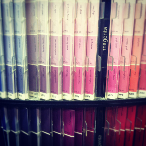
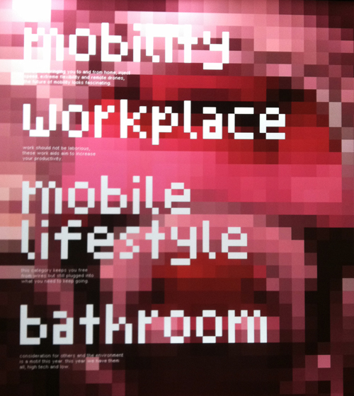
Here we have a pixelated display at the Red Dot Design Museum in Singapore. A blurry screen becomes textured art and the type conjures up early 90’s atari. If you follow our line of thinking and view Benjamin Moore’s paint chips immediately after, it’s easy to make a connection- they’re strikingly similar, but hold opposing conversations (and purposes).
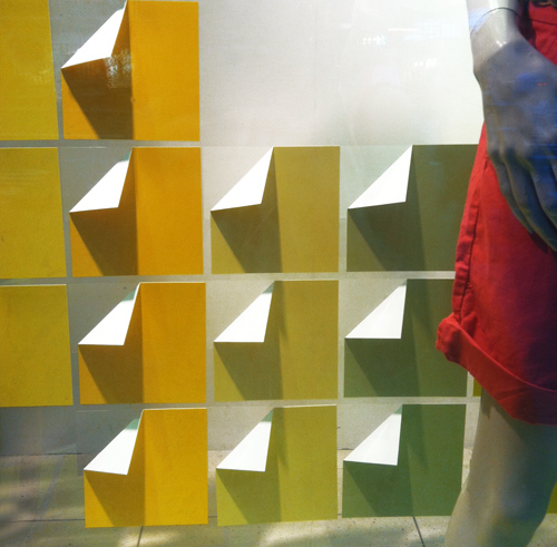
Now let’s move to the commercial realm. This is window display from the GAP on Fifth Avenue. It’s extremely economical- paper’s been folded and arranged in a grid. The gradient is the storyline and compliments the clothing.

Moving along to packaging, this method was recently the result of Sephora’s beauty collaboration with Pantone Universe. Pixels are again the focus. Mimicking the diversity within skin tones, the packaging amplifies the face and focuses on color, making us wonder if CMYK really wishes it were RGB.


The Colors of a Modern Identity Crisis


Identities are a funny thing. In one instance you’re one version of yourself and in another you’re an entirely different character. Alternate parts of your personality shine at varying times. Now add a digital layer. A boundary of sorts, something to protect you from the reality of what’s true and what’s false.

Today’s story hones in on the awkward line between these worlds. Photographically, it’s illustrated by Neil Barret’s latest print campaign of youth divided. Reminding us of Nick Cave’s beautiful and often confusing costumes, we have David Sim’s latest spread in LOVE Magazine and bringing an eerie surrealist interpretation to the table, there’s Dow’s Einstein-infused Solutionism campaign.


Music: Andy Gilmore & Ghostly


Stare at Andy Gilmore‘s works and we promise you’ll get lost. Using meticulous shades of gradation, line and pattern, Gilmore creates intricate spreads that evoke black hole sensations of time and movement.

In a recent collaboration with Ghostly, a record label and culture curator out of Ann Arbor, Gilmore’s devised a limited run of prints entitled, meno mosso. “The meaning of meno mosso in relationship to this piece, and my work in general, is rooted in the idea of using music to manipulate one’s perception of time in the creative process. Meno mosso being defined in music as less quickly.

Trend: Evening Projections


After returning from the Alt Design Summit, it was fairly evident that incorporating ‘surprising’ touches into your party planning is a very big deal. I’m no stranger to this concept, as I’m often hired to design content for branded activities, however the DIY spirit was in full effect, reminding me to keep a few things off the adobe punch list.

Using digital technology, projections and a starry night theme, all of the imagery above overlaps in one way or another. Casting gem-like projections on back-lit silhouettes, this party, from the pages of Elle Decor proves that subtlety can be elegant and luxurious. Keeping with the color scheme of blue and white, Sofitel, the luxury hotel chain evokes a Peter Pan-like mood with floating pillows. Applying this concept to an enormous symphony hall ceiling, Departures Magazine shares a the stunning results of a concert fueled video projection.


Beauty: Chanel's Digital Dance


Chanel’s gone and outdone themselves! With the help of Peter Philips and his brilliant animation eye, this monolithic brand has jumped into the animation pool head first, proving they’re not second fiddle behind Burberry in the pool of digital relevance. This Chanel beauty kit comes to life as a robot, interestingly giving us a masculine take on a brand that’s so extremely feminine…love the mix up. Click here to watch this Trontastic video.

Interactive & Structurally Sound


Patterns in nature are often the most intricate. When combined with an interactive mind, they can be completely mesmerizing. Leonardo Solaas, an Argentinean interactive designer living and working in Buenos Aires has been blurring the line of fantasy, reality and nature for over a decade. All of his drawings, video clips and interactive features are timeless in a futuristic meets nostalgic kind of way. When paired side by side with this architectural structure, it’s easy to see  the structural influence one has on the other, and by removing all traces of color, the contrast is simply compelling.

Tracking Repetitive + Awesome.
On Instagram.