Pattern Pulp

San Francisco: Digital Embroidery


Ehren Reed‘s mixed media works have been making the internet rounds for a while now. Merging technology’s ethereal presence with the physicality of handmade craft, Reed stitches and embroiders maps, books and other found objects with the intent of solidifying pixelated media. Her upcoming show at the Edo Salon and Gallery in San Francisco investigates the interpersonal relationships society has with the internet and contemporary culture. For more info, click here.

Edo Salon & Gallery
: 601 Haight Street, San Francisco, CA 94117

Opening Reception: Sept 3, 8:30-11pm

Artist Profile: Julien David


Graphic designers get really excited when the art world a.) beautifies and b.) acknowledges their daily design tools. Today we present you with Julien David and his most recent collaboration with Pringle of Scotland, Colette and DC Comics. Using bold illustrations, vivid colors and rich fabrics, David single handedly creates a playful dialogue for the luxury market to wrap it’s head around. The symbolism behind the keyboard and Superman logo remind us of the importance and influence both images hold on a global scale. By enlarging and repeating, we see how easy it can be to force an audience to heed a message. Whether you’re wearing a twinset or a scarf, all of David’s pieces are conversation starters, not to mention, exciting interpretations of pop culture.

Trend: Digital Snacking


Digital Snacking

Lately it seems that for Americans, life is delivered “on the go”.  This style of living, most famously portrayed in the story, Fight Club, highlights the single serving lifestyle. “(The) Cordon Bleu hobby kit. Shampoo-conditioner combos, sample packaged mouthwash, tiny bars of soap, single serving friends.”  While this trend was once attributed to the traveler on the go, it now characterizes consumption trends for a broader base of the population.  Beyond the mini servings of cereal and 100-calorie packs of oreos, consumers are now snacking on their information as well.  RSS feeds, text messaging, mobile apps, Twitter, and iPods all represent information, products and services that come in bite-sized packages that have been designed for flexible living and even disposable consumption.

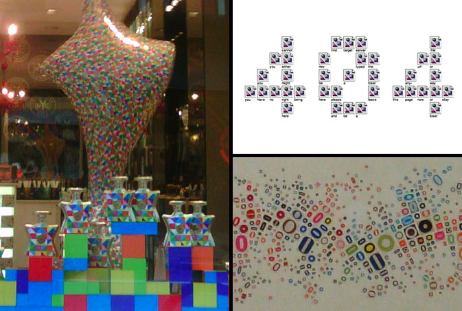
This concept of splintered technology is conveyed through color in Bond No. 9’s summer window display.  Each bottle of perfume is stacked in a tetris-like manner, reminding us of the infinite possibilities we must choose when devising a singular path. Jennifer Daniel, a graphic designer from the New York area is known for creating art as social commentary on the way we live our lives.  This 404 illustration is the result of 36 unloadable images. In keeping with the spirit of the stirring mind, Propeller Modern, a home goods store based in San Francisco, sells this local work of art that reminds us of a topographical landscape compiled of “O’s” from every form of print media.

Additional contributions by: Kelsey-Lee LeGassick

Trend: Digital Dividers


gordinjen-oumi

Digital influences are everywhere- from Invader’s pixelated street art to fashionable home goods and clothing themes, typically invisible details are gaining recognition across non-digital platforms.  Dutch designer Nienke Sybrandy‘s sheer curtains are a coder’s delight. Her tree branches are compiled of assorted letters and numbers and are laid out within a monochromatic palette.  In an alternate world, the LA designers behind the Oumi label have embraced this fashion friendly fusion by pairing transitory pixels with satin and knit.

kashiwasato1

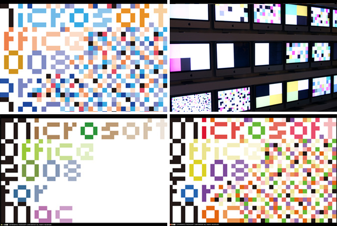
When assessing which patterns are most successful, it’s important to consider the role of color.  If a palette isn’t balanced, the eye will wander to the dead spots or over accentuated details.  These pixelated animations by the Japanese design team, Kashiwasato display type and movement for Microsoft Office’s 2008 for Mac launch.  Carefully choreographed squares cover the screen in chaotic movement, revealing digital disarray reminicent of a visual virus.

Trend: Type Remix


type-remix

The assemblage of letters and words is fascinating.  As children, we create our own mechanisms to communicate, then hone our craft and cognition skills as we age.  In recent weeks, there appears to be a visual unraveling of this basic foundation for which our society functions.  The results have been playful, though somewhat symbolic of confusing times. “This reminds me of when you’re tongue-tied and everything you want to say becomes sort of mush in your head. Or when you think you know what you want to say but completely forget,” says Pattern Pulp contributor Emily Gup.  Marina Camargo’s falling content was recently spotlighted on Swiss Miss and presents a surreal image of lost typography.  In real world time, these matching typewriter chairs are a curious window display at the high-end vintage furniture store Adelaide, in the West Village of Manhattan.  In the gaming and digital corner, Morisawa of Japan has created the addictive character game, Font Park, where beautiful calligraphy can be formed by disfiguring character symbols.

bergdorf-moma

In higher stake markets, scrambled letters are also catching on.  Bergdorf Goodman’s March window display showcased a backdrop of mismatched letters behind highly stylized mannequins.  A few blocks south at the MoMA, the just opened exhibition, Tangled Alphabets presents León Ferrari and Mira Schendel’s combined work over the later half of the 20th century.  Ferrari and Schendel’s joint collection addresses language as a major visual subject matter, encompassing the body, voices, words, gestures and metaphors for naming and writing trends.  Back downtown on Mott Street, I Heart NYC’s store signage is a retail reminder of Camargo’s work.

[youtube=http://www.youtube.com/watch?v=toWFvXHghDk]

Camille Utterback’s Text Rain interactive art installation from 1999 is quite mesmerizing, not to mention amazing, considering the technology was fairly rudimentary ten years ago.  For an afternoon laugh, check out the Prudential game Falling Words, as it’s a marketer’s lighthearted stab at releasing negative thoughts that people rarely share.

Fashion: Text Heavy Threads


venacava-salvorprojects

Is a picture still worth a thousand words if it’s a literal reproduction of organized type? While perusing the spring collections at Barneys and Blue and Cream last week, Vena Cava‘s heiroglyphics dress made a few notable uptown and downtown appearances.  For well established brands, this feat is a walk in the park, though it’s notable to highlight the versatility of this young American label, particularly when company buyers have clamped down on their retail collections.  Applying similar typographic methods, Ross Menuez, the founder of Salvor Projects, incorporates digitized text to create a vertical ticker of information.  This gray on gray stream of characters is a subtle reminder of the communication chaos that’s circling us on a 24 hour basis.

[youtube=http://www.youtube.com/watch?v=Pkyw4JTh19U]

This vintage m ss ngp eces video highlights Menuez’s creative process, an interesting watch with timeless appeal- one of many captivating shorts produced by Cool Hunting.

Tracking Repetitive + Awesome.
On Instagram.