Pattern Pulp

Jimena Palacios's Textiles


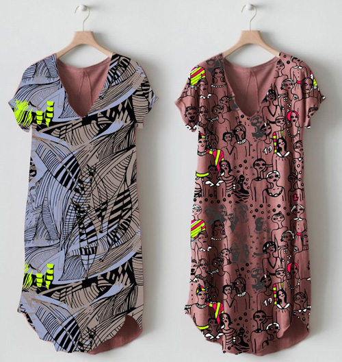
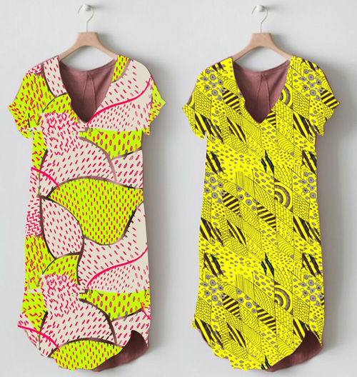
2jimena palacios 1jimena palacios

I love getting links from my friends. It’s a treat when they know what’s up the Pattern Pulp alley. Today’s post highlights the Argentinian artist, Jimena Palacios and was forwarded along by the talented Kim Devall. Bright and graphic with a unisex hand, the illustrations feel like graffiti. Her textiles range from soft and eclectic for babies to loud and expressive for adults. To view her whole range, have a look at her Facebook page.


Hunting for Homegoods in BA


Who here’s heard of Paul? Before heading to Buenos Aires, I knew nothing of this magical land of homegoods. After seeing it on many a friend’s Foursquare list and my own Fortnighter itinerary, I was determined to visit ‘the Merci of BA.’

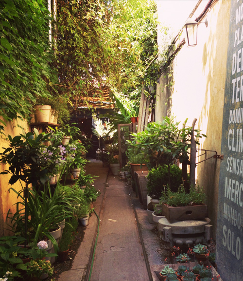
The store is located off the main road down a peaceful gardened path. For the New York readers looking for a comparison, it has an ABC Carpet meets South American vibe throughout. It also feels a bit like Corso Como of Milan.

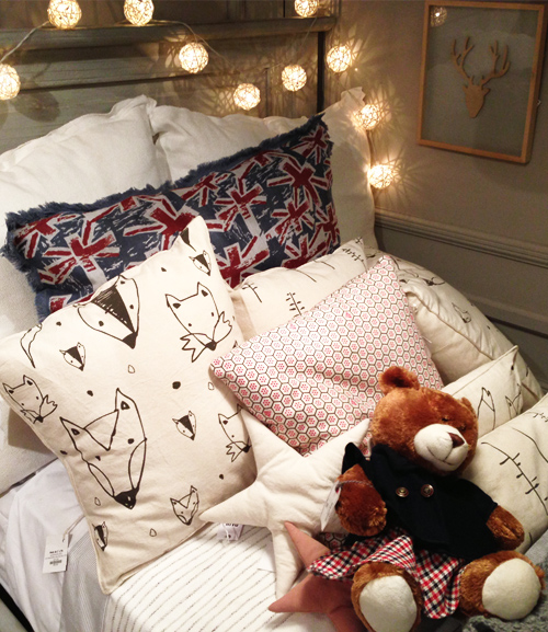
The home accessories are high-end, comfortable and air on the side of neutral. The patterns when enlarged are sketchy and imperfect, and when smaller are even prisms of geometry.

These knitted mounts are interesting. I’m not a fan of taxidermy, but this interpretation takes the edge off in a delicate way. They feel like creatures of the netherworld.

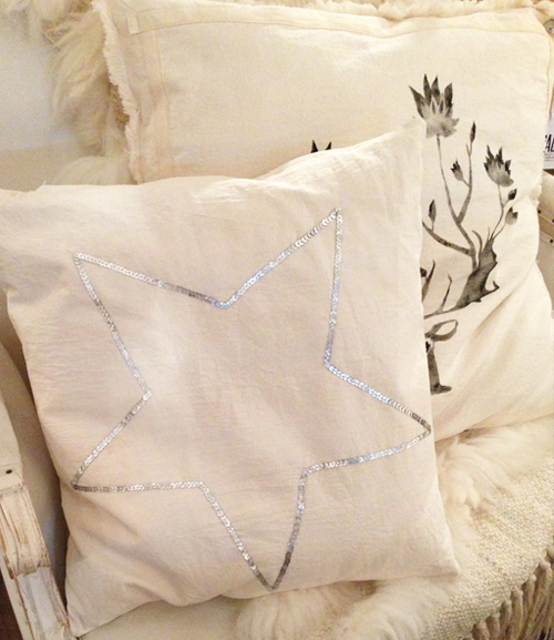
Everything’s mixed and matched with subtle embroidery, soft texture and screen-printed detailing.  Though a star is a star is a star, I was still drawn to this Sabe Bonito pillow- it has a seasonless appeal that you just want to curl up and read a book on.


Around the Globe: Funhouse Facades


If I ever open a brick and mortar shop for Pattern Pulp, it’ll be a dizzying experience- in a good way. So, when I venture into concept stores, restaurants, museums and essentially any retail spot that tests convention, I get very excited. I’ve found some of the most visually arresting store and floor facades in Helsinki and Tokyo…I can now add Buenos Aires to the list.

Here are a few collages representing a textured way of life. From iron welded walls and punctuated waste bins to street-inspired stencils and kid-friendly wallpaper. All of these were spotted in Palermo Hollywood and Soho.


Footwear Trends in Buenos Aires


My first job in New York had me designing shoes. I illustrated prints for OskKosh, Lord & Taylor, Rampage, Target, you name it- if it was mass market and had a licensing deal, it probably crossed my desk. It was an education in product design, commercial pattern making, trend forecasting and a bit of office politics. As a result, I was obsessed with feet.

Everywhere I went, I’d slyly glance to see what people were wearing- in stores, on the subway, at restaurants, even in bathroom stalls…I know.

Fast forward, and a few professions later, I still can’t shake my infatuation with footwear. I shoot and catalog shoes like I still work at ESO. Funny how some things stick. Anyhow, here’s a round up from my recent travels to Buenos Aires. The mens’ category was predominantly red, blue and neutral, had a sporty/sleek leather look, incorporate platformed color blocking and were often adorned with large tassels.

The womens’ shoes were more of a varied bunch. The common thread throughout were platform soles and adorned uppers. Striped, color blocked, glittered, studded, jute-covered, embroidered and perforated. Every girl (but me) was in a pair.

In the realm beyond this specific trend, the others were bright, flat, crafty and relaxed. I bought the mustard version of these perforated loafer slip-ons. I’m hoping they’ll be a sleek, supportive alternative to heels this summer. At first glance I wasn’t so much a fan of the boots, but I now adore them…they have a monochromatic boldness to them. Pesqueira’s bronze flats were whimsical, like her line, and the Alpargatas were essentially the TOMS of BA. Every store had it’s own branded version.

 

Interactive & Structurally Sound


Patterns in nature are often the most intricate. When combined with an interactive mind, they can be completely mesmerizing. Leonardo Solaas, an Argentinean interactive designer living and working in Buenos Aires has been blurring the line of fantasy, reality and nature for over a decade. All of his drawings, video clips and interactive features are timeless in a futuristic meets nostalgic kind of way. When paired side by side with this architectural structure, it’s easy to see  the structural influence one has on the other, and by removing all traces of color, the contrast is simply compelling.

Interview: Piktorama's Delectable Design


Filled with smiling toasters, teapots, and cupcakes, how can you not fall in love with the playful and upbeat designs of Piktorama (aka Amaranta)? Born and raised in South America, Piktorama spent a majority of her youth in Caracas and her later art making years in Buenos Aires. Currently residing in Miami, Piktorama combines her talents as an illustrator, animator and fine artist. Piktorama’s main inspiration: cupcakes, a delicious treat for any artistic or culinary palate. It’s certainly a recipe for success. Her stimulating artwork is catching the eyes – and taste-buds – of designers and food critics alike as her vibrant designs bring to life one of life’s greatest pleasures. Check out our Q&A with this irresistible Latina to learn more about her perfect taste in desserts and patterns.

*            *            *

PP:  How would you describe your aesthetic?

PIKTORAMA: Playful and whimsical.

PP:  Describe your collaborations with other artists.

PIKTORAMA: I haven’t had the experience to work with another artist just yet, but it’s something that I’ll do someday. What I have done is to participate in a project where several artists use the same theme to create their own unique work. The result is a body of art with similar topics yet drastically different outcomes. It is really amazing to see and be a part of. I really like that.

PP: Who inspires you?

PIKTORAMA: Love, friendship, music and cupcakes.

PP: How do color and pattern play a role in your work?

PIKTORAMA: These are the most important elements in my work. In almost all my creations I include colors and patterns, if not, textures. I’ve done black and white illustrations too, but is a real challenge for me.

PP: How does your culture and background affect your work?

PIKTORAMA: It doesn’t really affect it because my work is more based on my daily experiences. It depends on what I’ve done that day, what I’ve seen, my sense of humor, so it’s more a day-to-day experience that influences what I put on paper. I usually joke around a lot so that’s why you can find a lot of foolishness and happy characters in my work.

Coverage by: Rebecca Silver

Tracking Repetitive + Awesome.
On Instagram.