Pattern Pulp

Interview: Lucila Iotti


Lucila Iotti-pattern-pulp1

Sexy, unexpected, and attention getting. It’s everything you could want in a high heel, and it’s everything that Lucila Iotti delivers. Iotti started the eponymous label in her hometown of Buenos Aires where her father, Jorge Iotti, began his tailoring shop in 1920. In a city obsessed with shoes, her creations stand out with their eye-popping colors and mix of unexpected textures, including vinyl, patent leather, suede and leather. It’s certainly no surprise that her bold designs caught the attention of Patricia Field, Sex and the City’s infamous costume designer. We love Iotti’s latest collection, inspired by Brazil’s Carnival, and can’t wait to see what this innovator comes up with next. Check out our Q&A with this passionate Latina who is just as colorful as her shoes (even the electric orange and blue pair)!

*            *            *

PP:  How did the brand begin?

LI: The brand was born out of my frustration when I couldn’t find shoes in the market that reflected my aesthetic and that I would actually want to wear. It was the coming together of three friends that shared a vision; we opened a small shop in Palermo, a trendy neighborhood of Buenos Aires. Quickly we gathered a faithful group of followers that included fashion stylists, high heel fanatics and original design lovers. We caught the eyes of passing tourists and provoked admiring sighs from locals with our storefront window display.

PP: Who is your ideal customer?

LI: The one who doesn’t have to ask, “What do I wear them with?”

PP: What inspires your shoe designs??

LI: The multiple possibilities that come from mixing textures and colors are a constant inspiration. Also, the aim is to innovate through shape, explore and to take patterns to a new level. Really the main is inspiration is the WOMEN and the men who love to see themselves on top of fabulous heels.

PP: How do color and pattern play a role in your designs?

LI: Both are equally fundamental. Sometimes, the pattern can be very simple because the materials that I want to mix just ask for it. Other times I just want colors to explode and scream and be the main character. If that is the case my main tools are pattern because it allows me to play with many pieces that barely touch and provoke each other until they become a whole.

Coverage by: Rebecca Silver
Interview: Juanita Cárdenas


Juanita Cárdenas2

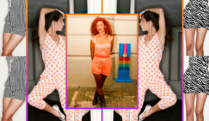
Meet fashion’s latest print maven, Juanita Cárdenas. Born in Colombia, raised in Miami and now a resident of Buenos Aires, Cárdenas is making a name for herself with her graphic ensembles. Her eclectic background has served as the inspiration for Polychromatico!, her new fashion label. Growing up in Miami “filled my imagination with colors,”says Cárdenas, a given after browsing through her electric collection. Check out our Q&A for a glimpse into the world of this cultural hybrid and get inspired by Cárdenas’ can-do attitude.

*            *            *

PP:  How did you start your own line?

JC: I had wanted to start a line or to embark on a project for some time, but I always thought that I had to have more experience, money, etc. I realized one day that the perfect conditions would never exist. The ability to map everything out clearly was further away than I was willing to wait. I decided that rather than planning how to face imaginary obstacles I would tackle the real ones as they came. After this realization I started thinking about the line, drew a series of sketches, produced some samples, designed a website and a little baby Polychromatico! was born.

PP: What inspires your collection?

JC: My inspiration varies from collection to collection. A common thread throughout is an interest in developing characters. My first collection was inspired by circus characters. The second line is based on intergalactic heroines. The line I am currently working on is inspired by Alice in Wonderland.

PP: Who is your ideal consumer?

JC: Someone who enjoys getting dressed and is willing to experiment with her image. I greatly appreciate people who wear something and own it; people who choose to express their unique being rather than blend in with the crowd.

PP: How has your unique cultural background influenced your aesthetic?

JC: My cultural background serves as a database of images that inform my aesthetic. Having lived in NY informs my certainty that beauty is often achieved through taking risks. Having been born in Colombia and having spent so many years in Miami fills my imagination with colors.

PP: What is your design and style philosophy?

JC: My style philosophy resides on wearing what brings your heart satisfaction. I try to resist the temptation of altering my designs based on mass-market appeal and try to produce accessible clothing (as far as price is concerned). I am not at all interested in having my line become exclusive through pricing, as it’s more rewarding to have people wear your clothing because it helps them express their personality.

Coverage by: Rebecca Silver

Interview: Andrea Cavagnaro


Andrea_Cavagnaro_patterns

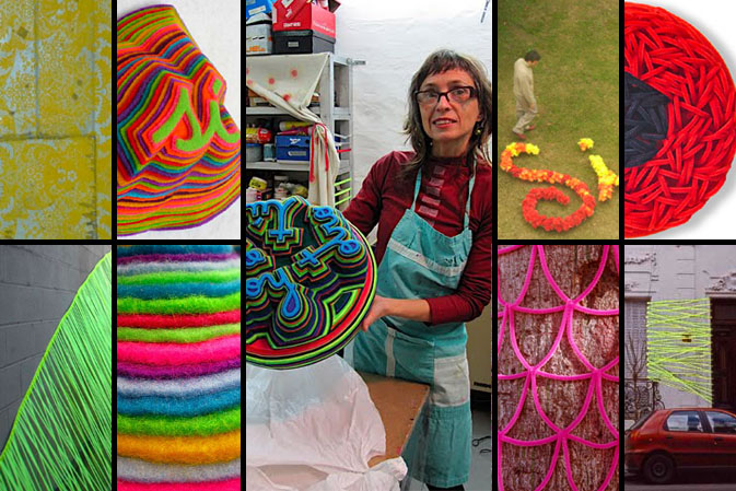
Risa (laughter), beso (kiss), and cuerpo (body) are just a sampling of the delightful Spanish words that Andrea Cavagnaro, Buenos Aires based artist, depicts in her eye-catching felt sculptures. We can’t help but be reminded of Jen Stark’s paper sculptures profiled here, when we see Cavagnaro’s brightly colored and lush layered felt. In addition to these colorful wall hangings, Cavagnaro creates large-scale environmental art displayed throughout Argentina. Pattern Pulp recently had the pleasure of meeting Cavagnaro in her charming studio where she allows her free spirit to guide her to new artistic discoveries. Check out our inspiring Q&A with Cavagnaro and discover how taking new paths led this artist to unexpected places.

*            *            *

PP: What is your design process?

AC: I enjoy working with fabrics. I love to spend hours and hours cutting, gluing, and choosing relationships between colors: contrasts, gradients, dizziness, agreements and opposites. During textile production, body connects itself, with breathing, energy, with all its invisible parts. It is an innermost moment.

My urban work is developed based on the project and depends on the unique and specific context of the piece. I express the experience of my body on that particular place, using contrasting visual language. I create a project, I draw up a plan for it (sizes, calculations, patterns), and then I prepare the materials and build up the staging. I also make sure to carefully document the entire experience.

PP: As a designer, how did you discover your talent and how has it evolved over your creative career?

AC: I worked as a fashion designer for a long time, so I think there is something unconsciously related to design when I choose colors.  I give myself over to color choices without thinking, finding them as if they are given to me…and suddenly, while working, I decide to change them abruptly, taking a completely different direction in the same work and embracing the new combination.

PP:  How does the medium affect the outcome of your work?

AC: I chose the medium based on the experience I want the work to have on the body. At the same time, the material defines the shape, dimensions, and colors of the intervention or sculpture.

While I am working with the industrial synthetic felt, lots of possibilities are open to me. It is like a road, I begin to walk and I find other paths so I choose those and so on. It happens with the shape, with the color, with the rhythms, with the sequence, so it is like a trip that I never know where it will finish.

PP:  What challenges have you faced as an artist?

AC: The most important challenge of my career was in 2001, during Argentina’s financial crisis. Up to that point, my work was a more formal enjoyment of shape and color. After the crisis, I began my public art interventions, and all of my work became completely conceptual.

Another important change was at the end of 2007.  After two years of intense collaboration on urban interventions, I needed a break.  I needed silence. I spent hours in my studio alone, and I discovered the felt that I fell in love with and now use in much of my work.

Compiled by: Rebecca Silver

Interview: Nasa* We Love You!


nasa-patternpulp3

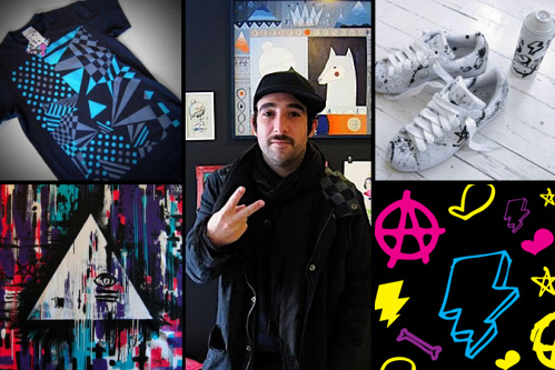
Street art, album covers, clothing, logo treatments, paintings, sneakers– what doesn’t Nasa* do? Nasa*, aka Hernan Mariano Lombardo, lives and works as a designer, store owner and creative collaborator in Buenos Aires, Argentina. Like so many of our favorites, Nasa*’s vast breadth of work is heavily influenced by street, skate and architecture. Pattern Pulp recently had the pleasure of catching up with this talented artist in his Palermo Hollywood boutique, Love You. The store, which doubles as an art gallery, was founded by both Nasa* and his partner Soma, and features work by several local artists. Check out our Q&A and get inspired by his endless energy!

*            *            *

PP:  Please describe your current work.

NASA: I just finished a solo exhibition called “Te Veo” in the Rojo Art Space in Rosario. It featured a series of my canvases and design objects from 2009. You can view the images here.

I am creating new cover art for the band Charlie3, a post punk band in Buenos Aires.

In collaboration with Vans, a sponsor of my art, I am designing a series of signature t-shirts.

Finally, I am branding and designing t-shirts for BlackFin, a street wear brand.

PP: What is your design process?

NASA: For me it begins as a mental process. I think of the message I want to convey and then I let it marinate in my head. Shapes, colors, textures and sounds start to appear. It is a very intimate process that can occur at any moment. It can happen drinking a coffee, skate boarding, showering, or at a concert. At all times I have paper and pencil with me. Depending on the specific project, the process changes. If it is a painting, the work is completely analog, if it is digital I scan drawings and work in Illustrator and Photoshop.

My tools are pencil, paper, markers, ink, camera, photos, scanner, wacom tablet and my laptop.

PP: You design artwork for so many different categories! What do you prefer and why?

NASA: I like to move throughout the creative realm. I really enjoy all that I do, so I can’t say I prefer one thing to another. I try to do projects that I enjoy and that will stimulate me as an artist. For example, I am beginning to work with motion graphics. I want to draw the movement with music.

PP: Describe your collaboration with other artists and how it impacts your work.

NASA: Working with other artists is always very interesting for me. It can take my work to a new level. Recently, I collaborated with Clorindo Testa a very important Argentine architect. He was a born into the local vanguard scene and is now 86 years old.

My assignment was a mural. We talked a lot about street art, Rome, and primitive painting. He gave me a sketch of his raw idea and allowed me to reinterpret it. That was very crazy for me. A real honor. I studied architecture and Clorindo Testa was always my idol. The mural can now be seen in the Buenos Aires Design Center in Recoleta.

PP: What challenges have you faced as an artist?

NASA: I see each work as a challenge. But of course some are more difficult than others. The mural I did together with Clorinda Testa was very important for me. It was a challenge.

Also, I consider it a challenge to show in galleries and cultural centers. Exhibiting my work I feel a lot of internal pressure, though I love it!

PP: What inspires you? Any specific websites or designers?

NASA: I am inspired by many artists of the past, such as Miro, Mondrian, Basquiat, Warhol, Perez Celis, Clorindo Testa, Le Corbusier, Mies van der Rohe and Pollock. I am inspired by the Bauhaus and the entire Modern European art movement of the 1940’s and 50’s.

Also, ancient art serves as a great source of inspiration, specifically from Egyptian, Chinese and Islamic cultures. Their calligraphy, alchemy, hidden sciences, and Freemasonry are extremely thought provoking.

I am addicted to music as an inspiration. The cure, stone roses, el punk, post punk, indie rock, record labels like warp records o fat cat records, French dub, etc.

I am inspired by skate and surf culture.

I am inspired by my 3-year-old daughter Donatella. She is such a source of pure energy.

I am fed up with the Internet. I try not to use the Internet as inspiration. It is difficult, but I try to look for inspiration in their roots, in old books, things of the past. Lately, I feel Internet is taking all my time with flickr and facebook. I spend too many hours online and it doesn’t inspire me at all.  However, I do recommend Rojo Magazine, where you can find high level emerging artists.

Compiled by: Rebecca Silver

BA Street Finds: Saving in Style


swines and savings

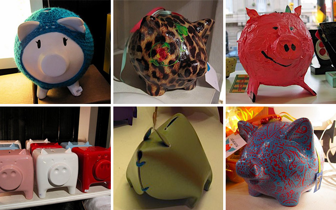
Saving money is certainly in style this season, and now so are piggy banks. Since everyone is pinching pennies, Argentine designers have transformed the kiddie version of a 401k into a design object for the style and money conscious. The colorful swine are dominating Buenos Aires’ boutiques, including Tienda Palacio, Puntos en el Espacio and Materia Urbana. Local kitsch brand Casicursi created two of our favorite piggys – one covered in leopard print, another in red and blue paisley. These two patterns have been dominating international trends, but look fresh when used in this unexpected way. Malba (Museo de Arte Latinoamericano de Buenos Aires), the premier modern art museum in Argentina, features colorful leather piggys in the must-see museum shop. The leather material of these banks celebrates the culture’s most popular export in a fun new way.

How else can you save in style?

By: Rebecca Silver

Interview: Valeria Pesqueira


PESQUEIRA-interview

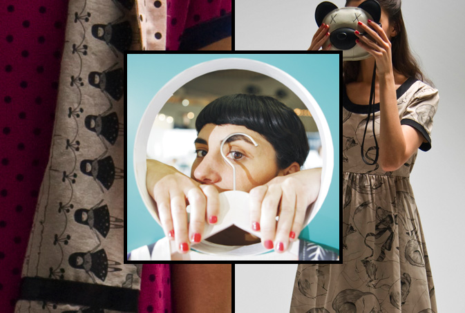
A brand that makes you smile. In 2001, Argentine designer, Valeria Pesqueira, founded her fashion label, PESQUEIRA, with that simple philosophy. She has certainly succeeded. Her innovative use of high-quality materials, bright, fresh colors and exclusive kawaii prints would make anyone happy. Pesqueira sells her classically modern clothing from her flagship store in Palermo Soho, Buenos Aires, in addition to distributing to worldwide retailers such as Bird in New York, Le Bon Marche in Paris, the MoMA Stores worldwide, as well as Nano Universe in Tokyo. Check out our Q&A for a bit of insight into Valeria’s world of pattern and inspiration.

*            *            *

PP:  How did you begin your clothing label?

VP: I studied fashion design at the University of Buenos Aires, then started working for huge fashion brands (Uma, Dockers, Levis etc) from Argentina. That experience taught me the basics of how to work in fashion. About 3 years later I really wanted to create my own work from my personal inspirations, so I started the PESQUEIRA brand.

I started in 2001 in the middle of Argentina’s huge economic crisis. As a result of the economic crisis, Argentines couldn’t afford to travel to shop, so they began buying Argentinean design.

PP: Describe your design philosophy and style.

VP: I love classic style. I enjoy mixing vintage fitting with modern design and prints.  I would love people to remember my brand with a smile. That is my philosophy.

PP: Who is your ideal consumer?

VP: Our clients are very special people with creative spirits. They are women of all ages who love art, the street scene, foreign cultures, fashion, animals, etc. They are curious and this keeps them young.

PP: How does pattern play a role in your design choices?

VP: It is the most interesting part of my work. I collaborate with young artists making exclusive prints for PESQUEIRA. I enjoy working with shapes, colours, animals; mixing all my worlds and prints together.

PP: What are your future goals?

VP: This August I am creating a children’s exhibition in the Malba Museum in Buenos Aires. I will present my Summer 2010 collection in the fashion fair showrooms in Tokyo this September.

PP: What inspires you? Any specific websites or designers?

VP: Basically life. Going to the supermarket, to art openings, traveling around the world, music, cinema, old ladies outfits in the street, yoga, the countryside, animals, colours, japanese packaging, my cat Neko.

Compiled by: Rebecca Silver

Tracking Repetitive + Awesome.
On Instagram.