Pattern Pulp

Color, Conversation & Hanes Underwear


http://www.youtube.com/watch?v=gRJ9ko0nZmI

1color_marketing_hanes

2color_marketing_hanes 3color_marketing_hanes

Have you seen the latest Hanes spot? Chances are, maybe not, as the YouTube page has only 118 views. Parts of it are pretty cool, we’d recommend giving it a go. The concept reminds us a bit of Gap’s Be Bright campaign from a while back, but has clever synchronization and pattern mash-ups that transition human puzzles into cotton graphics.

Complimenting the TV spot, the social media component plays off of color, hoping to create chatter about an otherwise taboo topic. Would you tweet the color of your underwear? Hanes is hoping you will, by utilizing a Pinterest-like layout and pre-populated tweetable content, with a campaign entitled, What’s Your #undercovercolor? Have a look, play with the wheel, and let us know what you think…
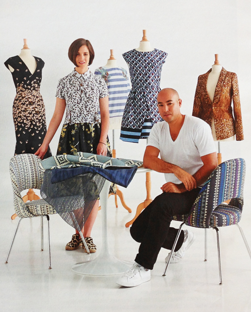
 

Textiles: When Knoll met Suno


1knoll_suno_textiles2knoll_suno_textiles3knoll_suno_inspoboard_textiles4knoll_suno_inspoboard_textiles54knoll_suno_inspoboard_textiles

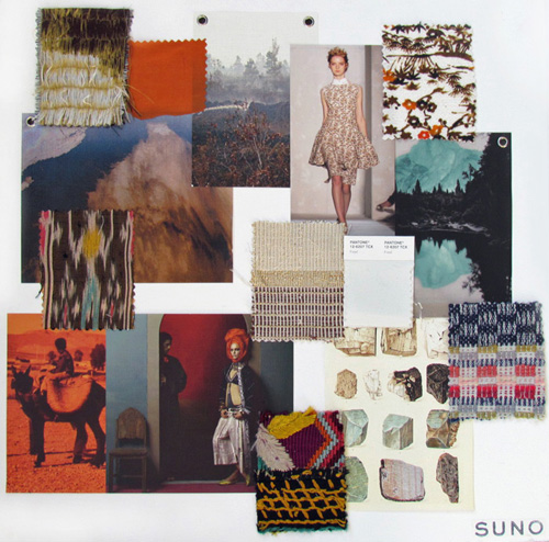
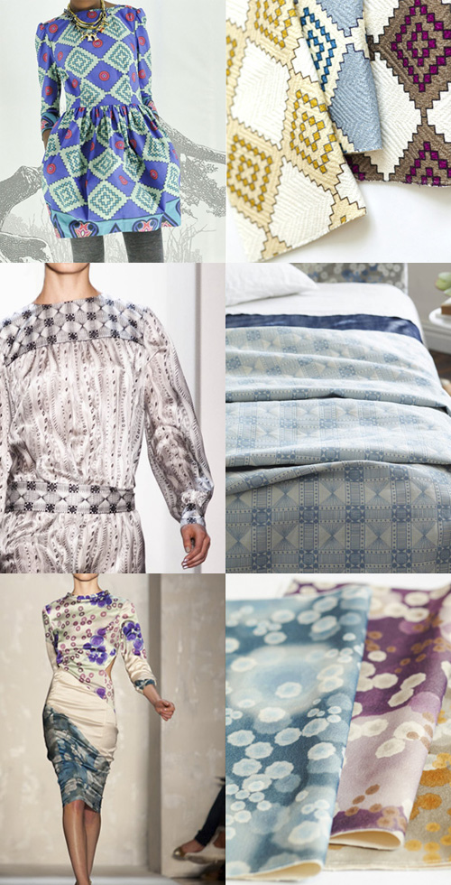
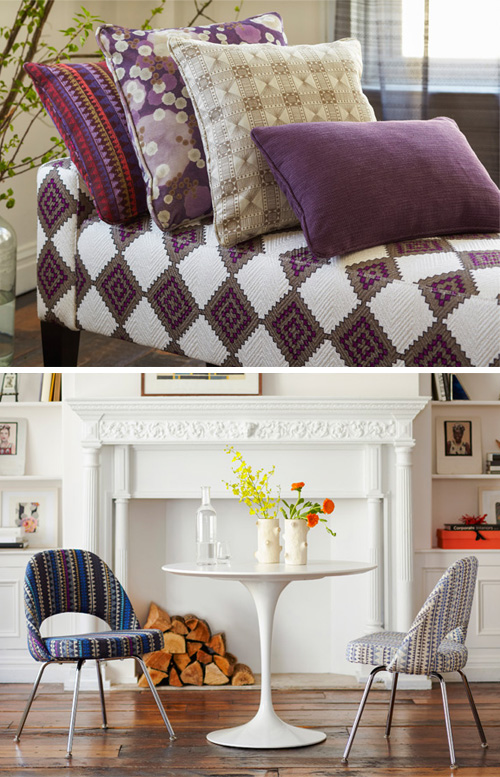
When I see partnerships like this, I get really excited. The product’s excellent, the vision makes sense, and the transition between mediums and industries is seamless…it almost makes me want to push more phenomenal fashion designers into the homegoods realm and champion brands to take a chance beyond their comfort zone.

Dorothy Cosonas of Knoll recently teamed up with Max Osterweis and Erin Beatty of SUNO, to produce a line of literal and abstract patterns for Knoll’s Luxe line. The patterns are sophisticated, delicate, literal, unique and rich with voice and global perspective. I’d love to outfit my apartment in the Piper, Arber and Beso fabrics. Which ones speak to you?


Photorealism & Engineered Placements


photorealism_morgancarper_marykatrantzou

No one’s complaining about the heat today. We all know it’ll be ending soon, and this last bit of summer is the perk of the season. The breezy nights, the refreshing jog at the end of the day, the back-to-school wardrobe consisting of  jackets, jeans and sandals…these swinging temperatures usher in Fall.

Which brings me to a textile trend that’s an interesting one. It can be difficult to assemble, but once you have your patterns and your placements down, it’s extremely cool in execution: photorealism and landscape textiles. Morgan Carper’s Fall Collection reflects her travels to California’s Big Lagoon, while Mary Katrantzou’s Resort Collection is a dichotomy of urban and country dwelling. Both have voyeuristic vibes and  surrealist moods. I’m very much a fan, what do you think?


Trends in Overlapping Textile Mediums


houseofmaryanne Louisa Crompton - Knitted Textile Designs2Louisa Crompton1epsteinrichterstearns

As artists, we’re often thrown for a loop and inspired to create our own interpretations from normal everyday oddities. On Pattern Pulp, we celebrate the thinkers and makers who combine, reference and refresh traditional mediums. Let’s have a look at a few works that straddle varying mediums and are tied together through vibrant, modular, unexpected overlap:

1. Maryanne Moodie and her woven tapestries. Like other instagrammers on the hunt for fresh work-in-progress, House of Maryanne‘s feed is a fabulous one, sharing asymmetrical tapestries, DIY classes and vintage clothing.

2. Louisa Crompton and her knitted textiles. Each design has a tetris vibe that celebrates modular graphics as 3D knits.

3. Robert Otto Epstein‘s vibrant colors, patterns and pain-staking details are digital, pixelated and asymmetrical.

4. Gerard Richter’s Tapestries, which we covered a few months back, where he converts paintings to woven works, breaking down each stroke into thread. In a similar but also radically different fashion, we mention Philip Stearns, who’s known for his blankets and tapestries inspired from lovely patterns formed from digital glitches.

The basic idea: “Transcode glitches in the cold, hard logic of digital circuits into soft, warm textiles.” When you think about the three, we have utilitarian textile patterns transformed into art, art transformed into tapestries and a fleeting digital moment captured forever in utilitarian tactile objects. What do you think of this trend?


Textiles: Water, Scales & Swimming


2girls_swim-pool1semenyak_meja_facade4fishmarket3boys_swim-sharks6trunks

For those basking in summer’s warmth, water, scales and swimming are on the mind. Today’s collage ties Bali’s textures together. We have graphic design chlorine fusions, triangular facades, tropical fish in the 2D and 3D, and abstract synchronized swimming. Happy weekend ahead!


Textiles & Art Gone Angular & Optic


1pieropassacantando_patternpulp2apieropassacantando_patternpulp3magasinmae_patternpulp4magasinmae_patternpulp

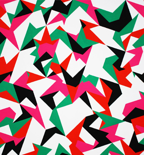
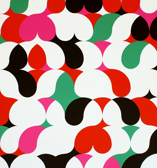
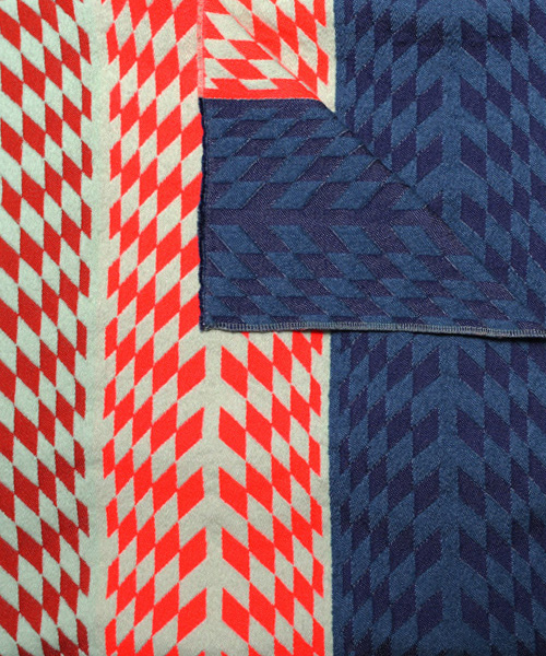
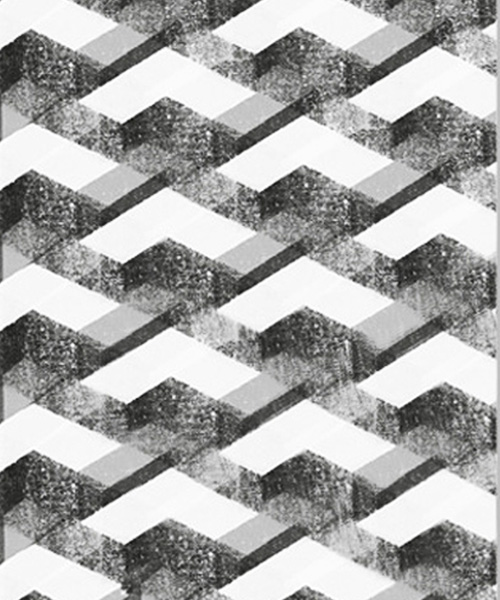
Paintings mimicing graphic design always have appeal (at least in our book). There’s a complication and prolonged execution that forces the viewer to appreciate the balance and contrast. From Piero Passacantando’s restricted palette in his RGMBW series to the printed textiles and homewares in Mae Engelgeer’s shop, the selections are just jarring and beautiful enough to remind us of geometry’s wonders.


Tracking Repetitive + Awesome.
On Instagram.