Pattern Pulp

Patterns & Posters from Project Projects


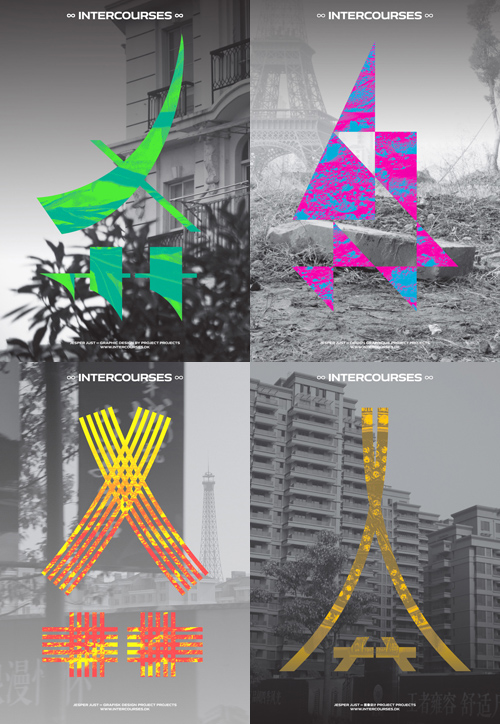
1projectproject_intercourses2projectproject_intercourses

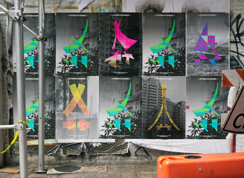
I’ve always been a wheat paste poster fanatic. I love the freshness in the graphic design, the fleeting nowness of pop culture and the way it merges into urban environments- usually a construction site or run-down corner. I love that it’s illegal, but not really, and that it keeps the general population in the know about current events beyond the internet. This collection, by Project Projects, caught my eye.

The graphic campaign centers around an invented symbol derived from the significant Chinese character, “Ei” — the first letter in the Chinese word for “Eiffel Tower,” and an ideogram often used in the phonetic transliteration of foreign (non-Chinese) names. Although it may appear Chinese to a Western viewer, the new symbol functions as a two-fold abstraction: a simulacrum and a fiction of the functioning of language.

Project Projects’ creative campaign is an extension of Intercourses, the Danish Pavilion’s five-channel video installation by artist Jesper Just for the 55th Venice Biennale. The pieces parallel ideas of doubling, dislocation, and the illusion of communication.
 

Manipulations in Advertising


2apatterns_manipulation_advertising1patterns_manipulation_advertising 3apatterns_manipulation_advertising 4patterns_manipulation_advertising

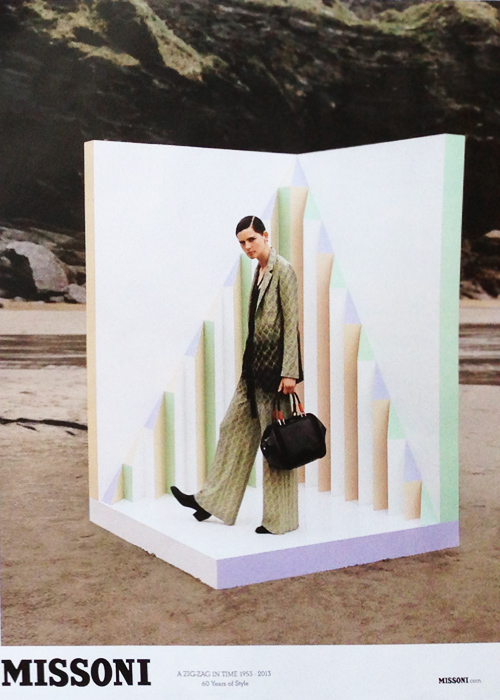
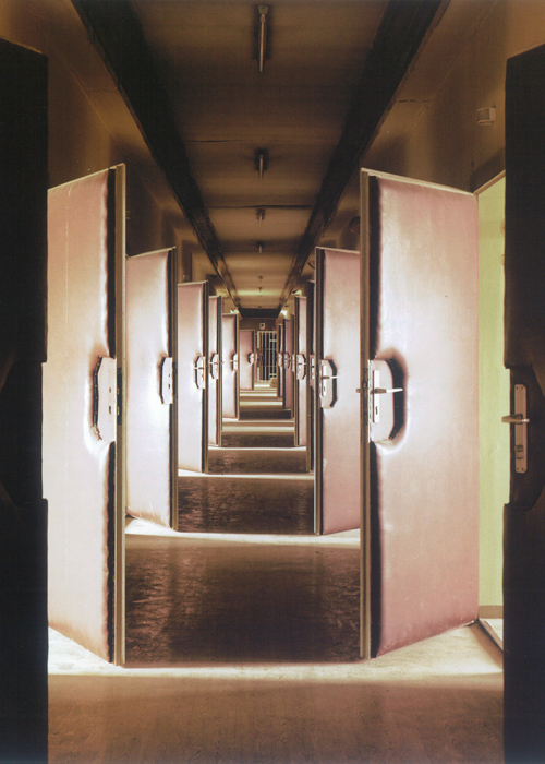
While flipping through British Vogue on my flight back to New York yesterday, the ads were plentiful. The September Issue’s out and prefall’s on display, along with rectangular manipulations and collaged scale. MAC’s amplification of the lash, Vivienne Westwood’s Gold Label as realized through white paint, long braids and lush leaves, and Missoni’s set within a set all play with scale, collage and perspective. If we were to make an art-related comparison, this print series is a visual tie back to Daniel & Geo Fuchs’ STASI – Secret Rooms featured in  Aperture Magazine (from a few years back). The comparison’s purely visual, though the idea of interrogation, memory and narrative are uncomfortable topics worth exploring that harness history, location and human indecency. Heavy topics to parallel print ads, but oddly relevant.


Bold Banners, Jay-Z, & Samsung


samsung_jayz_banner

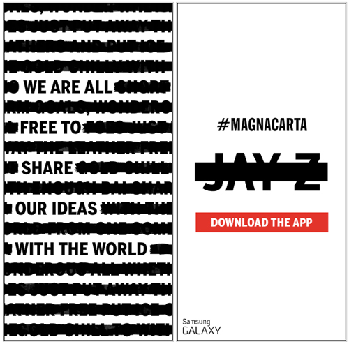
It’s rare when a banner catches your eye- they’re always a bit pesky and quite honestly, as a designer, they’re one of my least favorite items to create for clients. I’ll do everything I can to suggest other advertising methods before doing a banner-specific media buy. That said, this one, in particular, is interesting. It’s bold, it’s graphic, it’s minimal, and Samsung’s let Jay-Z and his latest album, Magna Carta Holy Grail, really shine. Rounding out a hefty social media campaign, this is one part of the puzzle preparing the world for Samsung’s Magna Carta app and Jay-Z’s July 4th release. Getting excited?


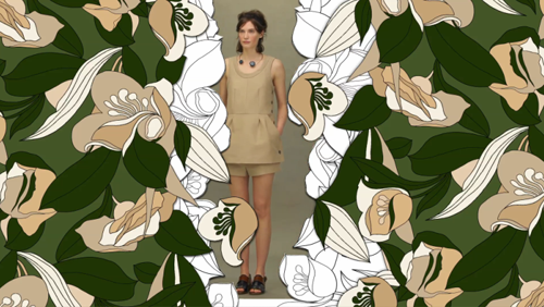
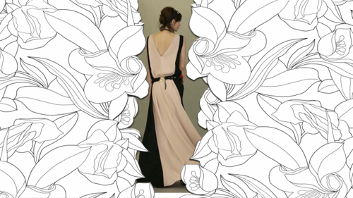
Flat & Floral with Marni


1Marni Resort 2Marni Resort 3Marni Resort 4Marni Resort

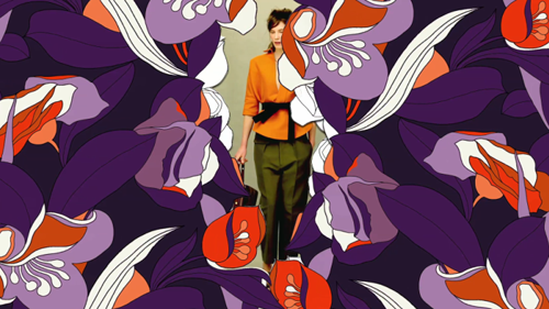
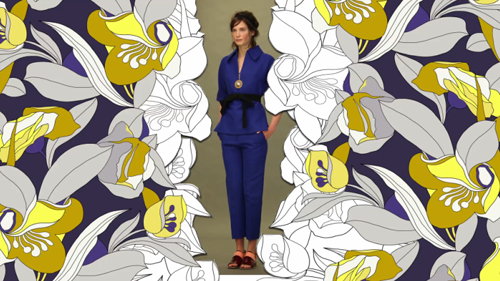
A few bold and beautiful palettes to illuminate this gray day in New York. Marni’s presenting their 2014 Evening and Resort collections with an artistic, flat video. Using floral vectors for a curtain, the edges are cloaked in busy stillness. The edges allow the viewer peer in ever so slightly, creating a secret garden effect. Here’s a link to the video, if you’re so inclined. What do you think?


Retail: Hanging Floral Displays


1pinterest.com:pin:234257618087805794:2anthropologie_hangingflowers3bisousciao_macarons_flower_window

The best retail displays are made meticulously with TLC. Today’s feature highlights the delicate beauty of hanging flowers. Inspired by the drying process, as illustrated in the first photo, flowers are elegant in all lives. Handmade in both instances, Anthropologie‘s paper tulips hang above their home department. Bisous Ciao‘s display, a love of labor by the owner and chef, Tanya Ngangan, is a gradual wave of layered papers. All very season appropriate, isn’t it?


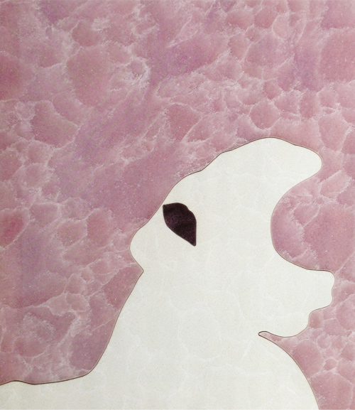
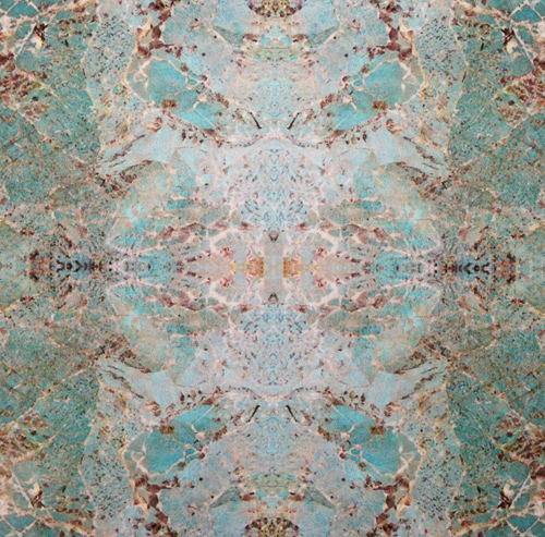
Trend: Marketing Natural Textures


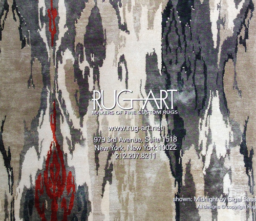
1natural_textures_caesarstone_supremo 2natural_textures_abcstone 3natural_textures_rugart

When advertising’s paired with texture, there’s a good chance our team will take note. This round up’s not overly clever, though the product focus is unmistakable. Using negative space and a contour profile, Ceasar Stone presents an elegant thoughtful message. Showcasing a simple swatch, ABC Stone and Rug Art share their wares. Are you a fan?


Tracking Repetitive + Awesome.
On Instagram.