Pattern Pulp

Patterned Safaris at DVF & Gap


1dvf_gap 2dvf_gap3dvf_gap

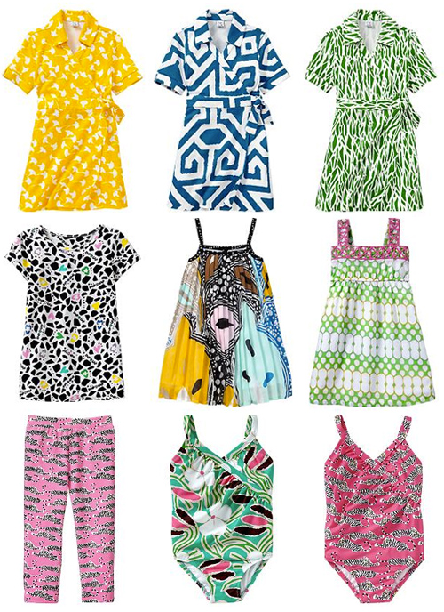
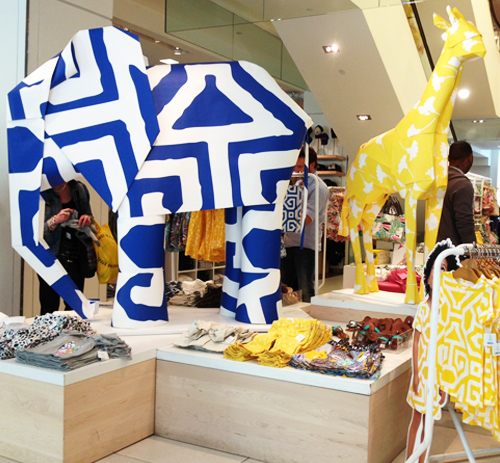
If you haven’t paid a recent visit to the Gap, we highly recommend it. Their latest collaboration with DVF is as bright and cheerful as the billboards suggest. The palettes have a playful sophistication and the clothing’s a mini replica of Furstenberg’s signature looks. In addition to the oversized giraffes and textured elephants, you’ll find dresses, onesies, stretch pants, raincoats, swimsuits, beach balls and footwear. The collection includes 50 items that are toddler to few year appropriate.


Around the Globe: The Hues of Holi


2holi_festival_patternpulpcolormerad1holi_festival_Polli_patternpulp

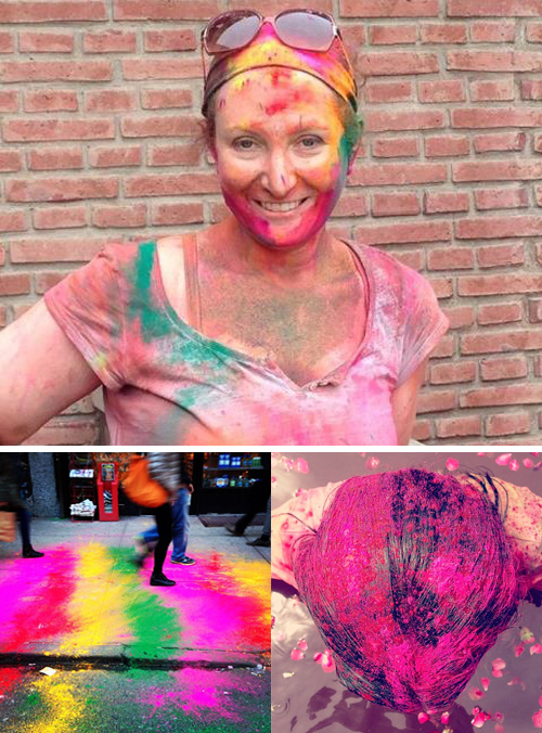
Today we’re linking hues round the world. First and foremost, March 27th marks the religious festival of Color, otherwise known as Holi. Gillie Nevel, a friend from childhood, posted this portrait to Facebook today, fresh from the festival in Jaipur. For a kid at heart, it looks amazing!

Of course instagram followed suit with rainbow colored NYC streets that seem to dually reflect this week’s Gay marriage vote (shot by Timothy Goodman). The hair shot is by Lauren Conrad.

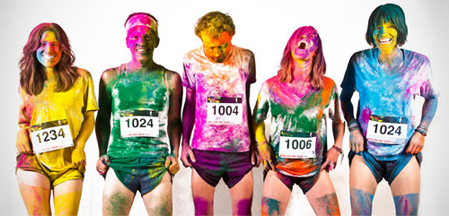
Then there’s the Color me Rad race. It’s an interesting translation of Western customs. A vibrant and messy fusion reminiscent of Burning Man culture.

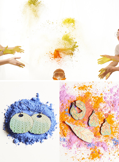
Bringing this full circle and reminding us of tasteful and creative ways to market yourself along w the global calendar, the Polli team recently produced their own Holi photoshoot from Australia. After testing dyed flour powdered paints, Polli used trampoline style propulsions along with a super fast pack to capture loads of frames per second.


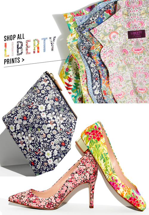
Liberty of London for J.Crew


liberty_jcrew

Over the past few years, J.Crew’s evolved into both a curator and a collaborator, partnering with international brands to create unique product. This strategy’s proven successful as they’ve given exposure to companies looking to break into new markets. The latest partnership’s a fun one, as they’ve teamed up with the folks at Liberty of London to create a floral story for spring. The patterns transcend generations, covering both children’s and womenswear. Compared to last year’s Nike collaboration, it’s great to see another step into the American market- it proves how malleable and timeless Liberty’s prints are. I love the zip pouch and bikini. Are you a fan?


Trend: Conversations in Cross-stitching


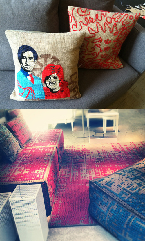
It’s an interesting phenomenon when DIY techniques are applied to luxury homegoods. You peruse the store thinking, my goodness, I could make that, then probably never do. The technical finesse and process behind what looked like a simple execution is rarely realized in the moment. Case in point: These clever burlap needlepoint pillows from ABC Carpet and this cross stitched living room set from Furniture Row on Greene Street.

This highly exaggerated design works well in other scenarios as well- particularly in retail display. I snapped this typographic lace signage during a trend trip to London last year while at the Converse store on Carnaby Street. Simple and ingenious, wouldn’t you say?


Cross-Pollinating your Gradients


Finding a connection between the digital and physical spheres is a never-ending hunt for today’s forecasters. Whether you’re comparing the symbolic differences between RGB or CMYK or simply finding inspiration in either execution, important observations can be made when considering how one medium influences the other.

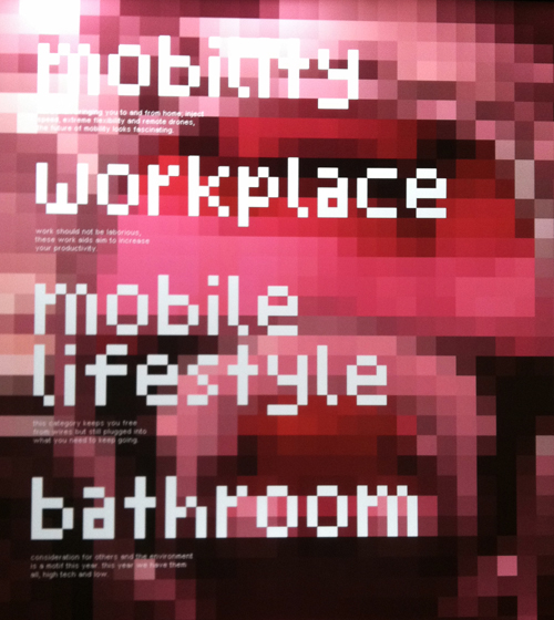
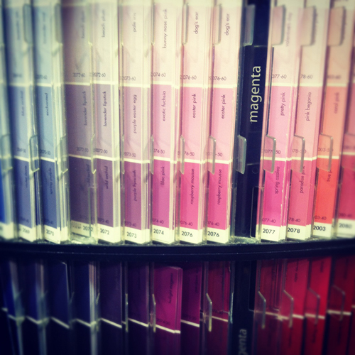
Here we have a pixelated display at the Red Dot Design Museum in Singapore. A blurry screen becomes textured art and the type conjures up early 90’s atari. If you follow our line of thinking and view Benjamin Moore’s paint chips immediately after, it’s easy to make a connection- they’re strikingly similar, but hold opposing conversations (and purposes).

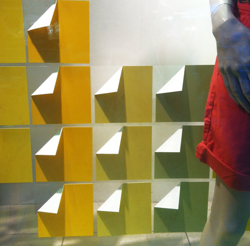
Now let’s move to the commercial realm. This is window display from the GAP on Fifth Avenue. It’s extremely economical- paper’s been folded and arranged in a grid. The gradient is the storyline and compliments the clothing.

Moving along to packaging, this method was recently the result of Sephora’s beauty collaboration with Pantone Universe. Pixels are again the focus. Mimicking the diversity within skin tones, the packaging amplifies the face and focuses on color, making us wonder if CMYK really wishes it were RGB.


Textures in Media from 2012


Nowadays, with all of our forms of media, we are constantly confronted with a barrage of images, sights and sounds. All of these combine to create the visual & societal texture that will come to define our time.

Here are some of the year’s most interesting textures in media:
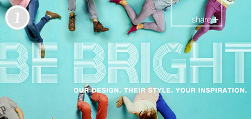
1. Gap & JCPenney’s bright ideas for Spring.

2. Die Antwoord & T by Alexander Wang collaborate for Spring ’12.
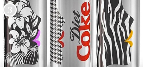
3. Diet Coke revamps their cans hoping to reach a fashion customer base.
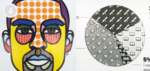
4. Investigating the increasing abundance of textures in advertising and infographics.
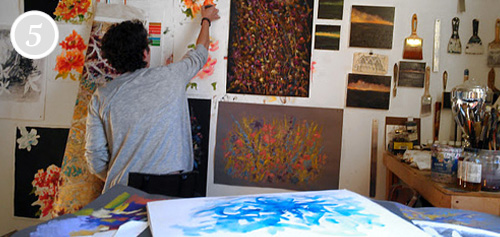
5. J. Crew’s walk-through of the process of painting and pattern-making for product and social content.
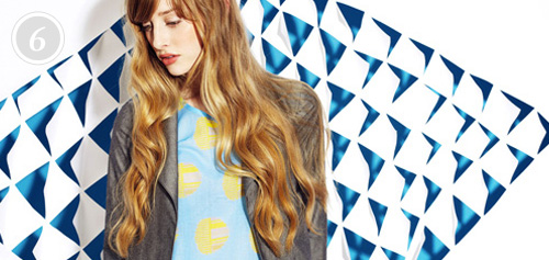
6. Hound Design & INDO’s inventive backdrops.

7. Ian Hall’s Patterns of Science presents a mashup of cultures through pattern.
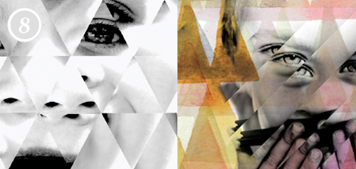
8. Watercolor and photoshop for clothing label Mimi & Maximus.
9. Does the ease of smart phone photography fuel or hinder our creativity?
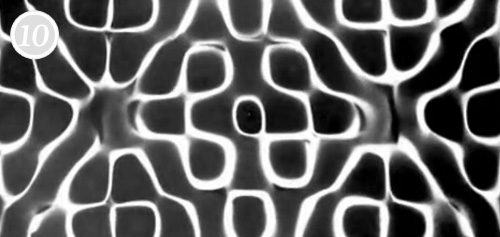
10. Meara O’Reilly uses cymatic effects to reflect the texture in sound through vibration in matter for Björk’s Biophilia world tour.

 

Tracking Repetitive + Awesome.
On Instagram.