Pattern Pulp

Janine Rewell x Minna Parikka


1minna parikka janine rewell

Today’s feature is what collaborative dreams are made of. If you haven’t yet watched the video, please go do that now:

Two incredible artists, Janine Rewell and Minna Parikka recently joined forces to create a campaign including body paint, shoes, graphic patterns and naked models. The result are show-stopping.


Skin Color, Marketing & Media


pantone skin huespantone skin hues3

I’m gonna keep this short today, as I injured my hand late last week and am still on the one-handed mend. I recently came across this creative project by Angelica Dass and was really drawn to it. It’s a gem of an exhibition, and when I first saw it, I thought it was from Pantone’s marketing team and was quite pleased to see an effort beyond branded merchandise.

Then, I realized it was an outside project. In the world of mug, makeup and fashion collaborations, this initiative speaks to the soul, touching the entire human race. Everyone’s skin color fits within Pantone’s classification system and the neutral portraiture is quite striking. If I worked at there, I’d get on the phone with Dass immediately and try to broker a collaboration.


A Kleenex & Mizrahi Collaboration


Kleenex_Mizrahi_PatternPulp

When’s the last time you were sick, and at the drugstore buying tissues? Did you opt for design over softness…or both? Whenever I’m restocking, I’m always annoyed at how loud the patterns are and entirely unsuited for my apartment. Then, I realize I’ve been standing in the aisle for an embarrassingly long time and just choose whatever’s softest and cheapest and dash for the cashier. I have to believe I’m not alone.

Here’s where Kleenex has amped up their visibility. They’ve partnered with Isaac Mizrahi in the hopes of adding a fashion touch to a clinical product. I’ll admit it’s a valiant attempt. While the patterns are still rather loud, (I’d love to see a subtler textured collection), the marketing video’s fun- a street Q&A, asking regular people if the patterns are from fashion or tissues. Have a watch– what do you think?


Trend: Allover Graphic Chaos


Peter-Pilotto-Target

Mary Katrantzou_gianvito rossi

loefflerrandall2

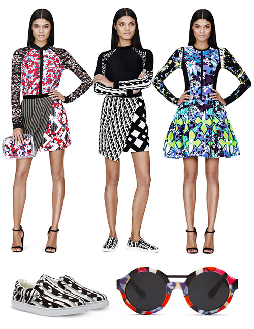
There are four brands in this mix- though it looks like one cohesive story. That folks, is a trend. At the top, we have Petter Pilotto’s fabulous new collection for Target. The prints seem a bit experimental for the Target customer, though, bright always sells, so it should be interesting to see who buys (beyond the city types).

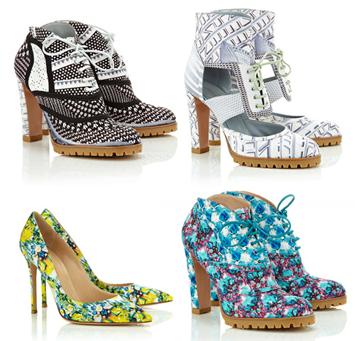
Then we have the most eccentric footwear collaboration by Mary Katrantzou and Gianvito Rossi. Simply amazing- the print collages are loud, and the styles remind me of J.Lo, but in a fresh way. Then, in a quieter, more pared down corner, there are these sophisticated beauties by Loeffler Randall. Crisp flats or boots for monochromatic fans. I might actually buy these, I like them so much.


Trend: Circular Styles


Circular Styles3circular spaces2

Circular motifs never get old. When history, science and creativity are hinged upon these forces, you realize why cyclical flow is a part of our daily vernacular. Much of the branding and styling I’m attracted to incorporates this concept, and you realize, over time, that it’s actually easy to reinvision a brand, packaging or any design for that matter, if the underlying direction has a timelessness to it.

From the mechanical curves of the Sonos logo to Dan Funderburgh’s recent illustration collaboration in the Manual for Speed, to ABC Carpet’s spiritual and nature-inspired retail merchandising to the graphic styling techniques in this Dazed and Confused spread, all overlap in relatable, defined ways.


Color, Conversation & Hanes Underwear


http://www.youtube.com/watch?v=gRJ9ko0nZmI

1color_marketing_hanes

2color_marketing_hanes 3color_marketing_hanes

Have you seen the latest Hanes spot? Chances are, maybe not, as the YouTube page has only 118 views. Parts of it are pretty cool, we’d recommend giving it a go. The concept reminds us a bit of Gap’s Be Bright campaign from a while back, but has clever synchronization and pattern mash-ups that transition human puzzles into cotton graphics.

Complimenting the TV spot, the social media component plays off of color, hoping to create chatter about an otherwise taboo topic. Would you tweet the color of your underwear? Hanes is hoping you will, by utilizing a Pinterest-like layout and pre-populated tweetable content, with a campaign entitled, What’s Your #undercovercolor? Have a look, play with the wheel, and let us know what you think…

 

Tracking Repetitive + Awesome.
On Instagram.