Pattern Pulp

Street Finds: Window Trends


2anthroanntaylor

Manhattan is home to some wonderful stores with even more magnificent window displays.  Designers often plan these fantastical arrangements months in advance, while visual teams work round the clock to get each window looking perfect, all in an attempt to lure customers off the street and into their stores.  While these displays double as public art for some, others follow these commercial relics quite religiously.  Here at Pattern Pulp, we’re fervent observers, and so we’ve begun photographing displays around the city, hoping to connect the dots whenever relevant themes and stories emerge.

And so, our first window round up:

Linear Stripes:

3gapanthrojcrew

One of the most notable trends this season appears to be the continued use of bold color.  Be it a clothing rainbow or carefully aligned fixture spectrum, stores like The Gap, Anthropologie and J.Crew are doing more with less to showcase their stock in the most budget savvy ways.

Flat Color:

1gapbendelkatespade1

Materials range from flat and printed (the norm) to tangible and tactile, as evident at The Gap, Henry Bendel and Kate Spade.

White Birds:

4levisbcbgkatespaperie

White birds keep popping up, evocative of the peaceful dove, oragami structures and, of course, the beach – it is summer time, after all. Pictured above, Levis, BCBG and Kate’s Paperie.

Found Objects:

5barneysanthro

6barneys

7anthrogucciprada

Found objects also reign supreme: hangers, bags, scraps of fabric – the very products being sold are being rendered as part of the “art,” as opposed to a blatant “here’s the shirt: buy me.” Pictured above, we have Barneys and Anthropologie, Gucci and Prada.

Warholian Photorealism:

8dieselfrenchconnection

We also love the Warholian photorealism of Diesel and French Connection – they seem to be tapping a trend that has continued to infiltrate a variety of markets.

Coverage by: Emily Gup
Fashion: Summer Screenshots


screens

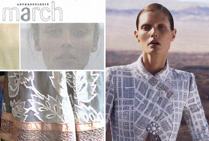
Nothing signifies the start of summer more than an exposed screen.  While spring has come and gone (or so it seems), screen-inspired imagery continues to pop up throughout the marketplace, revealing that moods often relax when temperatures rise. “Screens are good for your spirit, they allow you to smell summer while sitting inside your apartment,” says Michelle Lawson, a Greenpoint artist and resident.  From the textured cover art of Anthropologie’s March catalog to this sheer needle point skirt we spotted at Mojo last week, both applications signify human interaction with this stiff window barrier.  Moving past literal translations, this Chanel suit, which was photographed for Bergdorf Goodman’s summer catalog, glorifies the concept of the grid, proving that trends can inspire and transcend all price points.

matthewtischler

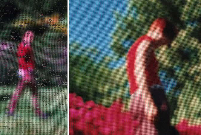
Matthew Tischler reveals the softer side of this fashion trend with his photography collection entitled, Screen Series.  Blurring reality with both wet and dry screens, his images are divided, pixelated, and filtered.  Subjects and figures are broken apart and reconstructed in such a way that they are both integrated into their environment and isolated within it.

Trend: Butterfly Beauties


butterfly-beauties

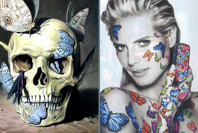
Pairing these two images side by side seems almost sacrilegious, however, we’d be fooling ourselves, and our readers, if we ignored the obvious artistic similarities between these paralleling layouts.  Butterflies signify many things, depending on what part of the world you come from.  In the image on the left (artist unknown), the colors are muted, though blue and bone read as vibrantly as the disturbing subject matter.  On the right, Heidi Klum, one of media’s (and fashion’s) most recognizable faces, endorses the LGRumor 2 phone, conveying that butterflies are an extension of her personality.  Regardless of the metamorphosis stage a butterfly (or a person, for that matter) is at, moods relaying youth, renewal, death and timelessnes can all be applied when considering this colorful, fluttering, insect.

Service: Microtrending with Pattern Pulp


microtrending_revman

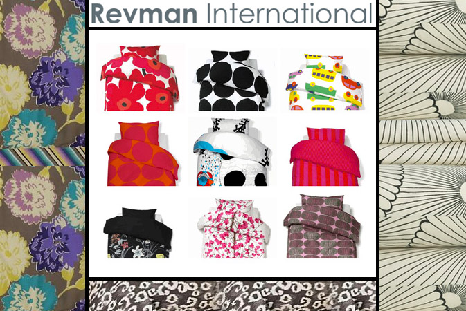
Pattern Pulp recently gave a microtrending presentation for the design team at Revman International.  Revman is a bedding manufacturer who licenses brands ranging from Marimekko and Steve Madden to Michael Kors and Tommy Bahama.  While we’re no stranger to the Home Department, it was a true pleasure to get out from behind the desk and share some of our latest findings.  It’s affirming to know that we can help designers and firms connect the dots from inspiration to commercial application.

Interested in a practical approach to dot-connecting? Contact us to have Pattern Pulp work with your team.

Interview: Dan Funderburgh


Dan Funderburgh

Every now and then you stumble upon work that is so creatively fascinating that it moves and inspires you.  Today we’re highlighting Dan Funderburgh, as his library of meticulous wallpaper falls into this awe-inspiring category.  Each of Funderburgh’s repeats draws upon historical references, be it Moorish mosaics, American op art, or simple tools humans use in everyday life.  Marrying commercial materials with modern day thought, Funderburgh’s art has seeped into several pockets of society, making significant waves throughout overlapping creative communities.  From 5Boro skateboards to the walls of Cooper-Hewitt’s Design Museum and the Miami’s Museum of Contemporary Art, Funderburgh continues to merge art, living and attitude.  Check out our Q+A for a glimpse into his daily routine.

*            *            *

PP: Do you have a daily routine for news/blog/information consumption?  What are your favorite publications?

DF: I start my day listening to public radio but usually glance over the NYTimes and BBC websites. As far as the bloggysphere there is far too much stuff to take in daily. I figure my friends will send me something if it’s really important. I do like my friend Kelly’s blog, Nothing is New.

And of course Arkitip and 12oz. where kindred spirits Cody Hudson, Grotesk, Ryan Geezer, and The Chinatown Soccer Club post.

PP: How did you discover your talent and how has it evolved over your career?

DF: I don’t know so much about a talent, but I discovered I have an acute appreciation for intricate ornamental arts about the same time that I discovered I have a limited patience for non creative corporate logo re-sizing. So I quit my job and tried to make my way as a wallpaper maker and artist.

PP:  Do you discuss your work with other designers?  If so, how does that impact your creation process?

DF:  All the time! Not too many other wallpaper designers, but I’m surrounded by smart artists and designers and photographers that help me tremendously. Not so much on the minutia of a specific piece, but more for larger questions about direction and concept.

PP: Where do you usually work on your patterns and what is your preferred method of creation + execution?

DF: Usually rough sketches in pencil and then redrawn from scratch in the computer. I try to always be open to other options –> painting and photography in case the idea calls for it.

PP:  When is the last time you took a professional/creative risk?

DF: Too long ago. It’s probably time I should take some more.

PP:  Do you incorporate commercial trends into your work and if so, is this a factor that drives your design?

DF: Of course not ! That was a trick question. I suppose a few years perspective will be the judge of whether I’m apart from the flock or just fooling myself.

Trend: Well-Dealt Hands


Playing Cards

The ubiquitous playing card is now being used for more than just playing games.

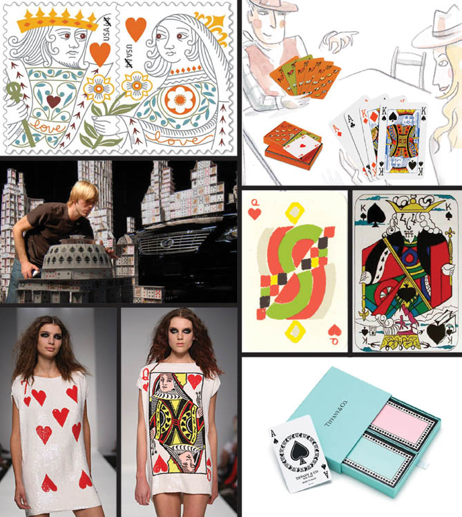
The U.S. Postal Service has just issued a new stamp in their popular Love series inspired by the king and queen of hearts from the 18th century French archives, the same cards that are the source for the recognizable 52 card deck that we know today.  Commercializing the game even more, Bryan Berg, the Guinness world record holder for card-stacking, is featured in this remarkable promotion video for the Lexus quiet ES model.  Bringing the deck to life, London fashion designer, Ashish Gupta’s Spring/Summer 2009 Americana collection includes sequined dresses reminiscent of Alice and Wonderland.

In the art world, playing cards have continued to be a source of inspiration. The geometric abstractionist, Sonia Delaunay designed her Simultane deck in 1964, while Salvador Dali had his own surrealist take with a series of lithographs completed in 1972.  Bringing this everyday pleasure into the luxury realm, Tiffany & Co., Kate Spade, Vivienne Westwood and Hermes have all placed their design stamp—and a price tag—on decks for the modern and upscale home.

By: Karen Maineti

Tracking Repetitive + Awesome.
On Instagram.