Pattern Pulp

Trend: Painterly Paths


bmw-expressionofjoy

“Not all artists are depressed,” is quite possibly be best tag line we’ve heard in a while. BMW’s latest Z4 campaign, Expression of Joy, has recently rolled out across several platforms, attempting to reach affluent customers of all of ages and interests.  BMW’s roadster has always been synonymous with intelligent design and has collaborated with select artists in the past to express this priority. Using GSD&M Idea City as their creative backbone, BMW has opted to jump into the driver seat this time around and let their product become the paintbrush, “While the original idea was to use the car to create artwork, over time, our thinking evolved from the final product to the process,” says David Matathia, VP and Idea Team Director at GSD&M Idea City. The results are both stunning and effective, as this vibrant spot translates seamlessly across all media platforms- be it print, tv, web, mobile or on premise entertainment.

tiretracks2

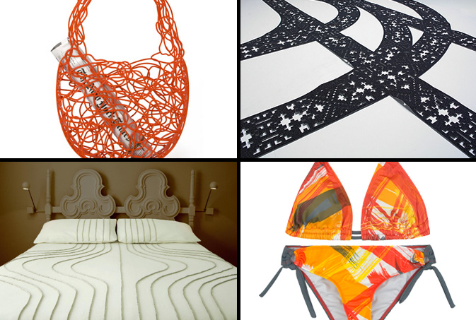
In an effort to embrace the concept, Expression of Joy, we decided to explore a few other products that inspire controlled chaos and negative space.  This Corallo Bag, a current feature on MoMA’s retail website, is an elegant, non-ending doodle that’s a durable alternative to the plastic throwaway.  Moving in a more literal direction, Hudson-Powell‘s patterned rug mimics tire tracks in the snow. Emulating tracks of another sort, Walter Onion’s wool and linen bed spreads are a minimalist and high-end interpretation of this trend.  This painterly Hurley bikini looks as if the roadster rolled over it while creating its 240 yard masterpiece.

Additional Contributions by Emily Gup.

Trend: Pixel Mashing


burton-bloomingdales

Photography and graphic design have become so interconnected in today’s marketplace that one medium rarely exists without the other.  Websites like ffffound and qbn showcase the best and the brightest, overshadowing what many print monthlies used to accomplish.  By offering a 24/7 stream of creative inspiration, designers and critics alike have been able to familiarize themselves with what’s current.  This photo, taken by Bueller Designs in LA, displays a cluster of translucent dots that are a result water and light.  By merely adding saturation and a grid, brands like Burton and Bloomingdales prove that the transition from natural beauty to commercial glam can be a quick (and profitable) one.

Typographic Story Telling


visa-2

Visa’s most recent advertising campaign is the company’s first stab at going global. Who would have though it would’ve taken this long to send a singular message under one corporate umbrella?  Merging lifestyle concepts with playful typography, each go spot taps a local audience, incorporating pattern-appropriate themes. Interestingly, the international commercial, Gofesto weaves several adventurous concepts throughout a one minute reel, taking their viewer on a Visa inspired journey.  The thirty second American spot, entitled Aquarium, simplifies this journey with the use of emotion and special effects.  Though the reel has a beautiful kaleidoscope theme throughout, we wonder if the Disney formula was applied, as this spot seems much like a summer tralier.

visa3

All of these concepts (in addition to a few others) were executed by Chiat Day and can be found on Visa’s corporate website.

Interview: Gerard Gang


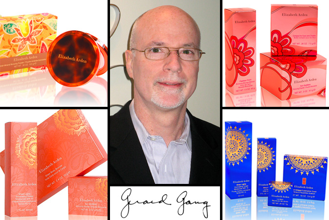
gerard-gang21

Pattern Pulp has had the pleasure of collaborating with Gerard Gang and the team at Lukasiewicz Design for the past three years.  Gang’s creative vision and design aesthetic is as experimental as it is polished.  Combining inspirational patterns and varied printing techniques, Gang has excelled at creating innovative packaging solutions for his fragrance and cosmetic clients for over twenty five years. When designing seasonal updates for mega brands, there’s a lot on the line and Gang hones in on relevant trends, commercializing them with true sophistication. Check out our Q+A for a glimpse into Gang’s creative process and how he stays ahead of the curve.

*            *            *

PP:  What websites do you generally start your day with-do you have a daily routine for news/blog/information consumption?

GG: I am a more traditional researcher. My consumption of information generally is not under a daily routine of surfing the internet. Most of my research is done through textile houses, Crate and Barrel, Grain Edit, Fashion Trends Letter and Shutterstock. I am a big periodical browser. Finding insight through magazines like Traditional Home, House Beautiful, Martha Stewart and Country Living. These sources allow me to hold it in my hand and find inspiration in a more tactile way.

PP: How did you discover your talent and how has it evolved over your career?

GG: I have always been interested in fashion, patterns and textures. In my early teens, I worked on a farm. There, I developed an eye for color and textures. Nature has a way of guiding us; teaching the basics of color, shape and texture. Once working in the graphic profession after college, my interest in patterns continued to develop. Patterns are a way of life – look at stones along a shore/bricks along a path/materials woven into a bird’s nest. We are surrounded by patterns, forming their own source of inspiration.

PP:  Please explain your design process when approaching new projects and pitches.

GG: Within moments of a new project my mind begins to whirl. Thoughts and visual memories take me off on a path. I keep a large volume of sourced materials. Anything that has caught my eye, combinations of color, patterns, dresses, jewelry and flowers, are torn out and gathered into binders. This is the time I also reach out to the internet, gathering additional reference to create the designs.

PP: Where do you usually work on your patterns and what is your preferred method of creation + execution?

GG: I am “old world” in using a pen, cutting and splicing art and drawing to put my thoughts together. There is a wonderful patina that is created using this method which the computer cannot achieve. The computer is a powerful tool once the initial idea is in place. I think back to the days of creating patterns by hand. Endless drawing, photo- stating and piecing to create a pattern or art. Then days to separate it by hand for production.

PP:   When is the last time you took a professional/creative risk? Please explain.

GG: Each day is a risk. We should always challenge ourselves. One should always look for the idea to push things over the top.

PP:   How do you incorporate commercial trends into your work and is this a factor that drives your design?

GG: Trends in the fragrance/cosmetic industry are vital resources. The goal is to create the trend and for others to follow. The periodicals, internet sources, catalogues and the fashion world give me the insight to work with trends. It is a personal flair which combines these two worlds.


Trend: Teal Appeal


green-black

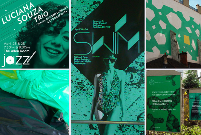
The print world is finally catching up to the runway.  Over the past few weeks, Pattern Pulp has been noticing a wave of teal-doused signage throughout various marketing campaigns and street murals. The choice of teal is a smart one, as it signifies winter’s end, linking lighter moods to summertime anticipation.  The design teams behind Luciana Souza’s jazz posters, American Apparel’s swimwear campaign and the new Rockefeller University Posters all utilize color to communicate their message.  At Pattern Pulp, we find it refreshing to see texture, photography and vector art all merged by the simplistic uniformity of a single pantone besides white.

Additional contributions by Emily Gup.

Trend: Bottling Sustainability


randy-polumbo

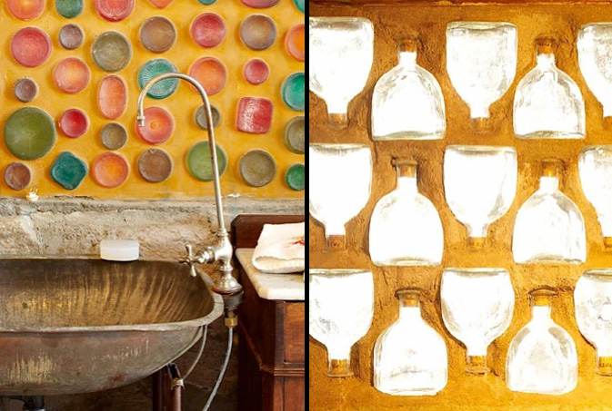
Artists throughout time have always been inventive with the objects around them, continually searching for beauty in most unusual places. Similarly, marketing teams and packaging gurus are continually on the hunt for new inspiration, hoping to design appropriately for the future.  Though the motives often differ, the end results are generally similar.  Artist Randy Polumbo of Joshua Tree, CA has always been passionate about using found objects to create art and was recently highlighted in the New York Times about his life long architectural endeavors. “I had very specific rules, to use nothing new except steel — it’s already a recycled material and no paint and no Sheetrock,” rules that laid the groundwork for creative explosions.  Inside there are embedded tequila, wine and soda bottles in the wall, a flashlight chandelier and countless other treasures that most anyone would agree, is quite striking.

stuarthaygarth1

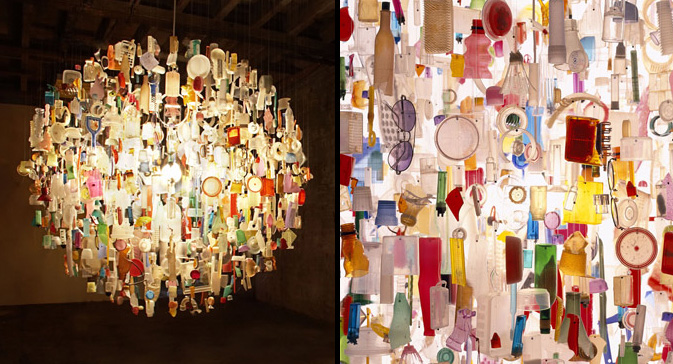
Lighting designer Stuart Haygarth creates beautiful pieces from man-made debris, breathing life into objects that would otherwise be tossed away.  His “Tide” chandeliers are literally created from washed up trash found upon the Kent coastline.

costaverdehotel

Looking for an eco-friendly kitsch vacation stay?  Look no further than the Costa Verde Hotel in Costa Rica, recently featured on Inhabitat.  A salvaged boeing 727 jet from San Jose was transported piece by piece through the jungle where it was then reassembled onto a 50 ft. pedestal and now doubles as a hotel.  No matter the size, sustainable methods for living can be applied to products of all shapes and sizes, proving that creativity paired with determination can lead practical, inventive, and beautiful solutions.

Additional reporting by Emily Gup.

Tracking Repetitive + Awesome.
On Instagram.