Pattern Pulp

Digital: Info Media Clouds


Nearly every designer is tasked with making a media cloud at least once their career. Today, as I was walking to Chelsea Market, I passed by this Blackberry bbm advert in the Meat Packing District. Using overlapping bubbles to simulate chatter and create a typographic headline, the casual language seemed to be the true draw. Everyone wants to feel like they’re peering into something secretive and this ad does a good job reminding us that only our bff’s deserve bbm. This ad draws a strong parallel to this music window in the Ginza district of Tokyo. While neither design is overly refined, it’s interesting to see the eastern and western approach is (unpredictably) in sync.

Ray Ban: Never Hide Campaign


What’s the first thing that comes to mind when viewing the latest rare prints collection from Ray Ban? My gut response channels a modern day Garbage Pail Kid set, only PG and without the creative titling. That being said, Ray Ban’s Never Hide campaign is an amazing example of how patterns can be incorporated into a high visibility ad campaign. Matt W. Moore, a Pattern Pulp favorite was tapped to design the limited edition shades and joins a talented roster of artists for the bold and colorful round up.

Follow-up: The Spherical Formula


Every few months a new circular pattern makes it’s debut on our site. It’s impossible to ignore the force that is the target and the power it has to draw you in. Back in October, circles appeared throughout multiple product categories, popping up in the most unexpected of places. This season however, color, transparency and the all-important bulls eye are being used to engage, entertain and educate. Lexus has gotten technical with info graphics in their portrayal of hybrid horsepower. Combining circular motion with photography, the creative team at Dazed and Confused has chosen an alternate route for their Gucci spread. Regardless of subject, medium or message, the pinwheel can bring focus to any layout.

Interview: Flavio Melchiorre


“All that I see stays in my mind waiting to be unearthed during the creative process,” explains Italian artist, Flavio Melchiorre. When you get lost in Melchiorre’s mesmerizing patterns you certainly see what he means. His colorful designs draw from all elements of everyday life, particularly street art.  Seeing his bold designs, you can easily imagine him walking by a splash of graffiti and filing it in his mind for years before it manifests into works such as Tips’ n Trips, Wild Things, or his recent iPhone skin for Grove. Check out our Q & A with this colorful Italian.

*            *            *

PP:  How does your culture influence your design aesthetic?

FM: I would say naturally, everything that I live can influence my work. I have a great photographic memory and all that I see stays in my mind waiting to be unearthed during the creative process.

PP:  What recent project are you most proud of?

FM: A new project that I can’t show now, made for a Spanish company, which has chosen some of my patterns to characterize some of their products. The work is still in progress, but there are good developments.

PP:  What are some of your biggest influences? Any particular artists or websites that inspire you lately?

FM: Mainly, Street Art and Pop Art. These two cultures have influenced my style, even if the abstract expressionism has been the key element in my personal research. I love the work of Keith Haring and Jackson Pollock. I also appreciate the work of some contemporary artists like Gary Fernandez, Alex Trochut and Si Scott.

PP:  What is your typical design process like?

FM: When I make my pattern, first I try to get carried instinctively drawing randomly, then I take a long time to create modular and color combinations. When I make figurative illustrations instead usually I know what I want to express, so I try to follow an idea even if I go very often to improve it during its development.

PP:  How do color and pattern affect your work?

FM: I’ve always been attracted by patterns; they give me a sense of balance. I like to create a visual harmony using many colors together; each element develops in something more complex. When I draw I find my balance!

PP:  What kinds of projects are you hoping to do in the future?

FM: I have many projects, from art to fashion. I’d like to draw an entire fabrics collection for haute couture, and then see my patterns on wonderful women covered in silk on a catwalk. I would also like to make a solo exhibition with huge artworks, and to watch people get lost in them!

Coverage by: Rebecca Silver

Trend: Aquatic Manipulations


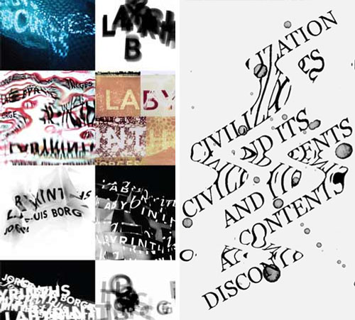
Typographic manipulations will always be current. Whether they’re spliced to create depth, formulate shapes or devise witty statements, language is a consistent filler when it comes to graphic design. Add a touch of surrealism and you have fantastic fluid nonsensical works of art. Anna Jordan’s in depth study of Jorge Luis Borges’s literary poems and writings serve as the baseline inspiration for this visual trend. Borges’ vast array of work became known for it’s “irreality” and existentialist undertones during the late 1880’s and Jordan reinterprets this using typographic jigsaw puzzles that are crisp, fluid and smudged. Using a similarly aquatic technique, Triboro Design, the combined genius of husband and wife, David Heasty and Stefanie Weigler, also incorporate surrealist themes. Combining crisp edges with nature-inspired textures is a true reminder that everything’s cyclical.

Tracking Repetitive + Awesome.
On Instagram.