Pattern Pulp

Austin: SXSW 2010


I’m pretty psyched that everyone around me- boyfriend, friends and colleagues included finally convinced me to make the trip to Austin this year for SXSW Interactive. The next few days have extraordinary media line ups and I’m looking forward to listening to speakers and meeting with some of the best content creators  in the industry. Idea sharing will be at an all time high and I’m sure the energy will be felt via thousands of twitter feeds. If you’re in Austin, send a virtual hello, as I’d love to meet up.

Street Finds: Geometric Graffiti Mash-Ups


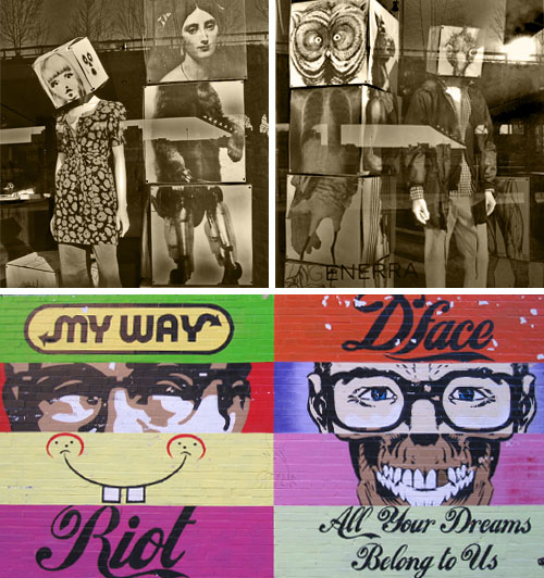
I spent some time walking round the meat packing district today while waiting for my laptop to be maintenanced at the 14th St. Apple Store. Though I’ve seen D*Face‘s mural close to a thousand times, it’s relevancy was elevated after noticing Generra‘s storefront. Black and white blocks stacked together comprised of Flora and Fauna were a complete parallel to D*Face’s baseline concept.  Both compositions are beautifully designed, interesting to dissect and provide social and political commentary of our current global climate. Whichever brand of culture you choose to identify with- be it historical, branded or generic, these geometric “quilts” are a thoughtful reflection of current creative styles, not to mention an interesting window into a now popularized counter-culture.

Follow-up: Carrying Patterned Protection


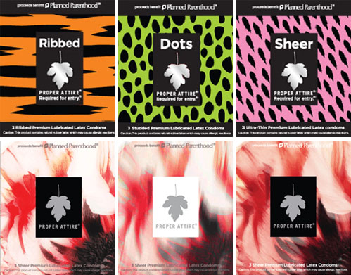
Celebrity collaborations are nothing new. When a product gets a nod from a famous face, we all know that sales will likely soar. A year ago, I featured Proper Attire, Planned Parenthood’s latest campaign, addressing the issue of unwanted pregnancies and sexually transmitted diseases among 18-25 year olds. The program has been a success and a phenomenal example of how decorative rebranding can reinvent the message of an everyday product. Most recently, Jeremy Scott and Brian Reyes have joined the cause to share their creative visions. Scott’s Flintstone-esque brights are electric, graphic and Gaga-approved, while Reyes’ designs tap an ethereal nature-inspired look and feel. Two designs for two different girls, all for betterment and health of society, it doesn’t get much better than this.

Follow-up: Spin It, Web Cam Style


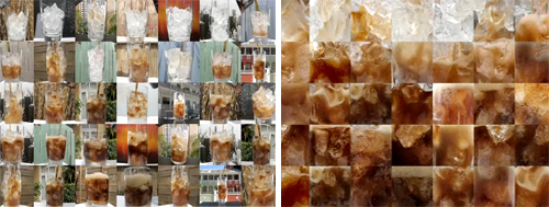
Oh, the proverbial question: Which came first, the chicken or the egg? The debate can go around and around. Much like the debates of who inspired whom, what inspired what, and where on earth do ideas come from. And of course, how do they become adopted by society and wind up as trends.

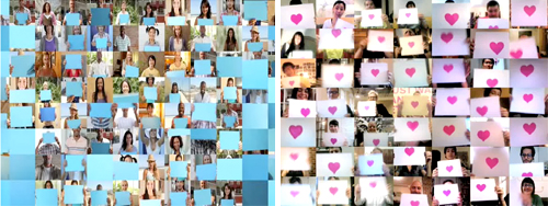
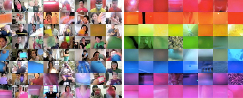
Because, we think we called it via our Interior Design Takes a Spin feature: people, they like change. They also like pixels. And in this case, web cams. We recently spotted Pepsi’s Refresh Project, One People tv spot, where a variety of people on their web cams interact with one another. Each paper conveys a pixelated vibe, and as objects are “magically” passed between squares, the concept is unified as global sharing. Naturally, we delighted at the synchronicity to our fun interior finds. Of course, in that ad’s comment section, we were then led to the Japanese band, Sour’s music video, Hibi no neiro” which has a very, very similar idea and was posted in July before Pepsi’s ad was released.

It’s speculated that Pepsi was heavily inspired by Sour’s music video which involves using the band’s fans in a fun series of web cam adventures. It’s not impossible to find other videos using a similar concept, though not necessarily as well executed as these two. In fact, watching these videos sparked the thought of another web sensation, Chat Roulette, where anyone can log online and through their web cam talk to people from around the world. They can switch to someone else quickly just by pressing a button. It’s Spinning It: People Style.  Maybe they’re all inspired by our increasing hunger for the new and the next, the impatience it inspires, and our desire for change. Now.

Coverage by: Emily Gup

Interview: Matt W. Moore


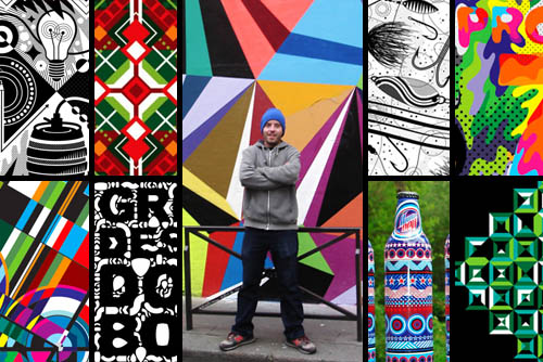
It’s no secret that Matt W. Moore’s vectorfunk graphics are single-handedly influencing an entire generation of artists. His fusion of graffiti, graphic design and watercolor are upbeat, intricate and extremely brand friendly. His work has appeared in countless magazines and print campaigns, from Nike and Burton to Wired and Mountain Dew. Moore’s Design and Illustration studio, MWM Graphics, is based in Portland, Maine and exhibits in galleries throughout the world, collaborating with clients from all sectors. Moore is also Co-Founder & Designer for Glyph Cue Clothing. Check out our Q+A for a glimpse into MWM’s daily routine!

*            *            *

PP:  What websites and news sources do you generally start your day with-do you have a daily routine for news/blog/information consumption?

MWM: I get at least an hour a day of Cyber Surfing in while I enjoy my morning coffee. Some of the websites I frequent:

PSFK
Format Magazine
FFFFOUND
Not Cot
Rojo Magazine
The KDU
Hype Beast

The list goes on. More and more lately, I find myself skimming my carefully curated list of Twits on Twitter. Less time scouring blogs, and more time surfing suggested links.

PP:  How did you discover your talent and how has it evolved over your creative career?

MWM: I’m not comfortable with the term “discover” when referring to talent. I’ve worked damn hard, and I have boxes full of sub-par art and design from my past to prove it. I prefer to think of it more as “nurturing” my vision and dreams. Hard work pays off. As for “evolution”, it is a constant evolution. Everything is always in flux. New ideas, new techniques, new knowledge, new dreams. This is why it is so exciting to be an artist and work as a creative. Everyday is a new adventure!

PP: Please explain your design process when approaching a new concept or product line.

MWM: My process is different for every single project, but a few things are constant. It always starts out with a dialog to make sure I understand the client’s objectives and vision. Then we draft a brief and timeline together. Then I do an exploration phase yielding multiple options. We review and open a new dialog. Then I continue working and refine, finesse, and finalize the design.

PP: What is your preferred method of design and how is it incorporated in your final product? (ie. collage, computer, handwork, etc.)

MWM: The majority of my commercial design work and apparel/textile/product graphics are created entirely with vectors in Adobe Illustrator. Some days I spend over 12 hours lost in this Vectorfunk World. It is my playground.

PP: When is the last time you took a professional/creative risk? Please explain.

MWM: Every single creative decision an artist makes should be a “risk”. If they aren’t taking risks, they are not an Artist, they are a Tradesperson. That said, a couple recent risky decisions that come to mind for me are: Launching my clothing company Glyph Cue during the Great Recession. Yikes! And last month I traveled to Paris for a month long residency at Since.Upian Gallery. I arrived with no artwork, no supplies, no sketches, no firm ideas for the new series of canvases. And my Exhibition was only 25 days away. Pressure makes diamonds!

Trend: The Power of Three


When it comes to social thought, the number 3 holds mystical powers. Be it positive or negative symbolism, it’s nothing new to watch humans get worked up over this symmetrical digit. Over the past year, many people have been forced to reevaluate their priorities. In doing so, basic principles have been challenged, causing many to revisit their decision making process, not two but three or more times. Unsurprisingly, the creative community has reacted with stark and compelling imagery, representative of this repetitive and sometimes obsessive nature.

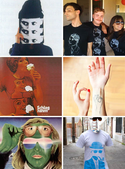
From this autumn ’09 spread in Theme Magazine, highlighting the Perks and Mini cultural movement of the ’80s and ’90s to this retro German ice cream ad conjuring up Playboy imagery, to this illusionary sunglass shot from Justin Blyth’s photo blog, Them Thangs, all of these archival images have recently resurfaced and inspired a new wash of designs over the past year.

These black and white portrait illustrations capture one of pop culture’s rising fashion stylists, Amy Stearley, proving the taste makers are on board and running with this trend. Using crisp photography to illustrate Sylvia Farago’s tattoo art, The Selby captures his subject, combining 2D and 3D story lines. Bringing this concept full circle, Philip Tseng‘s t-shirt design, The Invisible Gentleman for Threadless.com proves one doesn’t only look back, but looks back and then re-configures the situation or scene. Like today, innovation comes in reconsideration and re-evaluation.

By: Shayna Kulik & Kelsey-Lee LeGassick

Tracking Repetitive + Awesome.
On Instagram.