Pattern Pulp

How to Frame Your Art


Who else has a mounting pile of art that needs framing? When you invest in pieces you love, be it originals, prints or even the $6 poster, it’s important to house them in a way that will preserve and protect over time. Over the years, I’ve dabbled in matte cutting, basic wooden frame construction, buying online, straight from the store and of course with custom.

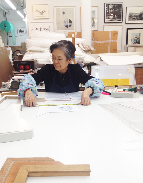
Last weekend, I decided to give eight pieces their wings, so to speak, and bring them to my local framer, Mrs. Lim of AZ Art Framing, pictured above. She’s remarkable. After spending two hours together brainstorming the best creative and affordable options, she walked me through her frame building and conservation process. She’s worked on Greenwich Street in Tribeca for over 30 years and continues to frame everything from street art to original Warhols.

Here she’s measuring out a sweet little water color painted by Dale Smith, the in-house illustrator at Steven Alan. He’s one of my favorite local artists. I figured this post would be most useful if I shared a few different frame and matte styles to consider when  taking the plunge. While I’m still waiting to get my works back from Mrs. Lim, the collection below is an assortment of techniques I’ve made, used and accumulated over the years.
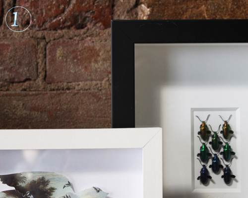
1. Shadow Box Framing: The left is a white wooden painted frame with a delicate centered  bird cutout. The right is a standard plastic/synthetic with a glued double matte for dramatic effect.
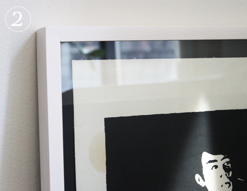
2. Light Frame, Black Matte: Both the art and the frame job came from The Poster Museum on Chambers Street in Manhattan (highly recommend as well). The frame is on the thinner side and has a reddish gray tone.
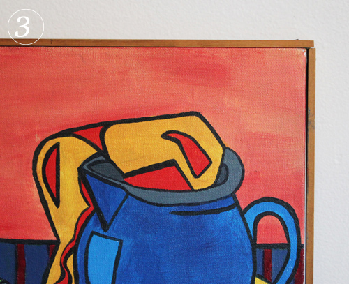
3. Wooden Frame and Canvas: In college I was invited to display a few of my paintings in a show and needed them framed that week. Aside from the unrealistic deadline, I had no money to get it done professionally, so I went to the local art store and bought wood strips, stainer and nails. Very DIY and still happy with the results.
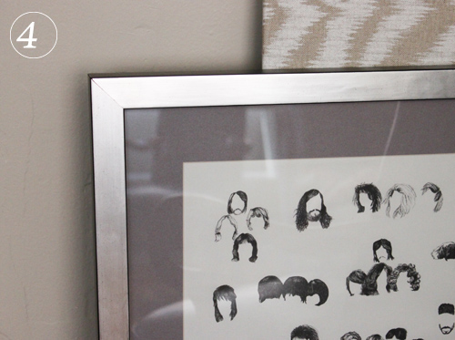
4. Monochromatic & Tonal: Here’s an example where I went sort of crazy and spent loads more on the frame than the art (I’m sure a few of you have done the same, right?) This was a $6 poster from London and I love it. I put it in a slightly textured cool metallic frame alongside a warm gray matte. I had it done at 567 Framing on 14th St.
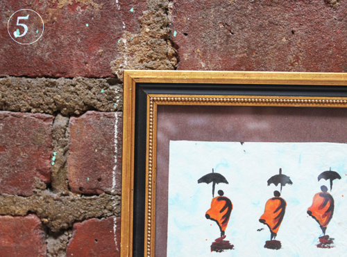
5. Classic & Ornate: I really wanted this Lao watercolor to sit in classic textured frame and luckily found this preassembled affordable gem at New York Central Framing Annex on 3rd Ave.
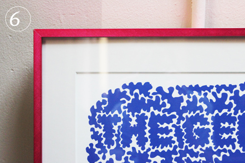
6. Colorful Metals: This is one of the first prints I ever bought and the first frame job I ever invested in. It’s a playful typographic maze and needed something similarly fun around it. The matte’s a grayish white so it makes the print really pop.

7. Thin White Frame, No Matte: This is an old subway map. It’s quite large, so it didn’t need a matte, nor lots of breathing room. I decided to add a simple thin white frame, as it speaks for itself.

8. White Wooden Floating Shadow Box: This beautiful photo was a wedding gift and sits elegantly within the space around it. It was framed at City Frame on w30th Street.
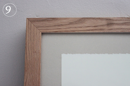
9. Raw wood, uncut matte: This piece was also framed at 567 Framing and it’s a nice reverse. You don’t always have to have a cut matte for interesting results.
 

Texture & Dots


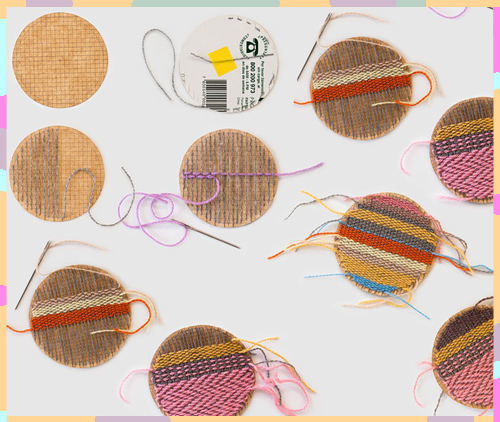
Sometimes dots are a great stand alone texture. Other times, they’re just vessels waiting to be filled. Today’s feature highlights two feminine takes on disorder and geometry. The first, a Karen Barbe original reveals the time and patience behind woven needlepoint.

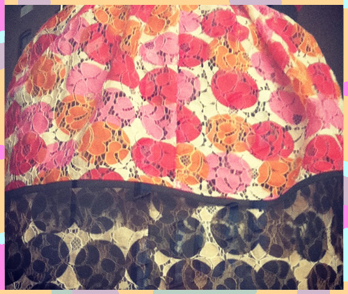
Taking a more chaotic yet refined route, Marni‘s lace dress nearly brings the photoshop process to life, revealing what filters and layers can look like when collaged in a tangible way. Are you a fan?

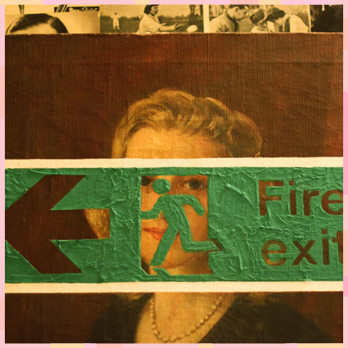
Trend: 2nd Life Canvas Alterations


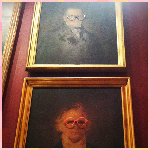
As a big appreciator of fine art, street art, kid’s scrawl and anything artistic or imaginative, it’s easy to understand why I’d be drawn to these mixed media works. Used more for playful retail installations than statement pieces, each classical painting aids in quirky modern messaging.

I snapped the exit sign while enroute to the restroom at the Zetter Townhouse last Fall amidst a meeting with the Think Work Play team. TWP is a London-based editorial collective that celebrates London’s artistic community. If you haven’t already, have a look at their site- it’s a rabbit hole of inspiration. The spectacle-punctured imagery below is housed at Selima, the Italian optics store on Wooster St in lower Manhattan.

If you’re not too uptight or worried about the imperfections that can come from a few creative missteps, I’d recommend visiting your local thrift store and getting crafty.


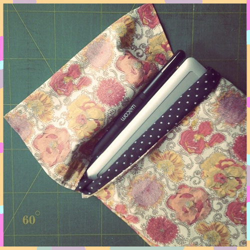
DIY: How to make a Tablet Protector


For all of you design-crafters out there, we have a treat today from our Paris-based DIY contributor, Tiffany Iung. Follow along and let us know if you end up making one for yourself (send photos too)! – Shayna

*            *            *

I waited a long time to get a Bamboo tablet. Now that I have it, I treat it like a little baby. I thought it only right to make a pretty pocket to keep it safe. I had high hopes of making a fancy closure, but when I finished the first part of sewing I realized I was happy with the simplicity of the fold over closure. I figured the proportions of this pocket could be adapted to keep any of your goodies safe and sound.

Materials :

1. thin cotton padding (about 1/2 cm thick), cut into a 56 cm x 21 cm rectangle

2. fabric for exterior (I used this LUCY DAISY C TANA LAWN Liberty Art Fabric), cut into a 112 cm x 24 cm rectangle

3. fabric for interior (lining), cut into a 56 cm x 21 cm rectangle

4. basic sewing materials (color-coordinated thread for top stitch and bobbin)

5. sewing machine or materials for hand-sewing

 Process:

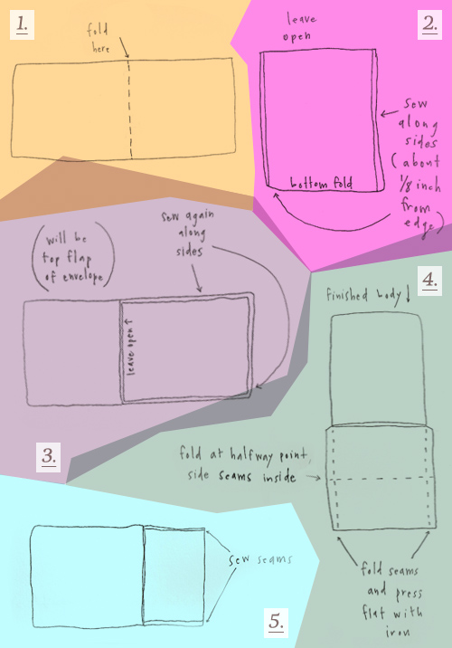
1. Fold cotton padding and lining fabric pieces in half, the lining fabric wrong-side out. Line up folded edges (this will be the bottom of the pocket).

2. Sew along sides, leaving a 1/2 cm seam allowance.

*Turn work inside out. This is the padded lining.

3. Fold exterior fabric right-sides together, leaving a 24 cm allowance for the top flap of the envelope). Place padded lining on folded portion, again sewing sides with a 1/2 cm allowance.

*Turn right-side out. Body is finished.

4. For the Top Flap portion of fabric fold 1/2 cm seams and press flat with iron. Fold again at halfway point (the seams you just folded should be tucked inside, making a clean rectangle).

5. Sew along side seams.

(I wanted to say thanks to Eva Black, on Emmadime, for inspiration from her Top-Notch Type series. I’ve been introduced to so many cool fonts, including this one, thanks to her!) – Tiffany Iung


Mixing Watercolors & Photo Styling


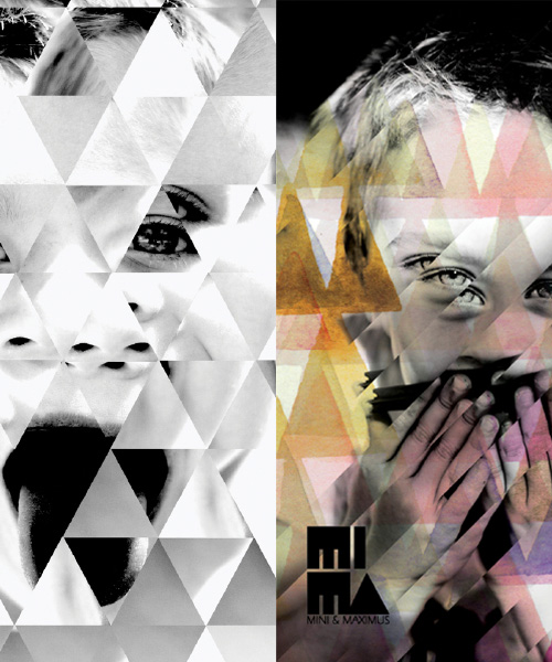
Watercolor-photo collages have been a mainstay for a while now. From soft lyrical lines to crisp geometrics, adult and youth brands have continued to incorporate the direction in both digital and tangible goods.

Case in point, Mimi & Maximus.  Always producing great clothing, it’s no surprise  their summer catalog is playful and visually engaging. The branding is compiled of triangles and photography- almost reminiscent of my wedding art from last spring!

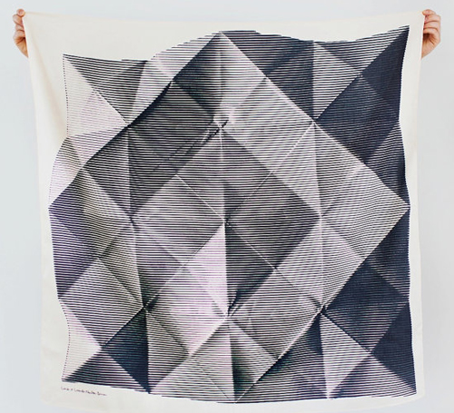
Meshing monochromes, folded imagery, depth and soft materials, The Link Collective, a Japanese-based Etsy shop is selling beautiful scarves with similar energy. Which leads me to ask- are you still a fan of the style? Are you ready for what’s next?


Making a Farmville Set with Lesley Morphy


We all know Instagram’s pulling us into every corner of our friends’ lives. The immediacy of the photos and close perspective allows us to dip in and out of each activity, whether or not we’re actually there to experience it. So it goes with this latest post. I saw a stream of photos on Lesley‘s feed of her current project. As I’m known to do from time to time, I shot her a note and asked her to send higher resolution photos over so we could do a proper feature. Luckily for me (and you) she complied!

PP: So give us a little background, who was the client and what were you asked to do?

LM: So, FarmVille (of Zynga) and Serve (a stand alone brand of AMEX) recently partnered up and wanted to celebrate. It’s pretty exciting as it’s bringing digital money transactions to a new place.  And it seems like people are coocoo bananas for FarmVille- Zynga is a multi billion dollar gaming company!

PP: So how did the collaboration come about?

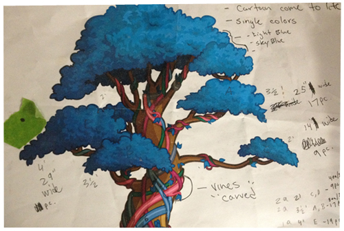
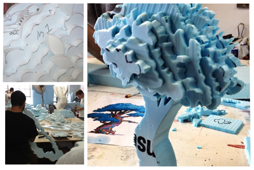
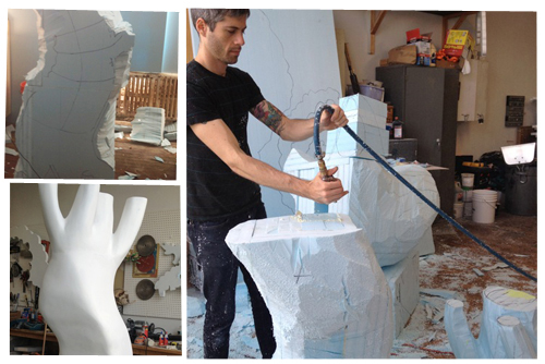
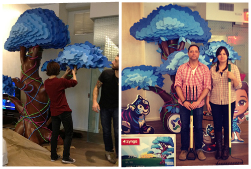
LM: I was approached by 1 Trick Pony to realize the launch in a creative way.  Being a 3D thinker, I really wanted to bring the game’s assets to life.  I played the game and it was easy te see that the MONEY TREE was the major asset. So I thought it would be fun to make it larger than life… 10’-6” tall x 7’-0” wide x 5’-0” deep. I also had a lot of fun propping it out with the game’s characters and a tickle trunk (a Canadian colloquialism for tv show Mr. Dressup’s trunk full of dress up clothes) of farm paraphernalia.

PP: What were your thoughts and initial inspiration with creative direction?

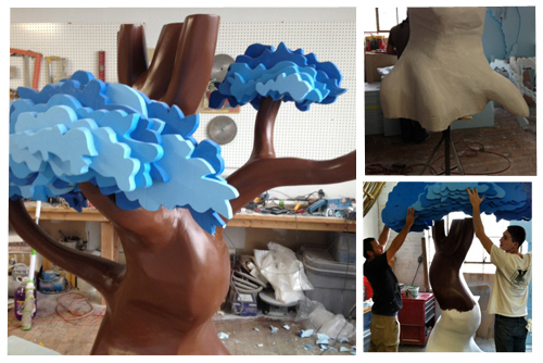
LM: I really wanted it to feel cartoon-like, as though it had literally been pulled from the game and placed in the Serve headquarters.  So it was important to build it in a fun way and for it to be glossy and cute. The biggest challenge was determining how to execute the cutouts; what materials to use; how to make the foliage playful; how to make the vines feel real; and getting the colors exactly right.

PP: What were some obstacles you encountered along the way?

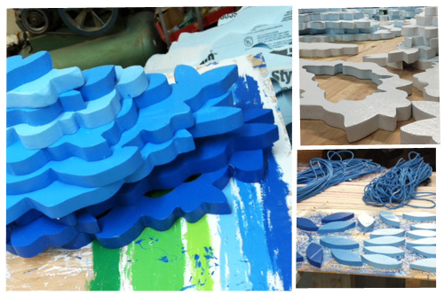
LM: A major obstacle was getting it done within the tight deadline. There were many steps in the process- custom sculpting the trunk and hand cutting all the foliage, sanding, plastering, coating in resin and hand painting everything, including the vines.  Not to mention weather conditions affecting drying time and other kinds of unforeseen challenges, which didn’t help. Needless to say it was the 11th hour and we had a few volunteers (very good friends!) with paintbrushes and super glue helping with the final touches. (A couple bottles of wine might have helped with the volunteer effort!)

PP: And did it turn out the way you had hoped?

LM: The client was absolutely thrilled with the results. So much so that we are now in the process of building three more trees and shipping them to California, Florida and Canada! It’s no myth, money trees really do bring good luck and fortune!!


Tracking Repetitive + Awesome.
On Instagram.