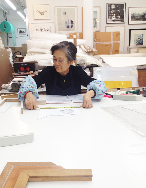
Who else has a mounting pile of art that needs framing? When you invest in pieces you love, be it originals, prints or even the $6 poster, it’s important to house them in a way that will preserve and protect over time. Over the years, I’ve dabbled in matte cutting, basic wooden frame construction, buying online, straight from the store and of course with custom.
Last weekend, I decided to give eight pieces their wings, so to speak, and bring them to my local framer, Mrs. Lim of AZ Art Framing, pictured above. She’s remarkable. After spending two hours together brainstorming the best creative and affordable options, she walked me through her frame building and conservation process. She’s worked on Greenwich Street in Tribeca for over 30 years and continues to frame everything from street art to original Warhols.
Here she’s measuring out a sweet little water color painted by Dale Smith, the in-house illustrator at Steven Alan. He’s one of my favorite local artists. I figured this post would be most useful if I shared a few different frame and matte styles to consider when taking the plunge. While I’m still waiting to get my works back from Mrs. Lim, the collection below is an assortment of techniques I’ve made, used and accumulated over the years.
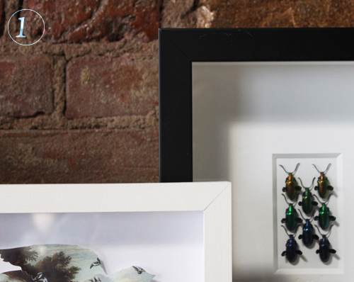
1. Shadow Box Framing: The left is a white wooden painted frame with a delicate centered bird cutout. The right is a standard plastic/synthetic with a glued double matte for dramatic effect.
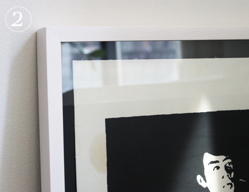
2. Light Frame, Black Matte: Both the art and the frame job came from The Poster Museum on Chambers Street in Manhattan (highly recommend as well). The frame is on the thinner side and has a reddish gray tone.
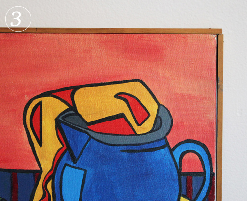
3. Wooden Frame and Canvas: In college I was invited to display a few of my paintings in a show and needed them framed that week. Aside from the unrealistic deadline, I had no money to get it done professionally, so I went to the local art store and bought wood strips, stainer and nails. Very DIY and still happy with the results.
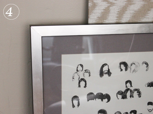
4. Monochromatic & Tonal: Here’s an example where I went sort of crazy and spent loads more on the frame than the art (I’m sure a few of you have done the same, right?) This was a $6 poster from London and I love it. I put it in a slightly textured cool metallic frame alongside a warm gray matte. I had it done at 567 Framing on 14th St.
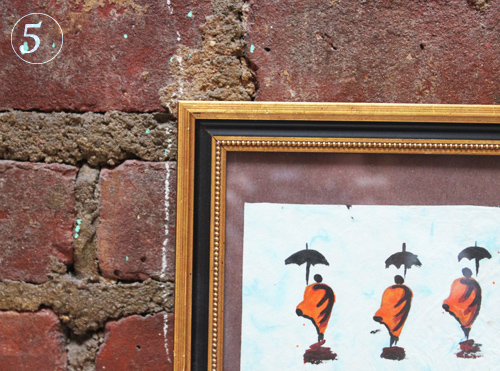
5. Classic & Ornate: I really wanted this Lao watercolor to sit in classic textured frame and luckily found this preassembled affordable gem at New York Central Framing Annex on 3rd Ave.
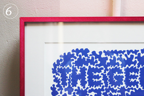
6. Colorful Metals: This is one of the first prints I ever bought and the first frame job I ever invested in. It’s a playful typographic maze and needed something similarly fun around it. The matte’s a grayish white so it makes the print really pop.

7. Thin White Frame, No Matte: This is an old subway map. It’s quite large, so it didn’t need a matte, nor lots of breathing room. I decided to add a simple thin white frame, as it speaks for itself.

8. White Wooden Floating Shadow Box: This beautiful photo was a wedding gift and sits elegantly within the space around it. It was framed at City Frame on w30th Street.
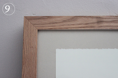
9. Raw wood, uncut matte: This piece was also framed at 567 Framing and it’s a nice reverse. You don’t always have to have a cut matte for interesting results.