Pattern Pulp

Follow-up: Highend Doodles


chairity

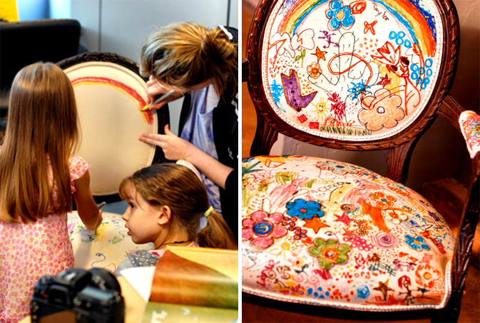
It’s hard to not be inspired by the Pamela Bell couch we featured this past February. In an effort to freshen up her antique furniture, she handed crayola markers to her children and let them fulfill every child’s fantasy; yes, she let them draw on the furniture.

The idea of letting doodles run wild has been swept into a multitude of mediums over the past year.  After a forward from friend and fellow blogger, Lisa Toff, we were alerted to this “Chairity” project, a DIY initiative that directly benefited the Palliative Care program, an extension of the Cook Children’s Hospital in Forth Woth, Texas. The funds raised were funneled into a support system for seriously ill children and their families. Jane Aldridge, the writer behind Sea of Shoes, along with her mother and aunt, a pediatrician at the Cook Children’s Hospital, recovered an antique chair with beige canvas and let a few lucky kids have their way with it. The results speak for themselves.

Coverage by: Emily Gup

Color: Jewel Toned Geometrics


jewel-toned-gemotrics

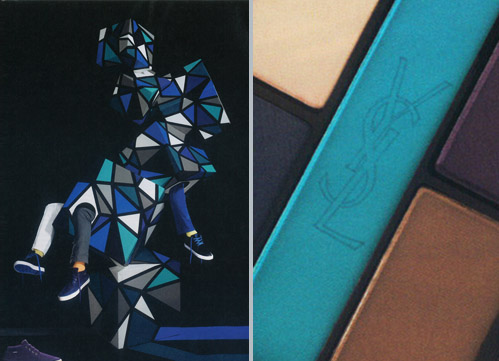
It’s always thrilling when brands fuse artful thinking with strategic marketing. Pointer footwear appears to be quietly racing to the top as they’ve built a cult following of sneaker enthusiasts over the past two years. Merging relevant trends, such as black and blue color schemes with cubic formations, Pointer’s art direction appears to overlap product categories of every variety. When paired beside this African Shore Eye Palette by Yves Saint Laurent, it’s easy to understand how one color can make the difference between gender specific marketing.

By: Shayna Kulik

Playing Historical Checkers: East Meets West


checkered-art

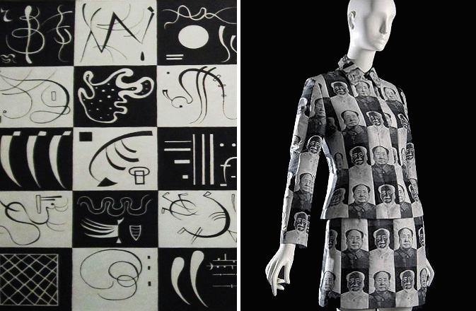
Nothing makes an impact quite like black and white tiling. Add graphic theory, a world renowned artist and political controversy and you’ve got a museum piece on your hands. Today features two creative icons known for such experimental designs: Wassily Kandinsky and Vivienne Tam. Of the vast array of works currently on display at the Guggenheim, the above composition, (title and date unknown), reveals delicate vignettes aligned against a grid. Widely known for his sweeping bright strokes, Kandinsky’s works on paper reveal the building blocks for his grand paintings, mathematics at their finest. Incorporating checkerboard theory into modern day fashion, Vivienne Tam’s most iconic pattern is currently on display at New York’s Fashion and Textile Historical Gallery at FIT.  Tam, a Chinese American, has taken advantage of Western attitudes to ironically incorporate the infamous Chairman Mao into this woman’s suit– a true cultural revolution and a great leap forward.

By: Shayna Kulik

Artist Profile: Patrick Moberg


PatrickMoberg

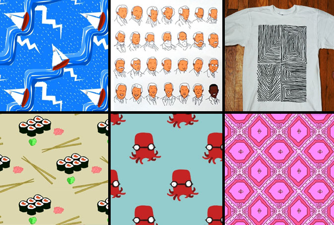
We were recently alerted to Patrick Moberg and his illustrative prowess by our dear friend Judy Prays. Moberg’s personality and point of view penetrates beyond his bright color palettes and lively illustrations. “He doesn’t seem to take himself too seriously and has a consistent output of cuteness that at times, like the November 4, 2008 piece, reaches heights of poignance while maintaining the simplistic charm that’s consistent throughout his work.” says Prays. Moberg has been on the New York media radar ever since his fearless feat of romance that brought him face to face with his MTA missed connection. Love life aside, we’re excited to see what’s next from this bright young artist, as the diversified and playful quality of his portfolio seems like a seamless fit for many mediums.

Fashion: Checks and Balances


checks-balances-pattern

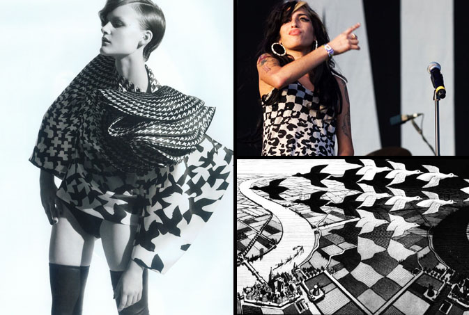
What’s a designer to do when told to pair down and get back to basics?  Do precisely that and wow their customers with innovative new staples. One route that appears to be gaining traction this upcoming season mimics the designs of the illusionary master, M.C Escher. This month’s cover of SOMA showcases a black and white checker print organza blouse by Alexander McQueen.  This sophisticated style transitions sharp geometrics into softer organic shapes.  We wonder if Ms. Winehouse has had an influence on this trend, as she’s sported this punk tank top for some time now.  Be it bird silhouettes or leopard print, we love it when math merges with nature for tactile wear.

Interview: Andrea Cavagnaro


Andrea_Cavagnaro_patterns

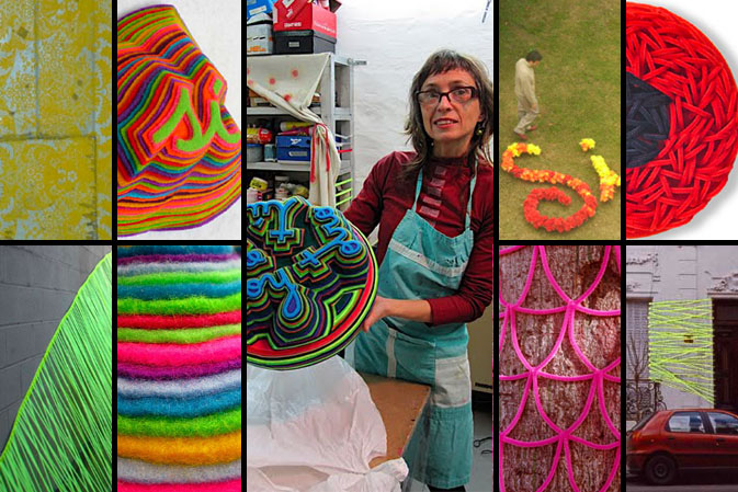
Risa (laughter), beso (kiss), and cuerpo (body) are just a sampling of the delightful Spanish words that Andrea Cavagnaro, Buenos Aires based artist, depicts in her eye-catching felt sculptures. We can’t help but be reminded of Jen Stark’s paper sculptures profiled here, when we see Cavagnaro’s brightly colored and lush layered felt. In addition to these colorful wall hangings, Cavagnaro creates large-scale environmental art displayed throughout Argentina. Pattern Pulp recently had the pleasure of meeting Cavagnaro in her charming studio where she allows her free spirit to guide her to new artistic discoveries. Check out our inspiring Q&A with Cavagnaro and discover how taking new paths led this artist to unexpected places.

*            *            *

PP: What is your design process?

AC: I enjoy working with fabrics. I love to spend hours and hours cutting, gluing, and choosing relationships between colors: contrasts, gradients, dizziness, agreements and opposites. During textile production, body connects itself, with breathing, energy, with all its invisible parts. It is an innermost moment.

My urban work is developed based on the project and depends on the unique and specific context of the piece. I express the experience of my body on that particular place, using contrasting visual language. I create a project, I draw up a plan for it (sizes, calculations, patterns), and then I prepare the materials and build up the staging. I also make sure to carefully document the entire experience.

PP: As a designer, how did you discover your talent and how has it evolved over your creative career?

AC: I worked as a fashion designer for a long time, so I think there is something unconsciously related to design when I choose colors.  I give myself over to color choices without thinking, finding them as if they are given to me…and suddenly, while working, I decide to change them abruptly, taking a completely different direction in the same work and embracing the new combination.

PP:  How does the medium affect the outcome of your work?

AC: I chose the medium based on the experience I want the work to have on the body. At the same time, the material defines the shape, dimensions, and colors of the intervention or sculpture.

While I am working with the industrial synthetic felt, lots of possibilities are open to me. It is like a road, I begin to walk and I find other paths so I choose those and so on. It happens with the shape, with the color, with the rhythms, with the sequence, so it is like a trip that I never know where it will finish.

PP:  What challenges have you faced as an artist?

AC: The most important challenge of my career was in 2001, during Argentina’s financial crisis. Up to that point, my work was a more formal enjoyment of shape and color. After the crisis, I began my public art interventions, and all of my work became completely conceptual.

Another important change was at the end of 2007.  After two years of intense collaboration on urban interventions, I needed a break.  I needed silence. I spent hours in my studio alone, and I discovered the felt that I fell in love with and now use in much of my work.

Compiled by: Rebecca Silver

Tracking Repetitive + Awesome.
On Instagram.