Pattern Pulp

Trend: Casting Shadows


shadow-patterns

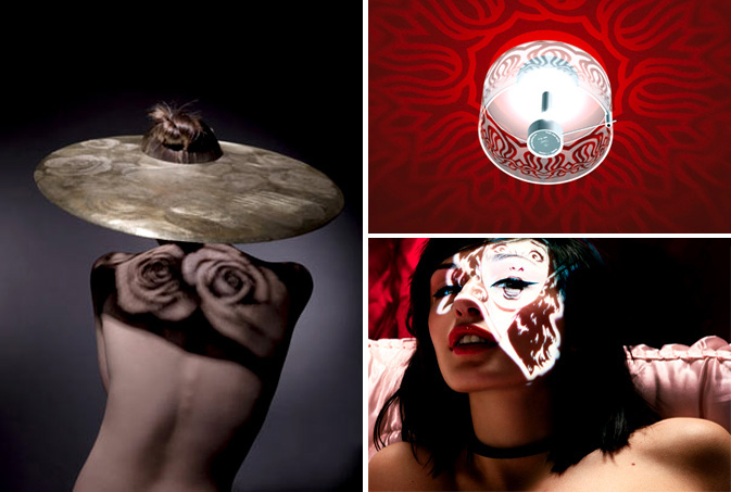
Light will always be a source of inspiration. From free hand shadow puppets to mood-induced candle lighting, shadows have a way of revealing an alternate reality. Recently, we’ve been noticing an equal importance between objects and the shadows they cast.  Maiko Takeda, an ’09 graduate from Central St Martins, recently applied this concept in her final academic project entitled, Cinematography Collection. Takeda’s jewelry casts an elaborate shadow upon the body, weaving organic movement with man made metals. Using a similar theory, Peter Burning’s ceiling lights project elaborate flower-like patterns on the surrounding wall space.  Moving into the world of whimsy, Marc Philbert’s fashion photography is no stranger to light and patterns as he incorporates beautiful women with color and contrast.

light2

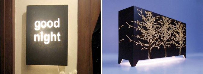
Light boxes can be easily crafted, as demonstrated on Design*Sponge this past December.  Using canvas, paint and a creative concept, conversational or decorative art can make it’s way into your home.  Taking this idea up a few notches, Jo Meesters, a Pattern Pulp favorite, has thrown a sophisticated spin on a would-be cabinet by converting it into an over sized light box.

Additional Contributions by: Emily Gup

Trend: Digital Snacking


Digital Snacking

Lately it seems that for Americans, life is delivered “on the go”.  This style of living, most famously portrayed in the story, Fight Club, highlights the single serving lifestyle. “(The) Cordon Bleu hobby kit. Shampoo-conditioner combos, sample packaged mouthwash, tiny bars of soap, single serving friends.”  While this trend was once attributed to the traveler on the go, it now characterizes consumption trends for a broader base of the population.  Beyond the mini servings of cereal and 100-calorie packs of oreos, consumers are now snacking on their information as well.  RSS feeds, text messaging, mobile apps, Twitter, and iPods all represent information, products and services that come in bite-sized packages that have been designed for flexible living and even disposable consumption.

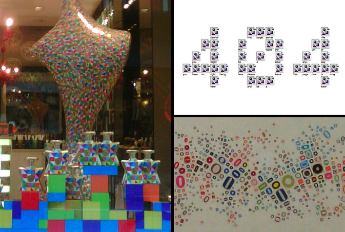
This concept of splintered technology is conveyed through color in Bond No. 9’s summer window display.  Each bottle of perfume is stacked in a tetris-like manner, reminding us of the infinite possibilities we must choose when devising a singular path. Jennifer Daniel, a graphic designer from the New York area is known for creating art as social commentary on the way we live our lives.  This 404 illustration is the result of 36 unloadable images. In keeping with the spirit of the stirring mind, Propeller Modern, a home goods store based in San Francisco, sells this local work of art that reminds us of a topographical landscape compiled of “O’s” from every form of print media.

Additional contributions by: Kelsey-Lee LeGassick

Trend: Identity Crisis for an Online World


scattered-features2

The scattering of physical features is similar to how digital identities resemble a kaleidoscope – lots of colorful parts pieced together to create different patterns. We are constantly juggling multiple on-line identities which when built together illustrate who “we are.” It’s not hard to take a trip down the digital rabbit hole and become lost in a sort of Wonderland, a marvelous “imaginary” place where we experience a bit of an identity crisis. Imagery reminiscent of this theme has been popping up throughout the fashion world, be it in this Agent Provocateur military spread, this Dazed and Confused Beth Ditto cover, or as Diane Von Furstenburg’s signature lip toss. It’s like Alice in Wonderland where Alice grows too big and then too small and in a conflicted state exclaims, “I know who I was when I got up this morning, but I think I must have been changed several times since then,” as she struggles to answer the question, “Who in the world am I?”

scattered-features1

There are so many digital outlets for expression – video, photo, social networks, blogs, microblogs, mobile apps – that it becomes impossibly difficult to manage where our digital identities within these fields stand alone and where they merge and create hybrid channel identities. We ask ourselves, should I only tweet stories relevant to my work or career? Should my Facebook be just for friends or coworkers as well? I have three different blogs, so how do I distribute appropriate content and still manage to be “me?” At what point do I overwhelm my networks with repetition and duplication of thoughts?

One must ask where these identities overlap and weave together to write the story of who we are. And we’re not the only ones confused. Magazines are asking the same questions. Trying to find their place amidst a world that’s already started without them, they try to add digital value to their identities in an effort to temp users to pay for content. A few visual parallels of this are apparent in Bjork’s recent Interview cover, this Beautiful Decay photo collage by Bryan Schnelle, Katya Ford’s inspirational photography and this New York Times illustration by Fred Tomaselli.

scattered-features3

This investigation brings to light the question of how this splicing translates into our own expressive habits. Thinking about how our personal fashion and style is affected by our many influences, how do these digital personas add up into one fashion statement, one outfit? Or, does one just wake up and wonder, who am I today and which influence do I want to bring into the physical world? This Barbara Kruger piece entitled, You’re Not Yourself, illustrates this concept quite clearly, as does this Valium advertisement, where discomfort and instability are acknowledged in the decision making process.

As bilinguals, we look to the familiar, the iconic and seemingly unchangeable to make sense of the new and foreign. Acculturating into digital, we must examine physical pieces of ourselves in order to understand how to adapt in our ever-evolving world.

Compiled by: Kelsey-Lee LeGassick

Trend: Doll Chronicals


Doll Chronicals

The idea of porcelain perfection has become fodder for the fashion and art worlds as of late. Be it society’s collective obsession with faultlessness or the idealization of homogeneity, wooden molds have been fused with human characteristics in the oddest of ways. Fashion’s stab at this concept has been illustrated quite literally in Citizen K‘s fall fashion spread, where a nude stiletto mimics the shape of a human foot. Playing homage to the notion of uniformity, this New York City restaurant setting, shot by our scout, Kelsey-Lee LeGassick, is reminiscent of the window displays we saw last Fall throughout many European store fronts. Departing from the idea of sameness, Bergdorf Goodman tackles this concept with a creative twist, surrounding their oversized wooden manikin with colorful outfits on either side.

Moving into the juvenile realm, it’s quite apparent that the relationship children have with their dolls is an interesting subject for many artists.  While the photographer for this Jblyth photo is unknown, the creative team behind the Italian design studio, Winkler + Noah make a clear case in their photography exhibition, The Puppet Show.  The mantra is clear and to the point, “The best present we can give to children is to let them be children.”

Additional Contributions by: Nicoletta Granati


Budget: Taping Spaces


taping-spaces-patterns

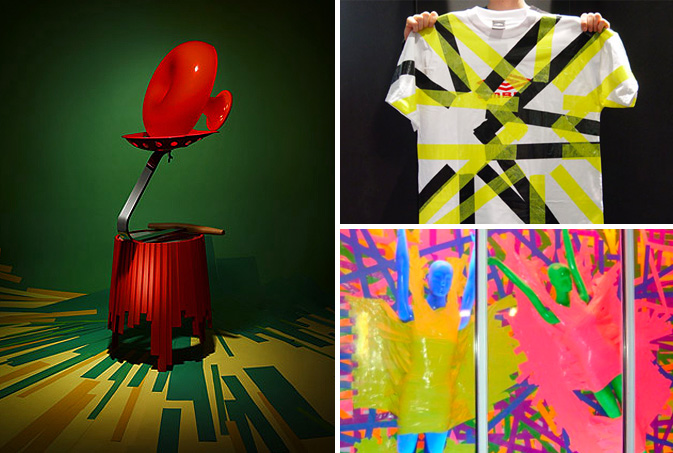
Budget slashing has forced artists, retailers and marketers across the globe to get creative in finding lower-cost solutions to advertise their wares.  Be it a rummage in the craft bin or a simple play on words, trend-setters such as Anthropologie and Barneys have proven less can be more when the concepts are strong. Today we’ve chosen to focus on tape as a decorative way to enhance a creative message.  Earlier this summer the malleable nature of this medium was incorporated in the Color Forms layout featured in the New York Times Magazine where the photographer chose to compliment this Matryoshka table with vibrant colored floor striping.  Applying similar energy and stiff color blocking, this repuposed Umbro t-shirt from 2006 reveals that DIY done right can update any brand.  Using color, function and a healthy dose of sexy, Marc Jacobs has created one of the simplest and most striking window displays on New York’s Bleeker Street, proving that duct tape can work for even the most innovative designers.

Trend: Measuring Up


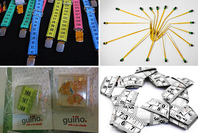
tape-measure

Tape measures can be used for more than just sizing up material — in some cases they are the material. Fusing pop art vibrancy with everyday functionality, the tool responsible for measuring our daily lives is stepping out from behind the scenes to claim a bit of creative recognition. We first noticed ruler art on the streets of Palermo Soho, where brightly colored suspenders popped up at a local craft fair. Inside the walls of Tienda Palacio, a trendy Buenos Aires boutique, folded flower pendants and resin keychain accessories reclaim the traditional notion of a tchotchke.

The fine art world hasn’t been exempt from the trend. In 2008, Debbie Smyth of Ireland, combined black and white tape measures to form magnificent geometric woven prisms. Using less malleable materials, a unique wall hanging featured at this year’s ArteBA was composed of several purposely-misaligned wooden rulers to create striped texture. Combining photography with witty art direction, “Space Time,” by Kevin Van Aelst explores multiple dimensions while simultaneously conveying wit through it’s “variable” measurement title.

Compiled by: Rebecca Silver

Tracking Repetitive + Awesome.
On Instagram.