Pattern Pulp

Trend: Brands Burning


As 2010 rolls on ahead, artists, writers, designers are all pondering the future, and it seems that burning the past (esp. 2009) might be a way to move forward. Burning, a cathartic ritual for many religions, releases the energy of the past to spark new beginnings.

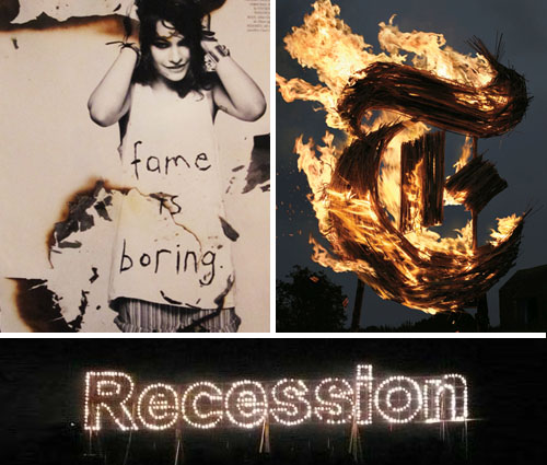
The New York Times Magazine recently featured a stunning cover with the “T” scorched and engulfed in flames. Pyromaniacs set designer, Gary Card and the photographer, Jacob Sutton, were inspired by the “Wicker Man” 1973 horror movie and commissioned a welder to fabricate a 10-foot-tall steel T. After layering it with sugar cane and soaking it in alcohol, they lit it with a blowtorch and “ran for their lives”. Although the T was intended for an Anglomania themed issue, you couldn’t help but feel it symbolized the current demise of the great newspaper in crisis to its internet nemesis.

Paralleling this theme, artist Karmelo Bermejo recently presented “The Grand Finale” at Art Basel Miami in December. The fireworks show ignited the word “Recession,” commemorating the failure caused by the worldwide economic crisis. Though controversial, this celebratory event emphasized art’s fleeting, yet explosive nature.

Using burn marks as a design element with a more lasting effect, the designers at LOVE Magazine recently styled Coco Sumner, incorporating past, present and future themes into the shoot, spread and article.
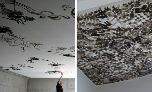
Art that isn’t so fleeting is best exemplified by Olivier Kosta Thefaine, who uses a cigarette lighter to burn his graffiti-inspired patterns into the ceilings of galleries. Inspired by Paris street culture, his illustrative strokes transform bare white rooms with complex smoke mosaics. Rather than desecrating to create the desired effect, the flame’s byproduct is in fact the “paintbrush.”
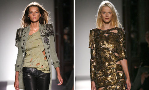
And lastly, burning has emerged as a tangible art in the fashion world. Balmain’s Spring 2010 Ready-to-Wear collection presents an array of tattered clothing with visible signs of distress. From beaded jackets to bullet strewn tees to ripped jeans. A tough sexy trend is already resonating with the fashion glitterati. Be ready to rock this look for major bucks or get inspired go DIY with your bleach, scissors and lighters. Layer up with skinny pants, embellished tops and jackets to complete the look. Tough girl attitude optional.

By: Angela Chen

The Herringbone Collective


Herringbone is about as popular as plaid. That being said, the variations in execution keep it fresh from season to season. Designers are continually reinventing the wheel, breathing life into this timeless classic. Ari Heckman, a development consultant and interior designer based in New York City, uses a wide array of materials, such as carrera marble, glass and metal when tiling this pattern for various clients. “I enjoy using textured patterns that reference men’s suiting for interior settings.  There’s something about the translation from fabric to a more durable material, like marble or stone, that’s very exciting to me.” The examples above showcase glass work from Noho Star, a restaurant in New York, a piece of graffiti on 23rd Street in Chelsea, Nero Marquina marble, a leather woven Cole Haan handbag, colorful woodwork in the children’s department at Printemps in Paris and a yarn stitched pillow that’s currently on sale at Urban Outfitters.

Street Finds: Mood + Movement


trailing-movement

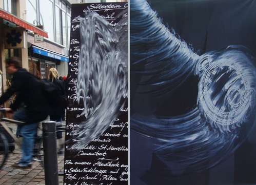
Time, movement and memory all conjure up similar imagery. While most of us go to great lengths to ensure that our moving moments are crisp, we’re starting to notice a trend that rejects this notion from both homemade and curated worlds. The picture to the left was captured last Fall in Berlin’s Mitte neighborhood. Berlin’s artistic community is thriving and truly pushing creative boundaries and it’s no surprise that this menu board remained smudged for nearly a day and a half while would-be customers struggled to read the specials. Unlike our fast-paced, mass market standards here in America, Europe continues to beat to a more romantic and man-made drum, even if it lowers efficiency standards.

Paralleling this moving trail, Gary Simmons, of New York, recently painted this swinging pocket watch, entitled, It’s Just a Matter of Time, in an effort to embody the bleak and anxious atmosphere so many of us have fallen privy to over the past year. This piece was recently part of a curated collective exhibited at the Sue Scott Gallery on the Lower East Side.  Regardless of the comedic, horrific, joyous or stale memories shared by a community, artists will continue to express themselves, extenuating the mood of their era.

Art: 2D Tanagrams


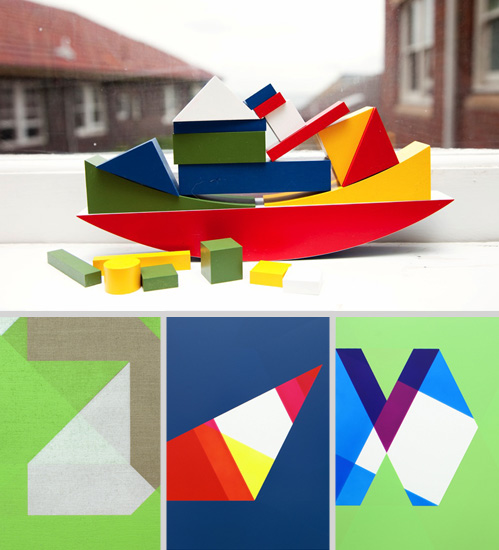
Nearly every child is handed a tanagram on their first day of kindergarten. From day one, we’re taught that structures are built from a series of parts and encouraged to play architect on the classroom carpet. These early associations follow us through life and are a reminder that the most complex arrangements are comprised of simple building blocks. This windowsill scene, shot by the talented photographer, The Selby, captures this playful notion as he follows Natalie Wood, a Sydney-based fashion designer around her home. Striping these structures of their volume, Jonathan Runcio uses basic palettes and tonal shapes to convey depth and movement on a 2D surface. The results are stunning and a reminder that life’s continually an asymmetrical balancing act.

Trend: Offtrack Stitching


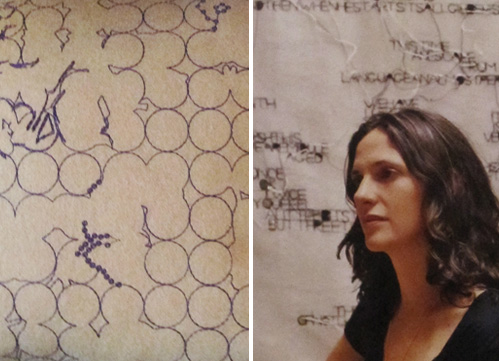
Imagine a world without the delete button. As humans, we’re programmed to color within the lines and erase when necessary. Rarely are we applauded for revealing mistakes along the way.  Today we’re showcasing two works that defy this train of thought and prove true beauty is a never ending stream of consciousness. In a recent collaboration with the home decor company, Maharam, Hella Jongerius of the Netherlands, has stitched this intricate and unpredictable pillow cover.  Using a similar technique, Jessica Rankin, of Sydney, Australia incorporates obscured language into her creative studies.  Be it pattern, dialect or unconventional theory, we’re excited to see future works from both Jongerius and Rankin, as their experimental formulas are a breath of fresh air when considering the pace of today’s production lines.

Artful Antfarms and Social Media


artful-antfarms

What do ants, art, fashion and social media have in common? We’ve been asking that very question ever since reading Noah Brier’s fascinating take on the power of colonization and it’s relation to the internet. The idea that “ants don’t really ever exist on their own, all their power comes from their ability to organize themselves in groups,” directly parallels social media’s impact online, particularly in relation to traffic, viral marketing and cross pollination.

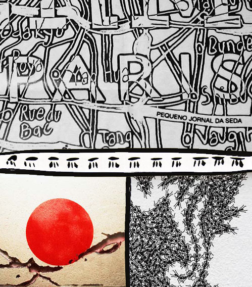
The use of ant farms to contextualize larger societal microcosms have been popping up in every media form, from literal depictions in Mad Men to more abstract print parallels, such as this Hermès map of Paris. Toying with the idea of national identity and cross pollination, Japanese artist, Yukinori Yanagi brilliantly displays the world through the eyes of  the ant in his 1990 installation entitled, The World Flag Ant Farm. Using a series of interconnected boxes, each filled with colored sand in the pattern of a national flag, Yanagi releases a colony of ants into the system, allowing them to travel freely. “The border crossings” result in an intermingling of color throughout the system, a stunning visualization of our cross-cultural networks. Bringing this concept to the masses on a more playful scale, Stine Gam and Enrico Fratesi merge ant farm living with brocade wallpaper patterns, proving mass mobilization can create tangible and beautiful results.

By: Shayna Kulik

Tracking Repetitive + Awesome.
On Instagram.