Pattern Pulp

Street Finds: Geometric Graffiti Mash-Ups


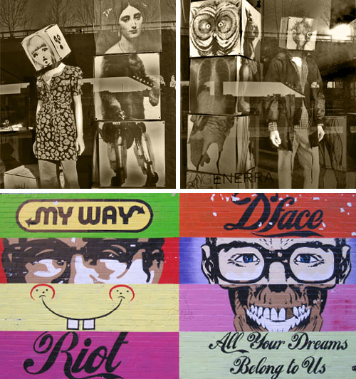
I spent some time walking round the meat packing district today while waiting for my laptop to be maintenanced at the 14th St. Apple Store. Though I’ve seen D*Face‘s mural close to a thousand times, it’s relevancy was elevated after noticing Generra‘s storefront. Black and white blocks stacked together comprised of Flora and Fauna were a complete parallel to D*Face’s baseline concept.  Both compositions are beautifully designed, interesting to dissect and provide social and political commentary of our current global climate. Whichever brand of culture you choose to identify with- be it historical, branded or generic, these geometric “quilts” are a thoughtful reflection of current creative styles, not to mention an interesting window into a now popularized counter-culture.

New York: SMartCAMP


There’s no doubt social media was created for our social endeavors – staying in touch, sharing information, etc. – but unless you’ve been living under a rock, it’s no secret that this interactive medium has exploded in corporate and branded spheres.

But how does it relate to the arts? Social Media Art Camp (SMartCAMP) is a conference that focuses on the social web and its relation to the arts community. Come learn how these tools are being utilized by artists and creative organizations to build vibrant communities throughout the globe. Whether you’re new and skeptical about the power of social media or presently engaged in one or more online platforms and want to further your knowledge, SMartCAMP’s presentations aim to be insightful as the list of speakers is quite impressive.

Roger Smith Hotel: 501 Lexington Ave., New York, NY 10017

Trend: Gum Droppings


What could be more ordinary than chewing gum? Possibly the most accessible material on the planet, gum never fails to be graphically inspirational, whether you’re dodging spots on the sidewalk or observing them in a highly curated gallery. Interestingly, these two-toned glass sculptures from Vogue Living breathe life into this sculptural concept, merging high and low culture with a complex medium. Interestingly, this New York, New York Gum on Canvas piece by Adam McEwen, along with Dan Colen’s 2006 technicolor Untitled compilation, remind us of the infamous Rorschach Ink Blot test. Regardless of the imagery one sees in these random arrangements, one thing’s for sure, these blots are highly adaptable with timeless appeal.

Interview: Matt W. Moore


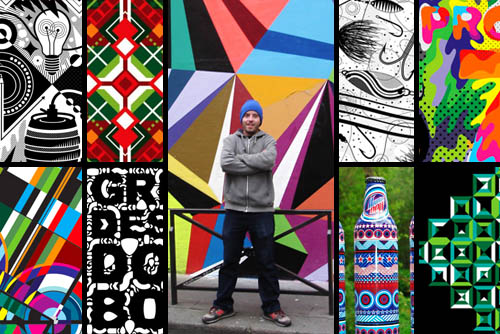
It’s no secret that Matt W. Moore’s vectorfunk graphics are single-handedly influencing an entire generation of artists. His fusion of graffiti, graphic design and watercolor are upbeat, intricate and extremely brand friendly. His work has appeared in countless magazines and print campaigns, from Nike and Burton to Wired and Mountain Dew. Moore’s Design and Illustration studio, MWM Graphics, is based in Portland, Maine and exhibits in galleries throughout the world, collaborating with clients from all sectors. Moore is also Co-Founder & Designer for Glyph Cue Clothing. Check out our Q+A for a glimpse into MWM’s daily routine!

*            *            *

PP:  What websites and news sources do you generally start your day with-do you have a daily routine for news/blog/information consumption?

MWM: I get at least an hour a day of Cyber Surfing in while I enjoy my morning coffee. Some of the websites I frequent:

PSFK
Format Magazine
FFFFOUND
Not Cot
Rojo Magazine
The KDU
Hype Beast

The list goes on. More and more lately, I find myself skimming my carefully curated list of Twits on Twitter. Less time scouring blogs, and more time surfing suggested links.

PP:  How did you discover your talent and how has it evolved over your creative career?

MWM: I’m not comfortable with the term “discover” when referring to talent. I’ve worked damn hard, and I have boxes full of sub-par art and design from my past to prove it. I prefer to think of it more as “nurturing” my vision and dreams. Hard work pays off. As for “evolution”, it is a constant evolution. Everything is always in flux. New ideas, new techniques, new knowledge, new dreams. This is why it is so exciting to be an artist and work as a creative. Everyday is a new adventure!

PP: Please explain your design process when approaching a new concept or product line.

MWM: My process is different for every single project, but a few things are constant. It always starts out with a dialog to make sure I understand the client’s objectives and vision. Then we draft a brief and timeline together. Then I do an exploration phase yielding multiple options. We review and open a new dialog. Then I continue working and refine, finesse, and finalize the design.

PP: What is your preferred method of design and how is it incorporated in your final product? (ie. collage, computer, handwork, etc.)

MWM: The majority of my commercial design work and apparel/textile/product graphics are created entirely with vectors in Adobe Illustrator. Some days I spend over 12 hours lost in this Vectorfunk World. It is my playground.

PP: When is the last time you took a professional/creative risk? Please explain.

MWM: Every single creative decision an artist makes should be a “risk”. If they aren’t taking risks, they are not an Artist, they are a Tradesperson. That said, a couple recent risky decisions that come to mind for me are: Launching my clothing company Glyph Cue during the Great Recession. Yikes! And last month I traveled to Paris for a month long residency at Since.Upian Gallery. I arrived with no artwork, no supplies, no sketches, no firm ideas for the new series of canvases. And my Exhibition was only 25 days away. Pressure makes diamonds!

Magasin Totale City Color Palettes


This particular feature is a bit of a double whammy. Not only are these Magasin Totale photos for sale One Kings Lane today, the graphic layouts are so beautiful and geometric that I thought adding color palettes were a creative must. If you ask any artist, inspiration lies in every corner and crevice of society. Something so simple as an abandoned stairwell or a broken wire can provide the missing piece to a creative puzzle. The Swing Set, Rusty Outlet and Bouncy Balls are by Joe Delano and The Stairwell is by Jeremy Harris. Both masters of mystifying the mundane.

Body Stories for the Inner Escapist


After viewing Tim Burton’s show at the MoMA, it’s hard not to draw parallels to Roberto Kusterle’s fantastical photography. Each piece is truly a show-stopper and a window into a world that challenges literal meaning. Here at Pattern Pulp, we all believe that moods can be defined in countless ways. It’s the inspirational element of a story that sticks, and if it’s done well, it will further resonate within society. Avatar is a perfect example of this. Brands continue to tackle this challenge on a daily basis, and Coca Cola provides perhaps some of the best examples in the market. When you invite your viewer into a world they’ve only dreamed of then give them a pair of wings, you have to trust that they will fly. Kusterle’s ability to convey affection and human emotion is remarkable, and sets the escapist bar just a little bit higher.

By: Shayna Kulik and Emily Gup

Tracking Repetitive + Awesome.
On Instagram.