Pattern Pulp

How to Frame Your Art


Who else has a mounting pile of art that needs framing? When you invest in pieces you love, be it originals, prints or even the $6 poster, it’s important to house them in a way that will preserve and protect over time. Over the years, I’ve dabbled in matte cutting, basic wooden frame construction, buying online, straight from the store and of course with custom.

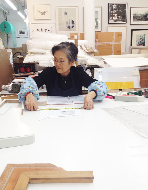
Last weekend, I decided to give eight pieces their wings, so to speak, and bring them to my local framer, Mrs. Lim of AZ Art Framing, pictured above. She’s remarkable. After spending two hours together brainstorming the best creative and affordable options, she walked me through her frame building and conservation process. She’s worked on Greenwich Street in Tribeca for over 30 years and continues to frame everything from street art to original Warhols.

Here she’s measuring out a sweet little water color painted by Dale Smith, the in-house illustrator at Steven Alan. He’s one of my favorite local artists. I figured this post would be most useful if I shared a few different frame and matte styles to consider when  taking the plunge. While I’m still waiting to get my works back from Mrs. Lim, the collection below is an assortment of techniques I’ve made, used and accumulated over the years.
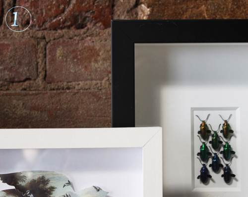
1. Shadow Box Framing: The left is a white wooden painted frame with a delicate centered  bird cutout. The right is a standard plastic/synthetic with a glued double matte for dramatic effect.
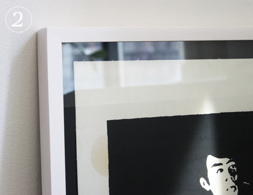
2. Light Frame, Black Matte: Both the art and the frame job came from The Poster Museum on Chambers Street in Manhattan (highly recommend as well). The frame is on the thinner side and has a reddish gray tone.
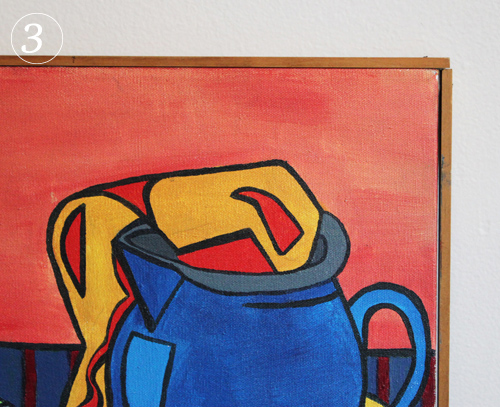
3. Wooden Frame and Canvas: In college I was invited to display a few of my paintings in a show and needed them framed that week. Aside from the unrealistic deadline, I had no money to get it done professionally, so I went to the local art store and bought wood strips, stainer and nails. Very DIY and still happy with the results.
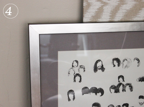
4. Monochromatic & Tonal: Here’s an example where I went sort of crazy and spent loads more on the frame than the art (I’m sure a few of you have done the same, right?) This was a $6 poster from London and I love it. I put it in a slightly textured cool metallic frame alongside a warm gray matte. I had it done at 567 Framing on 14th St.
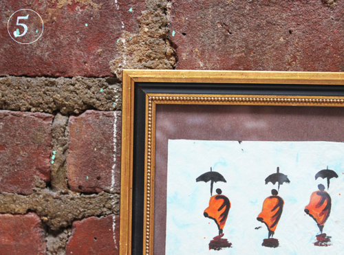
5. Classic & Ornate: I really wanted this Lao watercolor to sit in classic textured frame and luckily found this preassembled affordable gem at New York Central Framing Annex on 3rd Ave.
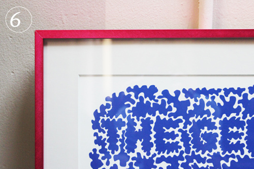
6. Colorful Metals: This is one of the first prints I ever bought and the first frame job I ever invested in. It’s a playful typographic maze and needed something similarly fun around it. The matte’s a grayish white so it makes the print really pop.

7. Thin White Frame, No Matte: This is an old subway map. It’s quite large, so it didn’t need a matte, nor lots of breathing room. I decided to add a simple thin white frame, as it speaks for itself.

8. White Wooden Floating Shadow Box: This beautiful photo was a wedding gift and sits elegantly within the space around it. It was framed at City Frame on w30th Street.
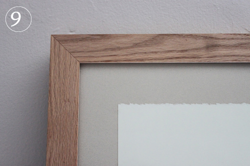
9. Raw wood, uncut matte: This piece was also framed at 567 Framing and it’s a nice reverse. You don’t always have to have a cut matte for interesting results.


Marimekko around Helsinki


This photo pretty much sums up my travels in Helsinki. Justin would explore (or wait) while I browsed with my iphone or Canon in hand, asking shop owners about their tchotchkes and the history behind their trinkets. Every once in a while I’d leave with a necklace, light bulb or keychain (or instagram a longing for something like this).

Like I mentioned in the Johanna Gullichsen feature, fabric is often sold on the premises and it’s no different at Marimekko, where the options are graphic and plentiful.

Here are a bunch of photos I took from inside the main store that houses clothing, artwork, books, toys, homewear and playful decor. Coming from America, where the uptown store feels like Marimekko-light, the hometown store is truly special.

From a retail and merchandising perspective, the flow and lighting compliment each other to tell a bright and whimsical story. Various patterns are assigned to different corners, capturing you in a textured atmosphere. I of course gravitated to the black and white sections first, then moved along to the polka dots and flowers.

Who remembers the delightful girls from Gone to Lunch? Doesn’t this wall speak to their dressing room jaunts?

Much like J.Crew and Kate Spade have filled their walls with art and literature, Marimekko’s wall and floor display tell a timeline of Finnish design history, including the company’s own.

As you can see, the brand’s patterns are woven throughout the city- they’re a part of everyday life, no matter where you turn. Here are tablecloths at an outdoor eating area.

I sometimes felt like a madwoman briskly following people with a camera (read: 1 in 5) were dressed in Marimekko patterns. It’s fascinating and exhilarating to see a brand so entirely embraced by the society that’s produced it.

A few more examples: a vintage bookstore incorporates the iconic black and white  print as a backdrop for it’s books.

And upon my exit at the Helsinki Airport, the dishes and trays are covered in Marimekko patterns. There’s a true appreciation for design within the fabric of the culture- and aside from the obvious label, it was easy to see why this city was named the Design Capital of the year.


Trend: 2nd Life Canvas Alterations


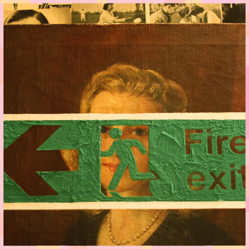
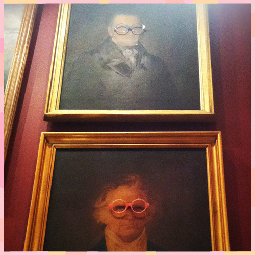
As a big appreciator of fine art, street art, kid’s scrawl and anything artistic or imaginative, it’s easy to understand why I’d be drawn to these mixed media works. Used more for playful retail installations than statement pieces, each classical painting aids in quirky modern messaging.

I snapped the exit sign while enroute to the restroom at the Zetter Townhouse last Fall amidst a meeting with the Think Work Play team. TWP is a London-based editorial collective that celebrates London’s artistic community. If you haven’t already, have a look at their site- it’s a rabbit hole of inspiration. The spectacle-punctured imagery below is housed at Selima, the Italian optics store on Wooster St in lower Manhattan.

If you’re not too uptight or worried about the imperfections that can come from a few creative missteps, I’d recommend visiting your local thrift store and getting crafty.


London: Economy of Attention


German artist Mike Meiré‘s latest exhibition, Economy of Attention, presents a series of  large-scale works on paper alongside ceramic sculptures that embrace the medium of newsprint and highlight its structural beauty.

His latest body of work follows a series of singular paintings on newsprint, which examines existing grids in newspaper layout and reflects on the prioritization of information through graphic design.

Meiré’s background as an art director along with his intrinsic understanding of this medium allows him to strip the compositions to a bare minimum.

Central to all of Meiré’s work is a delicate interplay between the highly refined and mundane everyday materials. The juxtaposition of organic and often sexually explicit or gender-orientated ceramic objects alongside anodyne geometric elements play an increasingly important role in Meiré’s work.

As one line of work continues to inform the other, Meiré’s paintings and ceramic sculptures reveal a profound understanding of popular culture. It is this knowledge, which allows the artist to explore the deep-rooted neurotics that inhibit today’s societies and in turn challenges these through his work. Click here for more info.

Bartha Contemporary Ltd.: 25 Margaret Street, London W1W 8RX


Half Piped Ideas with Leslie Friedman


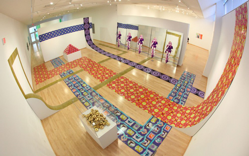
Jewishness, identity politics and skateboarding are the underlying concepts behind Leslie Friedman’s exciting new creative venture. Best described in her crowd-funding video, Friedman, a Philadelphia-based artist, describes her connection to Judaism, global stereotypes and ‘what’s cool’. Bringing art to the masses for functional use is always a complicated endeavor, though her plan is impressive.

In her own words:

In order to accomplish this project and participate in ArtPrize, I will make a dozen different tile patterns that will cover the curved portion of the ramp.  The patterns will address some of the stereotypes, conspiracies, and myths associated with Jews in America.  At the peaks of the ramp, the images will be the most positive stereotypes, while the valley will showcase the most evil, unflattering, dangerous stereotypes.   The significance of the word stereotype cannot be overlooked—it originated as a printmaking term, and for this reason, I believe the repetitious aspect of this sculpture will reinforce the overall concept of how myths spread.  


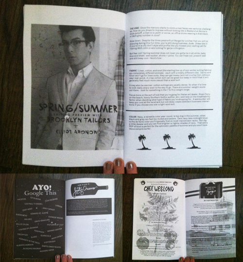
Zine Review: Our Show with Elliot Aronow


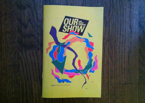
In his 8 years living in New York, Elliot Aronow has made quite the name for himself as a Creative Director, TV and radio personality and a well-respected scene maker & cultural hustler. Elliot is the Co-Founder and Creative Director of RCRD LBL, the world’s first free and legal curated download site. He currently produces and hosts a talk & variety show called OUR SHOW with ELLIOT ARONOW that has featured James Murphy/LCD Soundsystem, Vampire Weekend, Das Racist, TV On The Radio, and many more.

Aronow made a bold step last winter and turned his digital show into a seasonal arts & culture zine. An interesting mix of design, food, fashion & advice, Our Show maintains an inclusive, personal voice and pleasantly practical vibe.

“Brands are still having a really hard time talking to a guy like me–they’re addressing either the millionaire, up-in-the-sky, über-luxury guy alienating culture, or it’s total schlock… The era of quick-buck, over-saturated lifestyle marketing is coming to an end. The people they’re trying to reach are pretty damned sophisticated by this point; we’ve been messaged for almost a decade.” (fastco)

Elliot enjoys the tactile component of the zine and how you can flip through it with your hands and pass it through a network of friends. Unlike the internet, which can promote a passive sense of absorption and interaction, Our Show the zine invites itself into your life and circle of friends in real time.


Tracking Repetitive + Awesome.
On Instagram.