Pattern Pulp

Watercolors for Beginners


I’m a bit bias, but I love a good watercolor. There’s a graphic lyricism that’s extremely forgiving. The lines always emit a delicate strength, whether you’re a kid having fun or a master amidst a successful career.

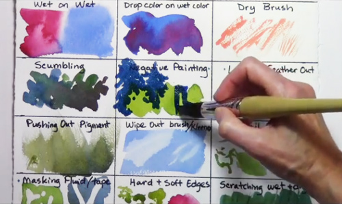
Realizing the importance of the negative space is one of the best ‘a ha’ moments you can have. I stumbled across Lorraine Watry’s tutorials on Pinterest last night and love how she walks us through various techniques, conveying methodical patience. Have a watch- anyone can do it!

 

Visualizing Wind Patterns


This lyrical short just landed in my inbox, care of the talented Nina Solomon. While it’s been circulating the web for a while, it’s worth sharing for those who haven’t seen it. Capturing the wind’s graceful sweeps, 612 free-rotating directional arrows dance under directional force. Created by Charles Sowers, installed by Rocket Science and commissioned by the San Francisco Arts Commission, I’m assuming it’s a sight to behold. Check it out if you’re in the Bay area.


Repurposing Patterns with Pottock


Converting his familiar character illustrations into upholstered fabric, Geoff Mcfetridge‘s venture into furniture is as playful as it is practical. The Allofus chair, a product of Pottock, him and his wife’s wallpaper company, merges midcentury styles with a playful pattern. Successful repeats have many legs and it’s exciting to see this soft, tangible extension executed so beautifully.


A Poem by My Grandmother


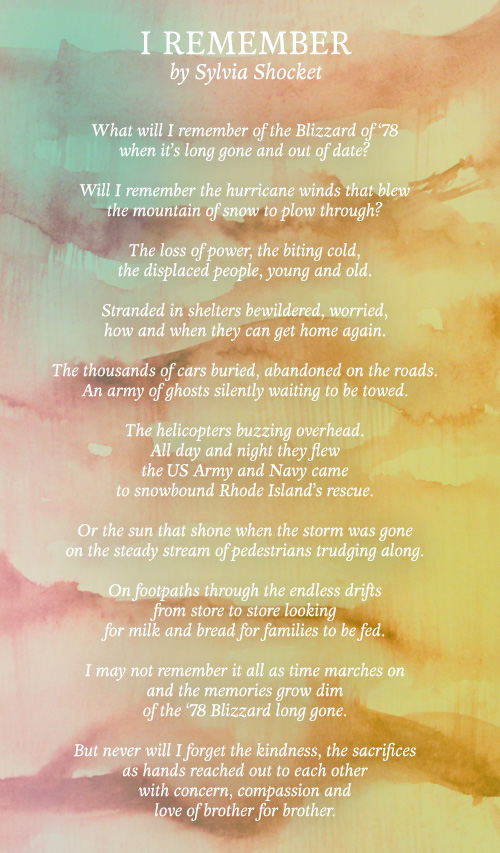
It’s been one hell of a week for the Tri-State area. When our cable box and lights flickered on Saturday morning, I went into turbo cleaning and work mode. It was a zen of sorts to balance a week of chaos. In sifting through an overstuffed filing cabinet, I came across a pile of my grandmother’s poetry. Here’s a piece she wrote about the Blizzard of 1978. Sans snow, the descriptions are eerily similar.

If you’re able to donate, here’s a link to the Red Cross.


Merging Creativity & Criminal Justice


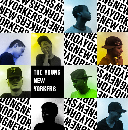
Busy, graphic and bold, just like it’s purpose. The Young New Yorker’s Project was recently forwarded along by Sam Fleischner, a very talented NY-based filmmaker, who (fun fact) also went to my high school. He recently shot Santigold’s Disparate Youth video and is in the process of creating Stand Clear of the Closing Doors, thanks to a successful Kickstarter campaign.

Fleischner’s known for uncovering and artfully sharing stories belonging to segments often forgotten by society and was an active part of this initiative over the summer. Founded by Sara Feinberg and Rachel Barnard, the goal is a simple one, to revise the curriculum for 16 and 17 year olds prosecuted as adults within New York State. Ambitious at it’s core and responsible in it’s execution, it’s refreshing to see alternative methods of system reformation.


Repetition Elsewhere: Geometry Daily


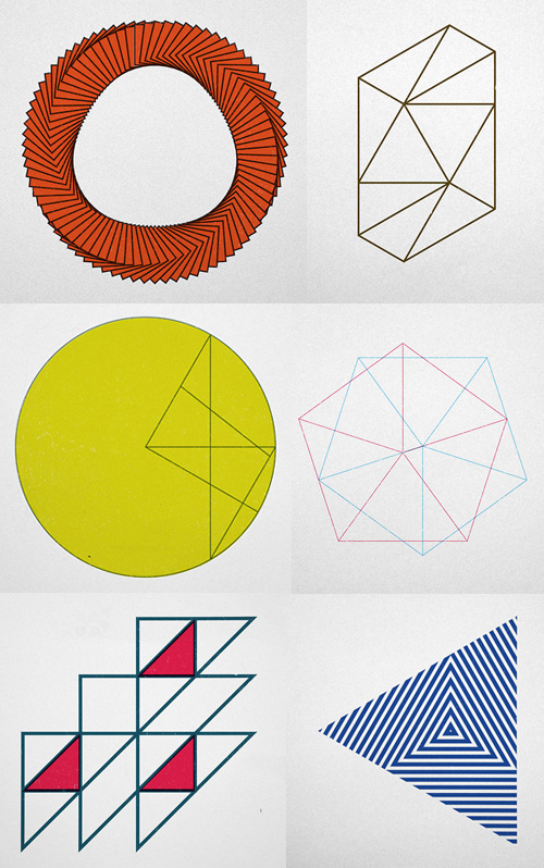
When’s the last time you were given a bag of tanagrams and ask to build something?  Kindergarden? Today’s feature is devoted to the art of geometry and the manipulation that accompanies graphic design. The shapes from Geometry Daily have a whimsy to them that bend the rules. Each color combination is mathematical in a whimsical way. Have a look!


Tracking Repetitive + Awesome.
On Instagram.