Pattern Pulp

Follow-up: Mandatory Headgear


tripleeight-helmet

In our continued advocacy of helmet wearing, we’re spotlighting an age appropriate option for the young rider today.  This 5Boro Pigeon League helmet incorporates iconic New York imagery, specifically highlighting urban street life.  While this two color pattern translates perfectly for headgear, we strongly believe it could be used on other branded items if Triple Eight were open to expanding their product line.  We first noticed this helmet while waiting for a tune up at Metro Bikes, but it can also be found on Triple Eight’s website.

Fashion: Zip and Repeat


zippers2

Zippers, the commonplace closure, have been striped of their hidden functionality and thrust into the spotlight, proving they can double as innovative solutions as well as decorative patterns.  The results are striking, and slightly quirky.  Part of the zipper’s appeal, perhaps, when compared to its closure counterparts such as buttons, hooks, and snaps, is the fluidity of movement.  This is evident in Ji Woong’s Zip Up Tangles, a creative solution to the wiry mess we all experience when reaching for our ear buds.  Stepping it up a few notches, Van Cleef & Arpels has recently dove into it’s archival library to revive it’s 1950’s Zip Necklace.  While today’s version may be toned down, it’s no less elegant, and a primary example of how innovation can have timeless appeal.

zippers

In a French design studio not far from Van Cleep & Arpels’ headquarters, Julien Rivoire, an Art Director and Graphic Designer, has applied his own zipper technique to Sixpack’s infamous t-shirt collection. Revealing striped down beauty in the most simplistic of logos, the Z and the P are solidified by the I in this seamless application of the object’s functionality.  Continuing with the theme of black and white, this patterned skirt playfully mimics the sex appeal zippers posess when applied to women’s clothing.

Zoe Cotlenko, a French jewelry designer and zipper connoisseur, is the mastermind behind this line of candy-colored necklaces and bracelets.  Using his illustration skills, Eric Elm’s zipper and button bag made its debut at Colette a year ago this month.  Elm’s work has been equally influential in New York, as proven by this remarkable 3D installation at the Nike 255 space in NYC for the Make Something Project, which was held in collaboration with Aaron Rose & Beautiful Losers Show.

Additional Contributions by Emily Gup.

Follow-up: High End Doodles


Harmonograms

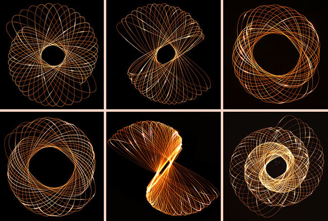
Delicate markings have continued to emerge over the past few months. Be it chaotic scratch or precise design, artists are predictably pushing boundaries and reinventing the creative wheel.  Ritwik Dey, an Interactive Designer and data visualization specialist at R/GA, demonstrates this brilliantly with his Harmonogram series of Lissajous figures.  Using only a flashlight-pendulum set into motion, a piece of cardboard with a pinhole for light and a camera set to expose between 30 and 90 second snaps, Dey has created his own light version of the hypotrochoid art set.  These metallic wonders quite acurrately represent why Dey works as an information designer.  Check out his weekly photo project to stay abreast of his latest musings and don’t forget to vote on what you’d like to see next!

Trend: Painterly Paths


bmw-expressionofjoy

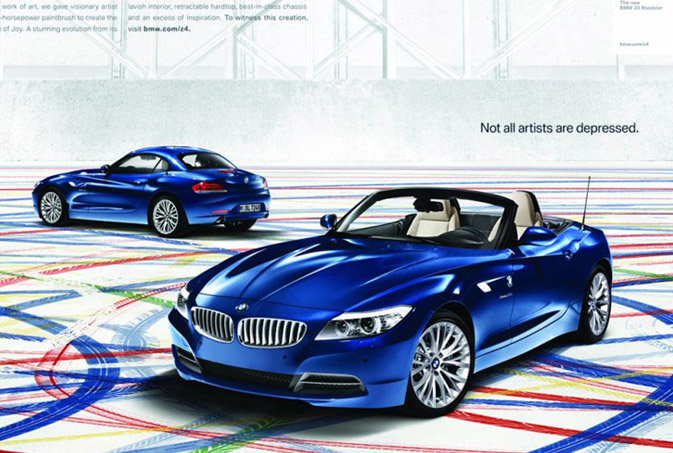
“Not all artists are depressed,” is quite possibly be best tag line we’ve heard in a while. BMW’s latest Z4 campaign, Expression of Joy, has recently rolled out across several platforms, attempting to reach affluent customers of all of ages and interests.  BMW’s roadster has always been synonymous with intelligent design and has collaborated with select artists in the past to express this priority. Using GSD&M Idea City as their creative backbone, BMW has opted to jump into the driver seat this time around and let their product become the paintbrush, “While the original idea was to use the car to create artwork, over time, our thinking evolved from the final product to the process,” says David Matathia, VP and Idea Team Director at GSD&M Idea City. The results are both stunning and effective, as this vibrant spot translates seamlessly across all media platforms- be it print, tv, web, mobile or on premise entertainment.

tiretracks2

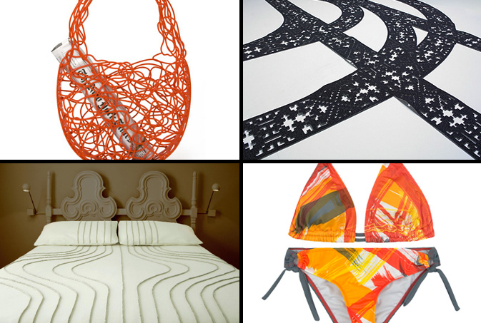
In an effort to embrace the concept, Expression of Joy, we decided to explore a few other products that inspire controlled chaos and negative space.  This Corallo Bag, a current feature on MoMA’s retail website, is an elegant, non-ending doodle that’s a durable alternative to the plastic throwaway.  Moving in a more literal direction, Hudson-Powell‘s patterned rug mimics tire tracks in the snow. Emulating tracks of another sort, Walter Onion’s wool and linen bed spreads are a minimalist and high-end interpretation of this trend.  This painterly Hurley bikini looks as if the roadster rolled over it while creating its 240 yard masterpiece.

Additional Contributions by Emily Gup.

Interview: Pattern Bakery


pattern-bakery

Patterns are on the rise in Helsinki, as four very talented women have recently joined forces to found the design studio, Pattern Bakery.  Beyond having a wonderful company name, Maria, Salla, Miia and Minttu all compliment each other quite strategically with a unified goal and varying creative backgrounds.  After first discovering this studio on Bloesem, we decided to throw a few questions their way to further understand their design process.  Check out our Q+A for a glimpse into the world of this pattern-minded printing studio.  We’re expecting big things from this creative quad.

*            *            *

PP:  The name “Pattern Bakery” is quite clever, how does each studio member’s specific talents, or “creative ingredients,” add to the mix?

PB: Our strength lies in the fact that we are all trained designers with varied backgrounds. For example, Minttu has previously worked as a fashion designer, Salla as a journalist, Miia has a keen interest in printed fabric and architecture and Maria in trend forecasting and the web.

Though we are all different personalities, we share a common interest and our drive helps us work together. It may be a cliché, but our differences complete each other and makes for a great mix of spices in terms of personality and visual style. This combination allows us to offer our customers a diverse selection of patterns.

PP: Please explain your studio’s design process, particularly when approaching new seasons and varying collections.

PB: Our kitchen always has something simmering! In addition to our research and on going curiosity for the future, one of our designers has a background in trend research and was recently a member of the Intercolor Finland team.  It’s only natural that every year we would create a recipe for the future.

Normally, everyone collects information that interests them. Once our research is complete, we bring our opinions to the table to discuss, then come to a consensus on how to visualize our hunch. Our designs become full themes with stories and color charts which we use as a backbone to our collection.

For example, right now we have seven different themes and color charts for our patterns. This ensures that a customer can match patterns from different designers and build their own collections from our body of work.

We pursue to illustrate the home and life in general.  All of our patterns have a story and reason behind them. The same applies to the other services we provide, such as custom-made collections, brand and design management and illustration.

PP: What are some of Pattern Bakery’s greatest challenges as a growing business?  Are there any business models that you look up and hope to emulate?

PB: Our biggest challenge is gaining our client’s awareness. We primarily sell our prints to companies without knowing where our patterns will end up.  This can make it difficult to explain why our designs will be beneficial to potential customers. Being located in Finland also creates it’s own geographical challenges, though the web is fairly global.

On a more personal level, it’s a challenge to maintain a balance between business and personal liberty. Any job has it’s good and bad days, but we really strive to keep our studio fun! It’s a wonderful thing to cook for ourselves rather than cut someone else’s cookies. Integrity is the key to our working philosophy. The business has to feel right.

PP:  How do you incorporate commercial trends into your collections and is this a factor that drives Pattern Bakery’s design?

PB: Design is a form of customer service. There are reasons why a certain client works with you, be it be style, recipe or taste. While a design might simply serve as decoration for some, it’s the core and soul for other customers. A pattern should convey a positive feeling, story and at the very least, relate to the product it’s being used for.

To achieve this, the each repeat should have a story behind it.  Commercial trends have roots and don’t appear out of the blue and the most interesting part of the process is translating trends into visual stories. As said before, it is not always conscious, but design is the pursuit of visualizing silent knowledge and trends into a concrete form.

A good pattern marries commercialism and something familiar that catches your eye. The most interesting designs aren’t always ready for market.

PP: Who are some of your dream clients?  If you could sell or license your patterns anywhere, where would they end up?

PB: Pattern Bakery is very much a pantry of ideas. The most optimal scenario would be to co-operate with a client in such a level that we get a grip on the core of the product. When you can influence the brand and not only the physical outcome, it’s a rewarding experience.

We would love to work on a campaign with a non-profit or develop the visual concept for a chain of an organic food-stores! We’re open for ideas.

Trend: Natural Formations


clinique-nantaka-plantation

Nearly everyone can remember their first trip to the Science Museum.  Between interactive displays and ecological wonders, it’s easy to understand why these educational centers have always drawn endless crowds.  Interestingly, many of the natural formations that have educated the masses are now being tapped for inspiration.  Rock patterns, as noted in late February, are continuing to subtly nudge their way into the the commercial marketplace, both figuratively and literally, adorning home accessory lines and commercial advertisements.  This Nature Exploration Agate greeting card, designed by Joy Deangdeelert Cho is one of many nature inspired prints on her website, Nantaka Joy.  In an effort to imply timeless beauty, Clinique ‘s latest product push embraces the tortoise, nature’s slow and steady (not to mention, reliable) winner.  Taking this theme to the most literal level, this rock-covered pillow from Plantation, in San Francisco, glamorizes the everyday pebble.

Tracking Repetitive + Awesome.
On Instagram.