Pattern Pulp

ArteBA: Made with What?!


arteBA1

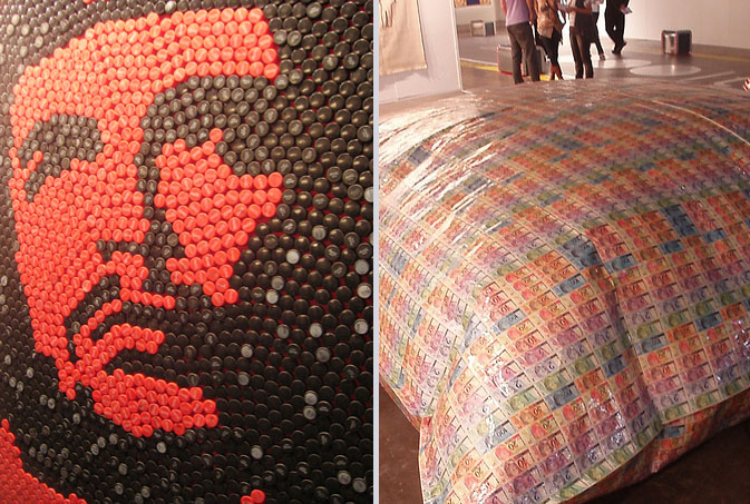
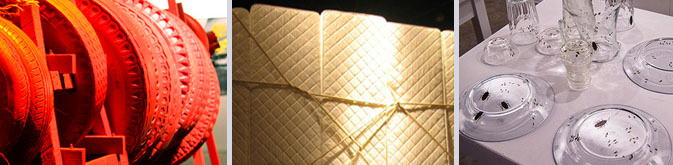
Mattresses, bugs, bottle caps, tires, and money: just a sampling of the innovative materials used by some of the 800 artists displayed at this year’s ArteBA.  This annual event is Latin America’s largest contemporary art fair (think Art Basal but smaller and in Argentina).  From May 22-26, the Buenos Aires event space, La Rural, was filled with installations by 80 contemporary art galleries from across Argentina, Brazil, Chile, Colombia, Uruguay, Spain and the United States.

arteBA2

Unsurprisingly, most of the works had vibrant colors, keeping in line with traditional Latin culture. The most unexpected aspect of the fair was the wide variety of found objects that made for fun viewing and quirky displays, not to mention, surprising patterns. We gravitated towards a Che Guevara portrait depicted with Coca-Cola bottle caps, a giant pillow created out of currency and a huge “animal” created out of tires and found objects.  Marta Minujin, a famous Argentine artist, created a room out of mattresses, controlling the environment her visitors experienced.  Quilted white walls tied together with jute drew striking parallels to what crib life might be like for adults.

We love how these artists took everyday objects and carefully manipulated them to execute new moods and works of art. Aside from new emerging patterns, traditional ideas and concepts were challenged through form and construction.  With 125,000 people in attendance, this year’s fair was ArteBA’s largest success thus far. We are anxiously awaiting next year’s show!

Coverage by: Rebecca Silver

Interview: Dan Funderburgh


Dan Funderburgh

Every now and then you stumble upon work that is so creatively fascinating that it moves and inspires you.  Today we’re highlighting Dan Funderburgh, as his library of meticulous wallpaper falls into this awe-inspiring category.  Each of Funderburgh’s repeats draws upon historical references, be it Moorish mosaics, American op art, or simple tools humans use in everyday life.  Marrying commercial materials with modern day thought, Funderburgh’s art has seeped into several pockets of society, making significant waves throughout overlapping creative communities.  From 5Boro skateboards to the walls of Cooper-Hewitt’s Design Museum and the Miami’s Museum of Contemporary Art, Funderburgh continues to merge art, living and attitude.  Check out our Q+A for a glimpse into his daily routine.

*            *            *

PP: Do you have a daily routine for news/blog/information consumption?  What are your favorite publications?

DF: I start my day listening to public radio but usually glance over the NYTimes and BBC websites. As far as the bloggysphere there is far too much stuff to take in daily. I figure my friends will send me something if it’s really important. I do like my friend Kelly’s blog, Nothing is New.

And of course Arkitip and 12oz. where kindred spirits Cody Hudson, Grotesk, Ryan Geezer, and The Chinatown Soccer Club post.

PP: How did you discover your talent and how has it evolved over your career?

DF: I don’t know so much about a talent, but I discovered I have an acute appreciation for intricate ornamental arts about the same time that I discovered I have a limited patience for non creative corporate logo re-sizing. So I quit my job and tried to make my way as a wallpaper maker and artist.

PP:  Do you discuss your work with other designers?  If so, how does that impact your creation process?

DF:  All the time! Not too many other wallpaper designers, but I’m surrounded by smart artists and designers and photographers that help me tremendously. Not so much on the minutia of a specific piece, but more for larger questions about direction and concept.

PP: Where do you usually work on your patterns and what is your preferred method of creation + execution?

DF: Usually rough sketches in pencil and then redrawn from scratch in the computer. I try to always be open to other options –> painting and photography in case the idea calls for it.

PP:  When is the last time you took a professional/creative risk?

DF: Too long ago. It’s probably time I should take some more.

PP:  Do you incorporate commercial trends into your work and if so, is this a factor that drives your design?

DF: Of course not ! That was a trick question. I suppose a few years perspective will be the judge of whether I’m apart from the flock or just fooling myself.

Quick Links: Weekly Notables


5-29wrapup1

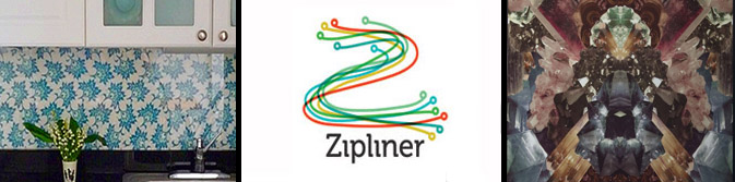
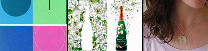
1.  Laura Hoyer of Open Face Sandwich gives her “blah” rental kitchen a DIY makeover, applying plexi-glass to one of her own prints, via Design*Sponge.

2.  Trends in logo design for 2009, via Design Boom.

3.  Great pictures from “Beneath the Surface: Flora, Fantasy & Fable” a show curated by Pattern People in Portland, Oregon.

5-29wrapup2

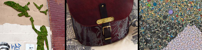
4.  Edina Tokodi’s moss graffiti, via Inhabitat.

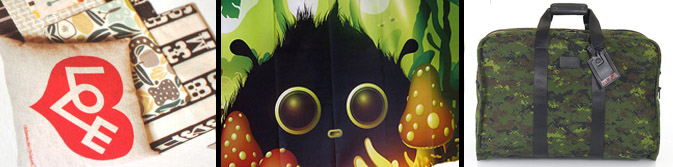
5.  Lovely intro to Woot ‘n Wright’s: One-of-a-kind handmade printed textiles, cushions, bags and leather satchels, Woot ‘n Wright.

6.  Chris Jordan creates beautiful photographs made entirely out of trash, via Abduzeedo.

5-29wrapup3

7.  Contemplating the colors of Jorma Hautala’s paintings and and Spanish graphic design studio La Mosca’s graphics, via Colourlovers.

8.  Barbro Andersson conceived a sequence divided into four acts that retraces the champagne-making process for Perrier-Jouët’s Belle Epoque celebration, via Yatzer.

9.  Interview with fabric designer Umbrella Prints and jewelry designer Ceeb Wasserman about their recent collaboration, via scoutie girl and modish.

5-29wrapup4

10.  Sneak peak at Alexander Girard’s upcoming collection of pillows, wall-hangings, and textiles for Urban Outfitters, via The Scout Mag.

11. Some interesting offerings from Domestique’s Zona Tortona, via Moco Loco.

12.  Tumi’s Alpha Collection for the urban battlefield rendered in digital camouflage, via Selectism.

By: Emily Gup

Trend: Well-Dealt Hands


Playing Cards

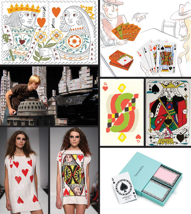
The ubiquitous playing card is now being used for more than just playing games.

The U.S. Postal Service has just issued a new stamp in their popular Love series inspired by the king and queen of hearts from the 18th century French archives, the same cards that are the source for the recognizable 52 card deck that we know today.  Commercializing the game even more, Bryan Berg, the Guinness world record holder for card-stacking, is featured in this remarkable promotion video for the Lexus quiet ES model.  Bringing the deck to life, London fashion designer, Ashish Gupta’s Spring/Summer 2009 Americana collection includes sequined dresses reminiscent of Alice and Wonderland.

In the art world, playing cards have continued to be a source of inspiration. The geometric abstractionist, Sonia Delaunay designed her Simultane deck in 1964, while Salvador Dali had his own surrealist take with a series of lithographs completed in 1972.  Bringing this everyday pleasure into the luxury realm, Tiffany & Co., Kate Spade, Vivienne Westwood and Hermes have all placed their design stamp—and a price tag—on decks for the modern and upscale home.

By: Karen Maineti

Fashion: Marketing the Disco Ball


mirrorball

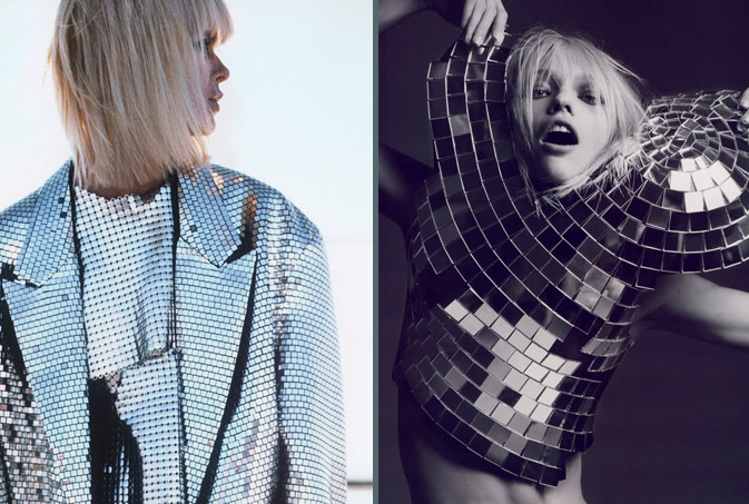
It’s always interesting to see fashion, print and marketing intersect unintentionally.  Having worked within the fashion and marketing worlds, we’re well aware of the power nightlife can have on a brand.  Mega bucks are spent on a daily basis to keep party goers dancing, drinking and living the lifestyle that their clothing, music and liquor choices convey.  With companies such as Mirrorball and The Happy Corp hitting their creative marks so precisely, it’s no wonder that nightlife’s most iconic symbol, the disco ball, has spurned it’s own fashion trend.

Garments bedecked in mesh metal mirrors are lighting up the night as well as glistening in the sunshine of day.  The jacket and the mirrorball blouse, as seen above, are Martin Margiela creations for his label, Maison Martin Margiela.  The eighties style jacket appeared in this past month’s US Elle, while Hedi Slimane‘s fiercely styled spread was a highlight French Vogue’s April issue.

Additional contributions by Emily Gup.

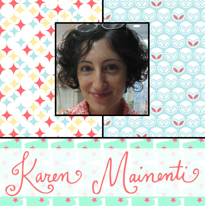
Interview: Karen Mainenti


karen-mainenti

Karen Mainenti has one of those jobs many of us crafty people dream about- she designs for Martha Stewart Living’s holiday department.  Her delightfully patterned textiles and accessories have been instrumental in keeping the season fresh for over ten years, evading the tired clichés this particular season can be known for.  In addition to today’s Q+A, we’re delighted to welcome Mainenti on-board as Pattern Pulp’s newest contributor.   We’re excited to see what she comes up with as well as expand our content offerings.  Check out today’s interview for insight into how a nontraditional path paired with talent and determination can lead to creative (and professional) success.

*            *            *

PP:  You sound like an exceptionally crafty person, when did you first discover your talent and how has it evolved over your career?

KM: I was always a creative kid who loved cutting, pasting and crafting.  My mother taught me how to sew and embroider, and I would spend countless afternoons decorating cookies, latch-hooking, and cutting apart wallpaper swatch books.  Art class was always my favorite, but when it was time for me to go to college my parents thought it would be more practical to attend a liberal arts college.  For years I felt that I was at a disadvantage because I hadn’t attended art school, but things started to change for me once I stopped worrying about following a traditional linear path and instead allowed myself to pursue my diverse interests.  I started by creating collages, quilts, embroideries—some of which I exhibited in group gallery shows in New York.  After that I became interested in design, and taught myself Illustrator and Photoshop, which ultimately led to my current job as a designer at Martha Stewart Living.  In my free time I’m focused on making things purely for myself. I’ve created a website that reflects my sensibility as a designer and which features a selection of my work. Most recently I’ve established Candyfig, an online shop where I sell my creations of those things that strike my fancy.

PP: What’s your favorite part of the design process and how often do you find yourself collaborating with other designers?

KM: I like the concepting stage where I begin to see my collection of reference materials and ideas grow into something viable, even if I’m not exactly sure what the outcome will be. Is it cheating to say that I also enjoy seeing the finished product?  I often like to work in series, where each design contributes to a larger idea; seeing the successful completion of a component fuels me to keep working towards the larger goal.

I don’t find myself collaborating with other designers that often.  I tend to work on my own. Sometimes I worry if I discuss an idea too much I will lose the drive to actually bring that idea to life.  I usually share my work with my husband for feedback.  He’s a writer rather than a visual artist, but his input gives me perspective on my work and makes me consider the choices I’ve made during its creation.

PP:  What’s it like designing for the holidays all year round?  How do you incorporate commercial trends into such a boundary-specific category?

KM: I’ve always been fascinated by the icons associated with the holidays.  As a little girl, I would decorate the door to my room for each holiday with posters and drawings.  So working on designing Christmas products at Martha Stewart Living is right up my alley.  While I’ve known coworkers who are burnt out by the time the “real” Christmas comes around, I still look forward to celebrating it each year—if you can believe it!

While designing holiday can be challenging, it’s not as limiting as one might think.  There are the standard icons customers expect (what would the season be without Santas and snowmen?), but each year I work to introduce innovations in color, materials, and techniques.  Christmas products are also a relatively inexpensive decorating solution for the home, so surprisingly some of the best performing products are those that pick up on color and pattern trends from home décor and fashion, rather than the traditional reds and greens that we think of as the mainstays of the season.

PP:  When is the last time you took a professional/creative risk?

KM: Since I work within tight parameters and timelines during the day, the risk for me comes when I develop my own creative work.  My latest designs were inspired by watching football this past season and becoming interested in the different team logos.  At some point in the process I had to quiet the voice in my head that kept questioning why making designs inspired by football team logos would be a good idea.  Developing my own work always takes a leap of faith to say that, yes, my interest and intent make it an idea worth pursuing.

PP: Do you have a daily routine for news/blog/information consumption?  What are your favorite publications?

KM: Emails are delivered to my inbox daily from Design*Sponge and Paper Crave. I also check in with what my coworkers have posted on our department blog.  In addition, I read the New York Times and The New Yorker.  I would say that I use online consumption to stay abreast of what is happening in the market, but I generally find my inspiration in random places.  An article in the New Yorker can spur an idea as easily as watching a football game or walking down the street.  I tend to find that if I look online too much my mind becomes cluttered.

Tracking Repetitive + Awesome.
On Instagram.