Debbie Smyth is textile artist most identifiable by her statement thread drawings; these playful yet sophisticated contemporary artworks are created by stretching a network of threads between accurately plotted pins. Her work beautifully blurs the boundaries between fine art drawings and textile art, flat and 3D work, illustration and embroidery, literally lifting the drawn line off the page in a series of “pin and thread” drawings. Debbie plays with scale well; creating both gallery installations and works for domestic interiors. Her unique style lends itself to suit corporate environments, public spaces, window display, set design, graphic design and illustration. By collaborating with interior designers, architects and other creative practitioners, Debbie pushes the expected scope of her work even further. Debbie has worked with companies both nationally and internationally including Ellesse, The New York Times, The Canadian Red Cross, Sony, and The Dorchester Hotel Group

Bright & Energetic for Spring
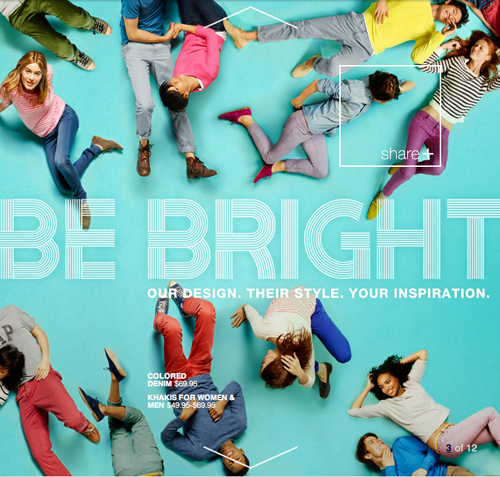
Spring’s around the corner- from a no sock and ice coffee perspective (New York’s been WARM) to an advertising and merchandising rollout. The color palettes are vibrant and have been populating the digital, print and TV airwaves since Super Bowl Sunday. Launching a new take on design, style and influencers, Gap’s tapped several bloggers and online personalities to showcase their latest collection. Have a look at Styld.by, the very sharable home for this execution.
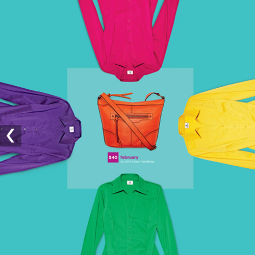
Continuing with the overhead vibrant theme, JCPenney’s recently launched an entire facelift, revealing a paired-down, optimistic, curated approach to shopping. The catalog is easy on the eyes with playful photography and bold typography.
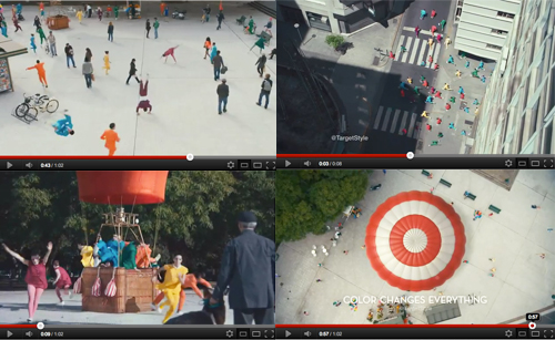
Tying the theme together, Target’s latest explosion of color spot reminds us all to get moving and douse our winter palettes with saturated hues.
http://www.youtube.com/watch?v=rMi5fFtye6o&feature=relmfu
Exciting to absorb, let’s hope the weather continues to follow suit.
Color: Hawt Pink

Hot pink is one of those amazing colors that I don’t want to taint by talking about. But coming off of a month-long project that allowed me to only look at kelly green, black and white, I had to balance my brain by giving “hawt” pink some love. For me, it’s the perfect accent: I incorporate it into my life as artwork on my walls and in my accessories, but remain muted in tone otherwise. I’m always amazed and impressed by people who can use it as a focal point and primary color. Check out these links and get your hawt pink on!
* * *
1. Silke Neumann Apartment | 2. Marcel Gomez Photo | 3. Aerial Views by Bernhard Lang | 4. Sølve Sundsbø for Vogue Italia | 5. Del Kathryn Barton | 6. Christopher Wool | 7. Street Style: Hot Pink Sweater
Coverage by Valerie Gnaedig
Trey Speegle
A unique mix of commercial and fine art has characterized Trey Speegle’s diverse career. Using one of the world’s largest collections of vintage paint-by-number paintings as raw source material, he draws inspiration from it as a “visual vocabulary.” In his work, Speegle explores themes of hope, love, longing, and loss by using affirmations, double entendre, and word play that resonate with a broad Pop appeal. The Texas-born artist was part of the 80’s East Village art scene, designing catalogues for art galleries, producing downtown club events and curated various shows. For 25 years, he art directed and designed for many publications such as Vogue, Vanity Fair and US Weekly.
In 2009, he collaborated with Anthropologie to adapt his artwork to a variety of decorative home objects such as gift soaps, plates, puzzles, pillows, rugs, and bed linens that were available throughout the United States and London. He was also commissioned by Stella McCartney to create a 18 X 32’ painting as a backdrop for her runway show in Paris in October of ’09. Smaller versions of the painting were also created for McCartney’s Los Angeles, New York, Paris, London and Beijing shops in April ’10.
Give & Get with Elizabeth Valleau
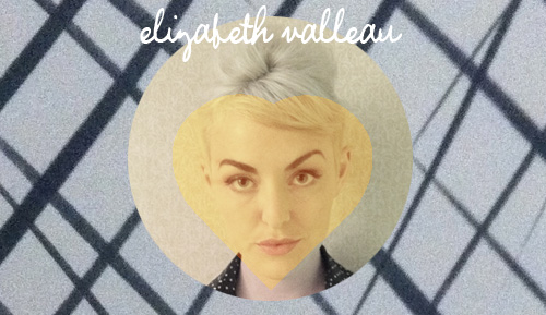
Elizabeth Valleau is a multitasker of the elite variety. A co-owner of Empire Mayonnaise, writer for Esquire and Creative Director at R/GA, it’s remarkable she’s able to juggle and execute with such taste and good fun. She also has a “ghost punk” band called OWWLS and hosts vintage superbowl parties on the weekend (for the commercials, of course)- which explains why she flat out does not sleep. Elizabeth’s warm, meticulous and artistic nature is reflective in her picks, have a look below.
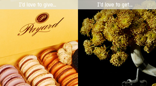
What Valleau Would Love to Give: I have a macaron problem, so this would hopefully be a gift to be shared. Payard is the best in NYC, IMO, and currently they are making TRUFFLE macarons! They are just the right combination of sweet and savory for a gentleman’s palate. And the delicate crunch followed by the smooosh of filling is so distinctive – it’s the sexiest pastry by far.
What Valleau Would Love to Get: I love flowers unabashedly. I think the act of enjoying a flower arrangement is something of a zen art – you can’t wear it, or consume it and it doesn’t last forever. You can only enjoy it’s beauty from a distance and for a short while. Currently Im’ obssessed with Amy Merrick’s arrangements. They are like paintings by a Dutch master. All time favorite is Emily Thompson Flowers. She did my wedding arrangements!
Press: Double Duty with Lifestyle Mirror

Lifestyle Mirror opened it’s beautiful doors yesterday, letting the world-at-large in to inspect. Unsurprisingly, the reviews have been good, very good. I got the opportunity to contribute and curate Sasha Levine’s story on utilizing furniture in small spaces. Was a fun collaboration, have a look.