Pattern Pulp

Leslie Friedman


Leslie Friedman was born in Providence, and while she currently lives in Philly, she still considers RI her home. During the summer of 2002, Leslie learned how to silk-screen at the basement printmaking workshop of the lauded arts non-profit, AS220. She received a BA in Political Science from Brown University in 2005 where she concentrated her studies in political theory and civil liberties. From 2005 to 2007, Friedman lived in Buenos Aires, Argentina, and built a printmaking studio in the historic neighborhood of San Telmo. She describes these years as fundamental to her maturation from poster maker to print artist. In the Fall of 2009, she began an MFA program in printmaking at the Tyler School of Art in Philadelphia.

Friedman’s alter-ego, LesliePVD, embodies the values embedded in Providence’s printmaking culture: the appreciation of industrial craft, the belief in DIY/punk ethos and the acknowledgment of the political and social historical significance of prints in promoting civil liberties. By blurring the line between rock n’ roll posters and fine art, LesliePVD aims to inspire spontaneous discussion and debate over complex contemporary environmental and social issues. Through humor, bold colors and collage, her serigraphs are funny, awkward, honest, expressive combinations of texture that awaken the democratic spirit.

Repetition Elsewhere: Patterns as Branding


I’ve been on the pattern-as-branding bandwagon for a while. When a company embraces a creative style, then infuses their branding, a la Hotel La Amada, the results can be more interesting than simply reusing a logo.

Christina Binkley expressed a similar sentiment in this weekend’s cover story for the WSJ’s Off Duty section, with the subtitle, “Prints of all shapes and sizes are replacing logos as a new way to signal a brand’s identity.”

It’s refreshing to cast a light on this part of the industry. Patterns in product development are a tremendous business, as is forecasting – from fashion to bedding to beauty packaging to digital experience, I could go on- textures are mood enhancing and tribe specific and something I’ve buried my nose in for the past 8 years. If you have a moment, be sure to have a look, it’s an interesting read.


Friday Quick Links!


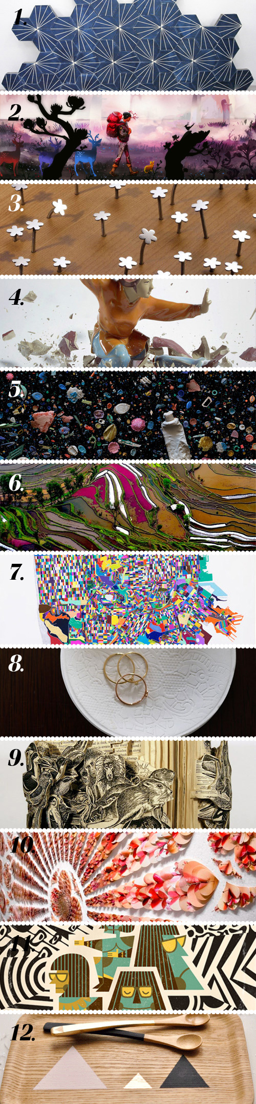
  1. 1. Fantastic ceramic tiles by Claesson Koivisto Rune for Marrakech Design via yellowtrace
  2. 2. Qian Yi blends modern digital painting with Taoist minimalism via Empty Kingdom
  3. 3. Thoroughly adorable flower nails via design*sponge
  4. 4. Martin Klimas’ photographs are taken the instant porcelain figures break via Trendland
  5. 5. Mandy Barker photographs plastic the plastic debris left on beaches via The Shiny Squirrel
  6. 6. Gorgeous photograph of rice fields in Yunna, China by Thierry Bornier via design for mankind
  7. 7. Jennifer Maravillas’ striking surrealist cartography via design-milk
  8. 8. Easy-peasy DIY clay jewelry dish via Honestly WTF
  9. 9. Amazing Cut book sculptures by artist Brian Dettmer via booooooom
  10. 10. Fascinated by David Adey’s pinned skin collages via This is Colossal
  11. 11. Digging illustrator & graphic designer Javier Garcia’s style via Grain Edit
  12. 12. Triangles on wood, a simple but striking DIY idea via Poppytalk

Coverage by Emily Gup


Andy Smith


Born and raised in Norfolk, Andy Smith studied illustration at the University of Brighton and the Royal College of Art, London. Graduating in 1998 he quickly established a client list of advertising, publishing and editorial clients including Orange, Mercedes, McDonalds, The Guardian, Expedia, Sony, Vodafone, Random House and Penguin Books, directing Run London a commercial for Nike in 2000.

His work combines illustration and typography to create images that have humor, energy and optimism and all are executed with a handmade, hand-printed, tactile feel. Quirky characters find themselves in absurd situations, often with a large piece of lettering nearby. When not producing commercial work for clients Andy can be found in the studio screen printing books and posters about Fatty, the Target People and the Hot Dog. He has exhibited in the UK, USA, France and Australia. He lives and pretends to work by the sea in Hastings, East Sussex. His favorite color is blue.

Accessories: The Pocket Square


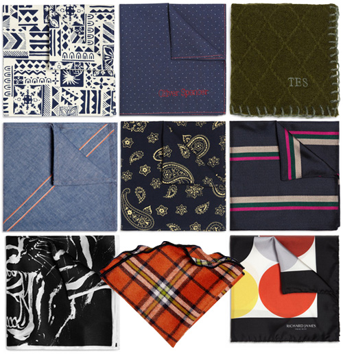
In celebration of Mr. Porter‘s first birthday, they’ve embarked on a collaboration with ten menswear designers to create a line of pocket squares.

The designs range from bold and artistic to subtle and patriotic. The designers include: Alexander Olch, Band of Outsiders, Drake’s, Horiyoshi the Third, Jean Shop, Oliver Spencer, Our Legacy, Richard James, The Elder Statesman and YMC.

I’d probably have the most luck getting my husband to wear this one. Which one’s your favorite?


Tracking Repetitive + Awesome.
On Instagram.