Pattern Pulp

Book Review:150 weekends in the US & Canada


Many of us equate the desire to travel with the exploration of the countries and cultures outside of our own North American borders. In this line of thinking, we often forget the rich diversity and nuggets of culture that fill Unites States and Canada. Since 2002, The New York Times has been offering up dream weekends with practical itineraries in its popular weekly “36 Hours” column.

The many expert contributors, experienced travelers and accomplished writers have all brought careful research, insider’s knowledge, and a sense of fun to hundreds of cities and destinations, always with an eye to getting the most out of a short trip. For this book, the Times has brought together new and updated versions of “36 Hours” columns in 150 U.S. and Canadian locations, from the great urban centers on everyone’s travel list to surprising locales with undiscovered character and charm.

The paths lead to fashionable clubs in Manhattan, blues joints in the Mississippi Delta, architectural treasures tucked in the Pennsylvania hills, the French America of Quebec, the seaside cliffs and Hollywood cool of California, and well beyond. For a taste of adventure and a veritable journey throughout the continent, explore 36 Hours in America.

 

Music: Die antwoord & Alexander Wang


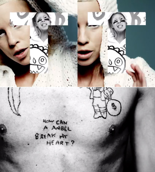
Just stumbled upon the Die antwoord & T by Alexander Wang Spring ’12 collaboration thanks to my friend Lauren‘s Facebook feed. I love the beat, the graphics, the typographic splicing.

The video feels like a print editorial come to life and features their new single, Fatty Boom Boom. Here, have a look:

What do you think, well done?


Kevin Van Aelst


The talented and innovative artist, illustrator and photographer Kevin Van Aelst creates extraordinary images out of everyday objects. It wasn’t until his B.A. studies in psychology at Cornell University when he began exploring his artistic side. Taking a gamble on his burgeoning love for photography, he went on to complete a M.F.A. in photography from the University of Hartford, where his work flourished.

Van Aelst is a 2008 recipient of the Connecticut Commission on Culture and Tourism fellowship grant, and has been commissioned to create art for such publications as TimeMen’s HealthGQBusiness WeekFast Company, and Scientific American. His photo illustrations can be seen every week in the New York Times Magazine. He has taught photography courses at the Hartford Art School, Middlesex Community College, and currently at Quinnipiac University and the ACES/Educational Center for the Arts in New Haven, Connecticut.

“My artwork is an attempt to reconcile my physical surroundings with the fears, fascinations, curiosities, and daydreams occupying my mind. The photographs and constructions consist of common artifacts, materials, and scenes from everyday life, which have been rearranged and reassembled into various forms, patterns, and illustrations. The images aim to examine the distance between where my mind wanders to and the material objects that inspire those fixations. Equally important to this work are the “big picture” and the “little things” — the mundane and relatable artifacts of our daily lives, and more mysterious notions of life and existence. This work is about creating order where we expect to find randomness, and also hints that the minutiae all around us is capable of communicating much larger ideas.”

Color: Today I'm Feeling Turq


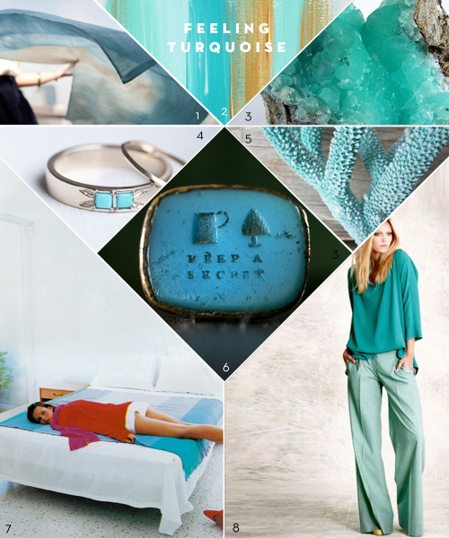
This week, I stumbled on Pentagram‘s project from December, “Today I’m Feeling Turquoise“, and all I could think was, “Hey Pentagram! You took the words right out of my mouth!”. All that has caught my attention this week has been robin’s egg blue and turquoise. Maybe spring is in the air (or maybe it never left with this crazy New York non-winter), but I’m really feeling the revival of these sunny, springtime blues.

   *            *            *

1. Scarf Shop | 2. Cocoa And Hearts Paintings | 3. Turquoise Mineral Rock | 4. Mociun Custom Turquoise Wedding Band | 5.Coral | 6. Keep A Secret 19th Century Wax Seal Ring | 7. Vogue Paris Spread from 1998 | 8. Piazza Sempione Resort 2012

Coverage by Valerie Gnaedig


Set Design: Puma's Olympic Wear Preview


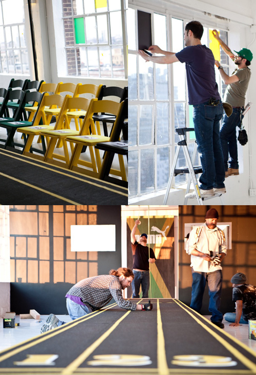
We’ve got a huge treat for you today! Lesley Morphy recently worked on the PUMA International press launch for PUMA Cedella Marley (Bob Marley’s daughter) Olympic Wear Collection. The coverage on the collection will run this summer, but Lesley’s been kind enough to share the creative process behind the fashion show and set design with all of us.

PP: So tell me about the project…

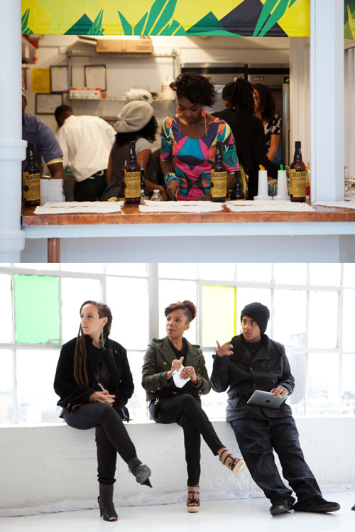
LM: PUMA International PR hosted a global press launch for long-lead international fashion, lifestyle magazines. Editors from top-tier magazines were invited to preview the PUMA Cedella Marley (Bob Marley’s daughter) Olympic Wear Collection.

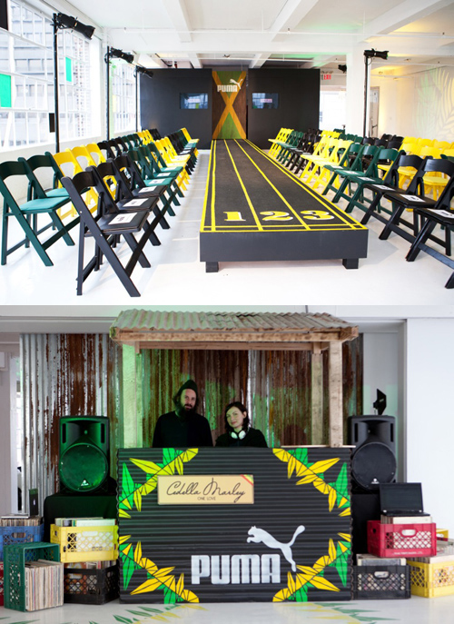
It included a fashion show, had an open bar and was catered by Miss Lily’s and the music was hand selected by the Marleys and played by one of New York’s hottest DJ’s: Queen Majesty.

PP: The assignment?

LM: To design a Jamaican inspired fashion show, clothing display, dj booth and time line as well as create a Jamaican vibe in an a New York Studio space.

PP: How did you solve it?

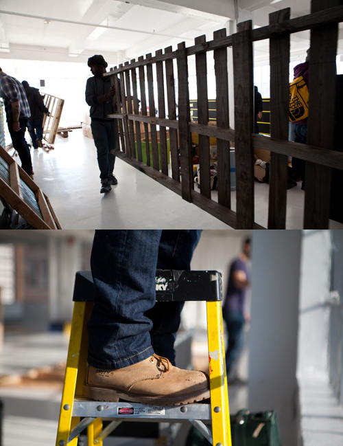
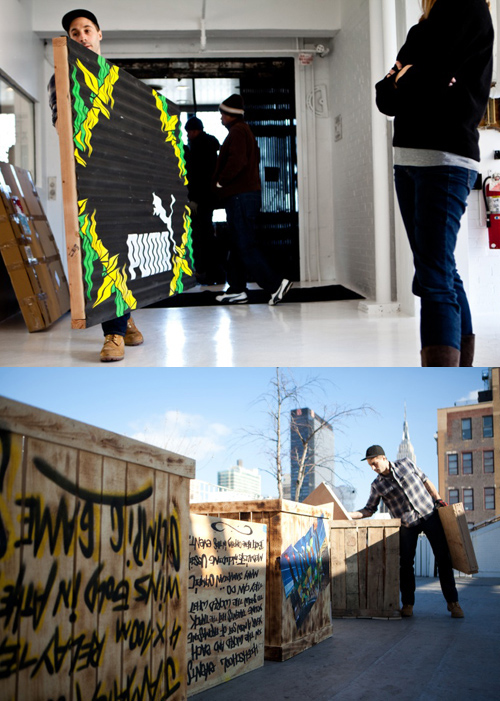
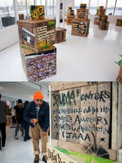
LM: I embraced the three colors of the Jamaican flag and did a lot of research on Jamaica. I gravitated towards woods, corrugated metals, graffiti. I also took graphics from the fashion line and applied them to the event space by using decals.

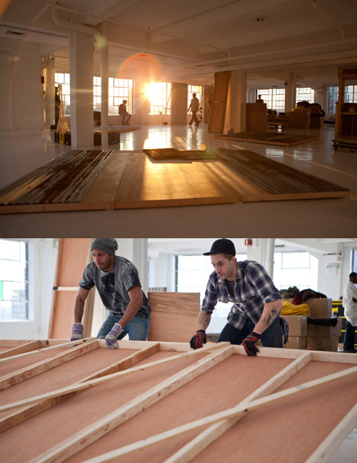
The client (PUMA) wanted to tell the story of its longstanding relationship with Jamaica, and I wanted to approach this in a unique way – so we took old reclaimed woods and built crates and graffitied them with facts about PUMA and Jamaica. We wheat pasted all the imagery. It was a unique way to tell a story and stay true to the concept, I really wanted to stay away from traditional boring boards.

PP: What did you find challenging about the assignment?

LM: The big challenge, as always, was time and money. Cedella Marley came for her walk through an hour before the event started, and I was covered in wheat paste, paint and applying decals to the floor behind her. We were literally making art till the doors opened. Luckily she was cool with it!

PP: Who helped you bring the vision to life? Did you hire a team?

LM: I hired an amazing team of local artists and builders. It was really cool assigning specific tasks to the specific talents of each artist involved.

To see the clothing, you’ll have to sit tight, everything will be released to the public a little closer to Olympic time.

Coverage by Lesley Morphy


Patterned Packaging: Japanese Sake


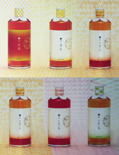
Off the heels of the last post, I wanted to share an ad I’ve been holding in my inspiration arsenal for a while. It’s a print advertisement for a line of Japanese Sake (sadly I don’t know the brand), beautifully packaged and branded with geometric texture.

On my last trip to Kyoto, I returned with many printed documents- this was one of my favorites. As you can see, the bottle and design could double as makeup or even perfume packaging. You could even make a baby blanket if you wanted. What do you think?


Tracking Repetitive + Awesome.
On Instagram.