Pattern Pulp

Cross-Pollinating your Gradients


Finding a connection between the digital and physical spheres is a never-ending hunt for today’s forecasters. Whether you’re comparing the symbolic differences between RGB or CMYK or simply finding inspiration in either execution, important observations can be made when considering how one medium influences the other.
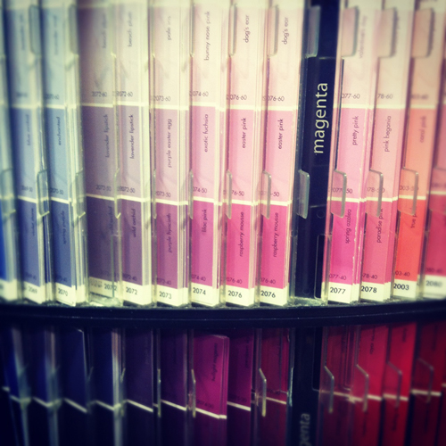
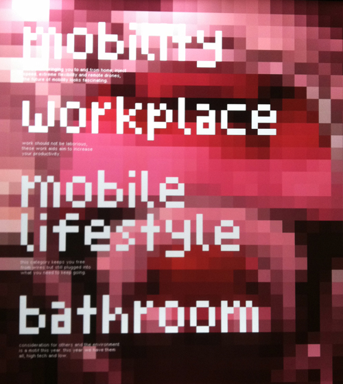
Here we have a pixelated display at the Red Dot Design Museum in Singapore. A blurry screen becomes textured art and the type conjures up early 90’s atari. If you follow our line of thinking and view Benjamin Moore’s paint chips immediately after, it’s easy to make a connection- they’re strikingly similar, but hold opposing conversations (and purposes).
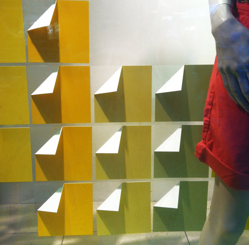
Now let’s move to the commercial realm. This is window display from the GAP on Fifth Avenue. It’s extremely economical- paper’s been folded and arranged in a grid. The gradient is the storyline and compliments the clothing.

Moving along to packaging, this method was recently the result of Sephora’s beauty collaboration with Pantone Universe. Pixels are again the focus. Mimicking the diversity within skin tones, the packaging amplifies the face and focuses on color, making us wonder if CMYK really wishes it were RGB.


Clever Seating for Creatives


I’m constantly reviewing photos from past travels. Whether I’m pulling a story together related to art, mosaics or trends, everything’s mentally cataloged. Today I figured it was time to do a stool round up.

Lately, cushions from the US seem to fall into one of two categories: neutral and organic or vibrant and geometric.

If you hop across the Atlantic (or perhaps the Pacific) though, you’ll notice that designers abroad are a bit more playful.

From this clever needlepoint top at Milan’s La Rinascente department store to these glitter-covered tree stumps at Bensimmon in Paris to this sad emoticon in Tokyo, to this Helsinki technicolor stool, all examples illustrate how to brighten up a home with a little unexpected character.


Graffiti as Art with Joachim Ixcalli


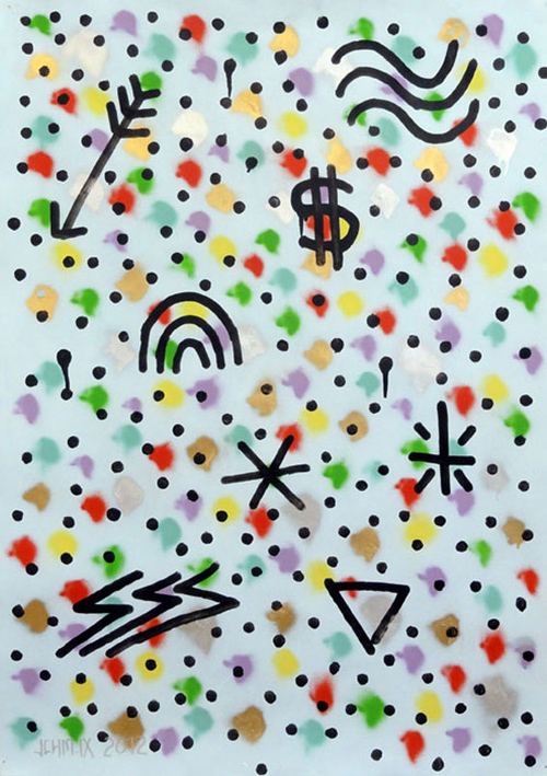
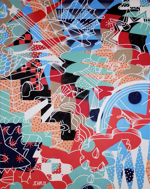
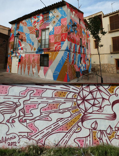
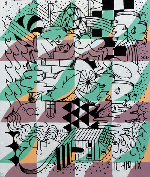
Barcelona is teeming with talent. The creative vibe is a recognizable one, as we’ve been receiving submissions over the past four years that collectively speak to a singular street-inspired tone. Today we’re adding updates to Joachim Ixcalli’s profile.

Originally from California, but currently living in Spain, Joachim, 29, incorporates a mixture of patterns and overlapping textures into his drawings and painted murals.

Combining icons, popular dialogue, Pacific-Mediterranean influences and illustrations to mirror relevant themes of our time, each work leads us through a maze of decadent illustration.

The upbeat nature of his work has commercial appeal, as Joachim’s palettes and playful layouts remind us of other Pattern Pulp favorites: Mike Perry, Geoff McFetridge, Emil Kozak, Nasa* and Flavio Melchorre.


Friday Quick Links!


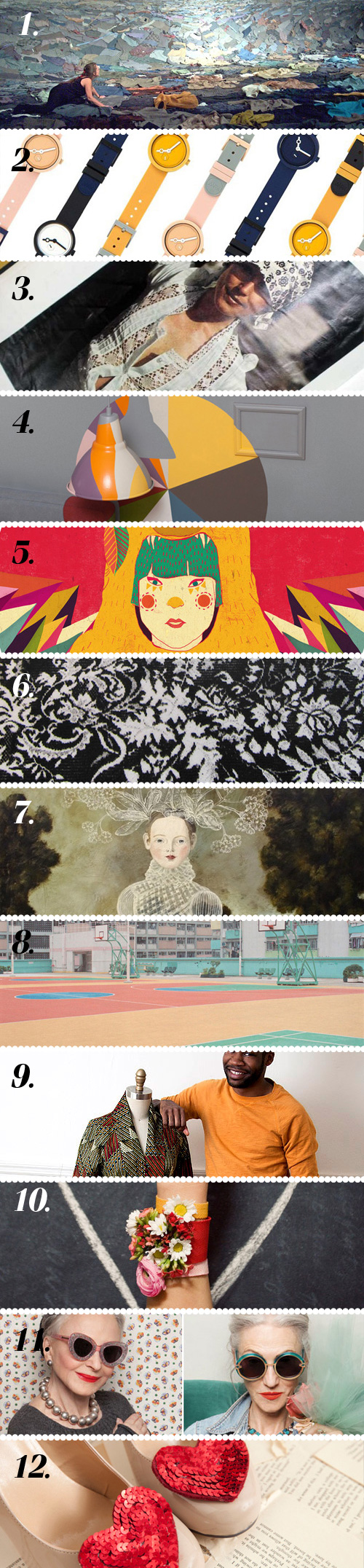
1. Hundreds of second-hand shirts used in Kaarina Kaiakkonen’s work Colossal
2. Digging everything about AÃRK Collective via Miss Moss
3. Looking through the archives of Laura Ashley via Style Bubble
4. Fascinating physical pie charts via Plenty of Colour
5. A fan of Diela Maharani’s psychedelic illustrations viaPatternbank
6. Persian rug created from 2 tons of refined sugar via Jeannie Jeannie
7. Beautiful artwork from Anne Siems Art Hound
8. Probably not the sport courts you’re used to seeing via The Fox is Black
9. Great interview with fashion designer Reuben Reuel via design*sponge
10. Super cute DIY floral friendship bracelets via Oh Joy!
11. Fabulous lookbook for Karen Walker’s Summer 2013 collection via Honestly WTF
12. Adorable DIY shoe clips for Valentine’s Day via ModCloth

Contributed by Emily Gup

Friday Quick Links!


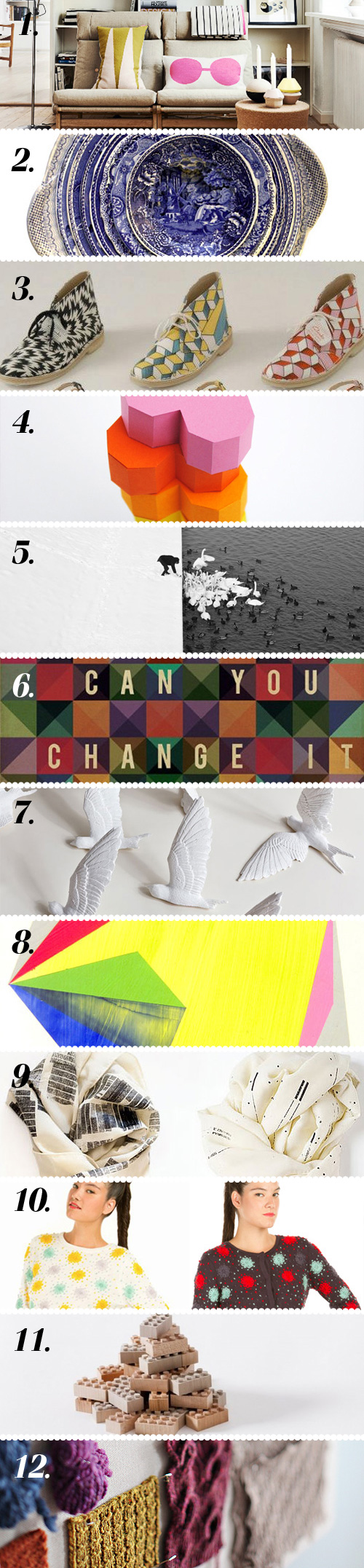
1. Digging the goodies in OYOY’s spring preview via Poppytalk
2. In love with Caroline Slotte’s layered ceramic dioramas via The Jealous Curator
3. Hankering for these Eley Kishimoto desert boots for Clarks via Style Bubble
4. Make your own boxed geometric heart via MinieCo
5. A man feeds swans in the snow via Colossal
6. “Favorite worst feedback” turned into posters – brilliant! via swissmiss
7. Telling time with swallows via Yatzer
8. Fantastic color in Jeremy Rabus’ Prismatic series via Design Crush
9. Lovely textiles from Israeli designer Lee Coren via Miss Moss
10. Behind the scenes with Opening Ceremony’s Resort via Opening Ceremony
11. Charmed by these wooden legos via Jeannie Jeannie
12. Studio tour of Brooklyn Tweed via design*sponge

Contributed by Emily Gup

MSGM's Pythagorean Theorems


Every once in a while I like to check in and see the trunk shows on Moda Operandi, as they’re beautifully curated and a window into what will be hitting the store shelves. Today’s presentation from MSGM is fantastic.

Reminding us of Megan Geckler’s 8-bit art series, Christopher Kane’s random stripes and Marni’s use of translucent color blocking, the patterns and unexpected details are sophisticated and experimental.

The camouflage, plaids and florals remind us that the underlying basics are intact, though they’ve been manipulated to keep themes fresh. If I had an unlimited budget I’d scoop up the entire collection, as it’s a beautiful example of fashionable art.


Tracking Repetitive + Awesome.
On Instagram.