Designers have a love/hate relationship with the pixel. We dislike being called pixel pushers, yet glorify the square throughout our work- whether it’s a conscious celebration (like in today’s feature), or a small part of the greater landscape.
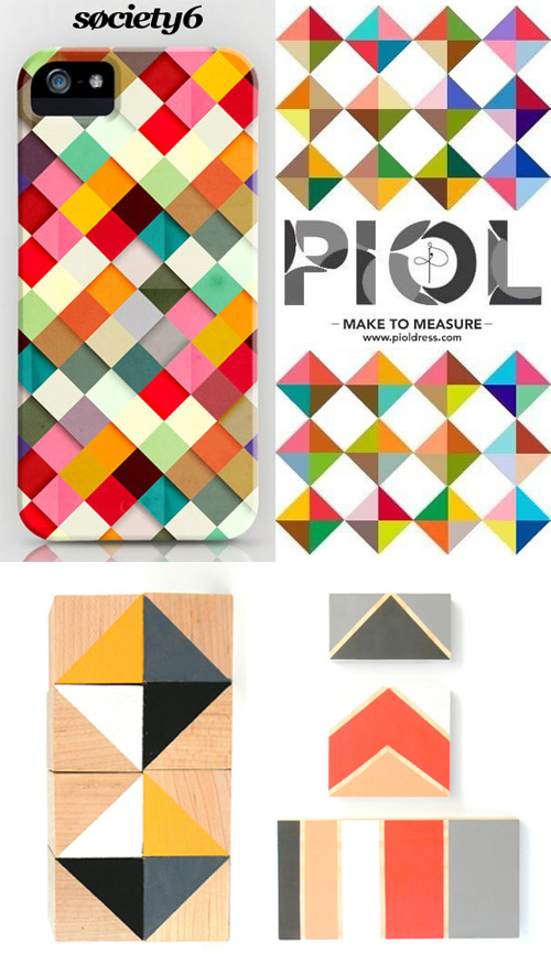
We’ve been tracking the life cycle of this motif for a long time, as it’s a geometric staple that’s never going away. What’s interesting though, are the vectorize alterations and evolving color palettes. We started picking up on the trend from Matt W Moore’s murals a few years back, then watched the corporate giant, Chase bank jump in on the action. Percolate then released iOS wallpapers in deep jewel-toned palettes, and now we have pastel grids from Society6, Piol and Squared Array.
The top two designs double as web banners, which is fairly unique in the digital ad buying world. Both caught my eye before starting in on the content…though someone like me may be a bit skewed. The punch of color and linear movement stands out in the sea of model and type heavy advertisements. Big fan over here.