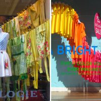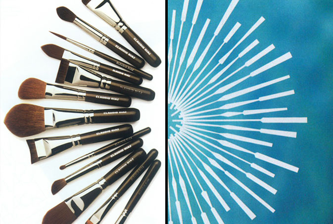
Circular bursts serve as inspiration for countless campaigns and logo layouts. Be it corporate, luxury, indie or budget, there’s something subconsciously wholesome about a round shape that nearly everyone is drawn to. One of the reasons we’ve chosen to focus on Claudio Riaz’s make up brushes from Barney’s summer catalog and the Viceroy Hotel logo, which was appropriately placed in Ocean Drive, is that these two layouts, while wholly unrelated, make perfect visual sense when placed beside each other. Unintentionally, both images speak to the luxury traveler who considers themselves a minimalist. Add Levi’s Go Forth art to the mix and your younger sister and her camp friends have suddenly joined the graphic vacation. What’s the take away? Essentially, you’re halfway there if you choose the appropriate line quality, color and photography for your spherical identity.