Pattern Pulp

Follow up: Haute and Hebraic


adamcourtney-pattern-pulp2

Having graphic design roots, I’m naturally drawn to typographic patterns.  From Visa’s go campaign to Adelaide’s West Village furniture selection to Ross Menuez’s summer ’09 dresses, it seems as though artists from all over the world are proudly showcasing their language of choice. Today’s post highlights the work of Adam Courtney, the photographer who shot this intricate and incredibly cool shirt. While there’s a possibility that this Hebraic adaptation ventures into sacrilegious territory, I’m curious what text was chosen and feel it’s important to note the commercialization of the Torah’s holy scriptures. Nothing’s off limits these days, and line-blurring across categories will most likely continue as artists use the internet to share and distribute content.

chai-shirt-patternpulp copy

Lest we forget the ladies! This ‘To Life’ blouse from Built By Wendy merges Chinese style hebrew characters with hipster chic for a modern take on Jewish fashion.

Image sent by: Lauren Epstein

Artist Profile: Michiel Schuurman


Michiel-Schuurman-patterns

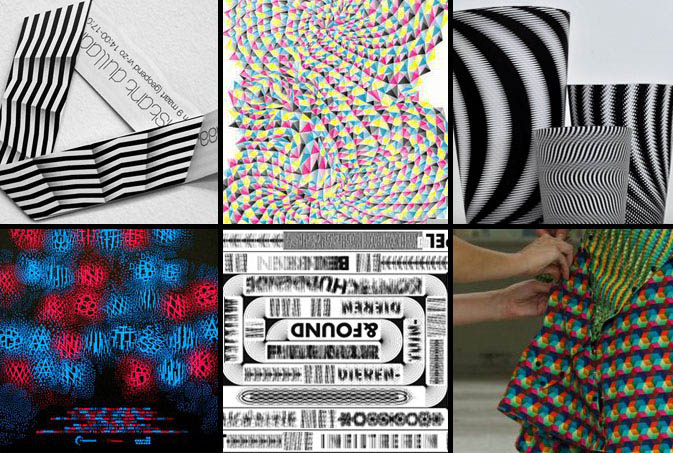
Printed 3D optics are a tricky feat for any designer to master. Add color, texture, type and a degree of unpredictability and you’ve arrived at the blogosphere’s latest darling, Michiel Schuurman. Schuurman’s ability to weave mathematical precision into beautiful, maze-like graphics sets him apart from his peers, as each design looks like a modern day M.C. Escher illustration. Aside from his obvious creative merits, it’s a trendy time to be a kaleidoscopic connoisseur, as evident from the geometric work of Alexander McQueen and Simon Page. We’re eager to see what’s next for Schuurman, as his recent marketing experience will certainly prove useful once his Grafimediatechnologie internship ends.

Typographic Story Telling


visa-2

Visa’s most recent advertising campaign is the company’s first stab at going global. Who would have though it would’ve taken this long to send a singular message under one corporate umbrella?  Merging lifestyle concepts with playful typography, each go spot taps a local audience, incorporating pattern-appropriate themes. Interestingly, the international commercial, Gofesto weaves several adventurous concepts throughout a one minute reel, taking their viewer on a Visa inspired journey.  The thirty second American spot, entitled Aquarium, simplifies this journey with the use of emotion and special effects.  Though the reel has a beautiful kaleidoscope theme throughout, we wonder if the Disney formula was applied, as this spot seems much like a summer tralier.

visa3

All of these concepts (in addition to a few others) were executed by Chiat Day and can be found on Visa’s corporate website.

Trend: Type Remix


type-remix

The assemblage of letters and words is fascinating.  As children, we create our own mechanisms to communicate, then hone our craft and cognition skills as we age.  In recent weeks, there appears to be a visual unraveling of this basic foundation for which our society functions.  The results have been playful, though somewhat symbolic of confusing times. “This reminds me of when you’re tongue-tied and everything you want to say becomes sort of mush in your head. Or when you think you know what you want to say but completely forget,” says Pattern Pulp contributor Emily Gup.  Marina Camargo’s falling content was recently spotlighted on Swiss Miss and presents a surreal image of lost typography.  In real world time, these matching typewriter chairs are a curious window display at the high-end vintage furniture store Adelaide, in the West Village of Manhattan.  In the gaming and digital corner, Morisawa of Japan has created the addictive character game, Font Park, where beautiful calligraphy can be formed by disfiguring character symbols.

bergdorf-moma

In higher stake markets, scrambled letters are also catching on.  Bergdorf Goodman’s March window display showcased a backdrop of mismatched letters behind highly stylized mannequins.  A few blocks south at the MoMA, the just opened exhibition, Tangled Alphabets presents León Ferrari and Mira Schendel’s combined work over the later half of the 20th century.  Ferrari and Schendel’s joint collection addresses language as a major visual subject matter, encompassing the body, voices, words, gestures and metaphors for naming and writing trends.  Back downtown on Mott Street, I Heart NYC’s store signage is a retail reminder of Camargo’s work.

[youtube=http://www.youtube.com/watch?v=toWFvXHghDk]

Camille Utterback’s Text Rain interactive art installation from 1999 is quite mesmerizing, not to mention amazing, considering the technology was fairly rudimentary ten years ago.  For an afternoon laugh, check out the Prudential game Falling Words, as it’s a marketer’s lighthearted stab at releasing negative thoughts that people rarely share.

Fashion: Text Heavy Threads


venacava-salvorprojects

Is a picture still worth a thousand words if it’s a literal reproduction of organized type? While perusing the spring collections at Barneys and Blue and Cream last week, Vena Cava‘s heiroglyphics dress made a few notable uptown and downtown appearances.  For well established brands, this feat is a walk in the park, though it’s notable to highlight the versatility of this young American label, particularly when company buyers have clamped down on their retail collections.  Applying similar typographic methods, Ross Menuez, the founder of Salvor Projects, incorporates digitized text to create a vertical ticker of information.  This gray on gray stream of characters is a subtle reminder of the communication chaos that’s circling us on a 24 hour basis.

[youtube=http://www.youtube.com/watch?v=Pkyw4JTh19U]

This vintage m ss ngp eces video highlights Menuez’s creative process, an interesting watch with timeless appeal- one of many captivating shorts produced by Cool Hunting.

Tracking Repetitive + Awesome.
On Instagram.