Pattern Pulp

The Homemade Montage


We’re all familiar with facebook’s photo narrative. Your friends upload a few images and shortly thereafter it appears in your livestream. The images are often disjointed and location-based and sometimes skewed with a vintage or poloroid filter. Moments after, you’re on to the next distraction. It takes a hint of creativity to really convey a message, stop you in your tracks and make you dissect the layout. This poloroid collage from the blog, Don’t Touch My Moleskin, does exactly that with it’s hipster meets Urban Outfitters angle. Using mixed media techniques and interesting photography, the larger layout is pieced together, trusting the audience to fill in the blanks. Tapping this mosaic method yet going in an entirely different direction, Theme Magazine proves busy isn’t always bad. With the right combination of line, color and repeat, the eye will connect the dots, making sense of the story.
Trend: The Power of Three


When it comes to social thought, the number 3 holds mystical powers. Be it positive or negative symbolism, it’s nothing new to watch humans get worked up over this symmetrical digit. Over the past year, many people have been forced to reevaluate their priorities. In doing so, basic principles have been challenged, causing many to revisit their decision making process, not two but three or more times. Unsurprisingly, the creative community has reacted with stark and compelling imagery, representative of this repetitive and sometimes obsessive nature.

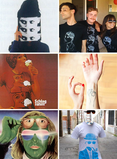
From this autumn ’09 spread in Theme Magazine, highlighting the Perks and Mini cultural movement of the ’80s and ’90s to this retro German ice cream ad conjuring up Playboy imagery, to this illusionary sunglass shot from Justin Blyth’s photo blog, Them Thangs, all of these archival images have recently resurfaced and inspired a new wash of designs over the past year.

These black and white portrait illustrations capture one of pop culture’s rising fashion stylists, Amy Stearley, proving the taste makers are on board and running with this trend. Using crisp photography to illustrate Sylvia Farago’s tattoo art, The Selby captures his subject, combining 2D and 3D story lines. Bringing this concept full circle, Philip Tseng‘s t-shirt design, The Invisible Gentleman for Threadless.com proves one doesn’t only look back, but looks back and then re-configures the situation or scene. Like today, innovation comes in reconsideration and re-evaluation.

By: Shayna Kulik & Kelsey-Lee LeGassick

Follow up: The Spherical Formula


Spherical designs are so common they probably deserve their own “feature” button on Pattern Pulp. That being said, it’s important to identify with designs that speak to you, as having a discriminating eye can help sift through the clutter.  Both of these layouts share a similar palette and emit a playfulness that’s easily transferrable for commercial use. In the latest issue of Theme Magazine, Peter Sutherland curates a stunning layout inspired by the spirit of freedom. This photo, shot by Hannah Whitaker, is a true embodiment of this concept. Paralleling this theme, Valentino’s recently released book, A Grand Italian Epic, converts a typographic pinwheel into an iconic status, the perfect symbol for a timeless brand.

Color: Transitional Textures


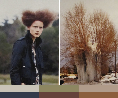
It’s easy to forget what time of the year it is with temperatures in the high 50s and low 60s this Fall/Winter season. While the general public is reveling in America’s extended summer, retailers are glued to their weather widgets, hoping winter will make it’s debut, triggering shoppers to open their wallets again. Along with transitional skys, we’re noticing a shift to muted palettes as designers and stylists seek inspiration from the bare essentials. Both of these Theme Magazine layouts provide paralleling imagery, proving textures come in all shapes and sizes, be it a Prada-inspired hairdo or an ice-ridden tree.

Trend: Sweet and Savory Details


motoi-yamamoto1

No matter how detail oriented you are, Motoi Yamamoto will still beat you to the punch.  Using salt and an extraordinarily steady hand, this Japanese artist merges organic influences with the most basic of natural elements, salt, to his build his masterfully intricate installations. Yamamoto’s work has progressed from an inquiry on death to the exploration of salt as a meditation on life. “Now I believe that salt enfolds the memory of lives…salt is used across culture as an antibiotic, preservative, and purifier.  Salt is a life-sustaining element.”  For the full story on Yamamoto’s work, pick up a copy of this month’s  Theme Magazine– unfortunately the online version omitted the story.

bantjes-cartier

It doesn’t take long to see techniques reinterpreted and trends take hold when an artist gains global acclaim. Using sugar in place of salt, Marian Bantjes, a typography genius, illustrates a variety of styles for Stefan Sagmeister’s book, Things I have learned in My Life So Far.  Infusing a touch of luxury to this trend, Cartier crafts golden fingerprints for thier latest ad campaign, Trinity, which can be found in Time magazine’s April supplement entitled, Fashion’s New Attitude.

Tracking Repetitive + Awesome.
On Instagram.