Pattern Pulp

The Colors of Summer


Living in New York, you can hardly ignore The New York Times and The New Yorker. I find both publications to be really enjoyable, not to mention illustratively informative and telling of the trends. A few weeks ago I pinned an Olimpia Zagnoli illustration from The New Yorker’s literary section. The simplicity in line, color and shape is reminiscent of patterns I personally enjoy. Fast forward to this past weekend, and The New York Time’s Book Review had an awfully similar layout. At first I wondered if it was an oversight, or perhaps a form of flattery, but after a little research, it looks like Zagnoli’s the artist behind both illustrations, proving this aesthetic and palette will be a summer literary mainstay.


Book Review:150 weekends in the US & Canada


Many of us equate the desire to travel with the exploration of the countries and cultures outside of our own North American borders. In this line of thinking, we often forget the rich diversity and nuggets of culture that fill Unites States and Canada. Since 2002, The New York Times has been offering up dream weekends with practical itineraries in its popular weekly “36 Hours” column.

The many expert contributors, experienced travelers and accomplished writers have all brought careful research, insider’s knowledge, and a sense of fun to hundreds of cities and destinations, always with an eye to getting the most out of a short trip. For this book, the Times has brought together new and updated versions of “36 Hours” columns in 150 U.S. and Canadian locations, from the great urban centers on everyone’s travel list to surprising locales with undiscovered character and charm.

The paths lead to fashionable clubs in Manhattan, blues joints in the Mississippi Delta, architectural treasures tucked in the Pennsylvania hills, the French America of Quebec, the seaside cliffs and Hollywood cool of California, and well beyond. For a taste of adventure and a veritable journey throughout the continent, explore 36 Hours in America.


Fashion: Florals Getting Fierce


As temperatures rise in Manhattan, it truly feels like summer’s around the corner. Fashion editors, publishers and retailers are simultaneously feeling a collective green thumb, as saturated florals flood the marketplace. Deep, vibrant blossoms are appearing on everything from home goods to branded merchandise. This Velvet Due chair slipcover, which was recently highlighted in the design issue of the New York Times Style Magazine, was created by Ken Scott, and  is the epitome of psychedelic wonderment.

Merging Americana themes with Japanese style, Barbie‘s most recent collaboration with Comme des Garcons presents a gridded floral pattern entitled, Jingle Flowers. Whether you’re pairing magenta with turq, yellow or black, you won’t go wrong with any of these combos, as this all-star color palette is ushering in summer with broad strokes and intricate details.

Budget: Taping Spaces


taping-spaces-patterns

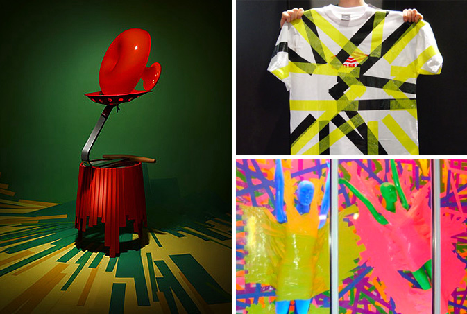
Budget slashing has forced artists, retailers and marketers across the globe to get creative in finding lower-cost solutions to advertise their wares.  Be it a rummage in the craft bin or a simple play on words, trend-setters such as Anthropologie and Barneys have proven less can be more when the concepts are strong. Today we’ve chosen to focus on tape as a decorative way to enhance a creative message.  Earlier this summer the malleable nature of this medium was incorporated in the Color Forms layout featured in the New York Times Magazine where the photographer chose to compliment this Matryoshka table with vibrant colored floor striping.  Applying similar energy and stiff color blocking, this repuposed Umbro t-shirt from 2006 reveals that DIY done right can update any brand.  Using color, function and a healthy dose of sexy, Marc Jacobs has created one of the simplest and most striking window displays on New York’s Bleeker Street, proving that duct tape can work for even the most innovative designers.

Trend: Framing the Conversation


Frame art has gotten a lot of airtime over the past few years.  From global recognition in the fashion world (see Tokyo streets and London runway), to providing a polished edge in home decorating, the familiar gilded border is experiencing a welcome role reversal.

A recent New York Times discussion of the Met’s current exhibition, The Pictures Generation (1974-1984), recognizes that Allan McCollum’s installation, Collection of Forty Plaster Surrogates, heightens a viewer’s awareness simply by highlighting the unexpected.  “McCollum’s works were not presented as decorative accessories or social commentary but as physical signs of the mechanical drives of existence—of repetitious behaviour and patterns of market-based relationships.”

Drawing inspiration from this trend, Lisa Rengtsson, a young designer from Sweden, has created wallpaper designed to frame personal moments and details from everyday life.  Entitled, Familjen,this pattern provides the structure for artsy types to create their own visual diaries.

Furthering the concept of the visual diary, this examination wouldn’t be complete without the inclusion of Todd Selby, the extraordinary photographer and illustrator behind the website, The Selby.  On a weekly basis, Selby profiles interesting people within their own creative spaces.  This photo, for example, highlights Francois Curiel, the European Chairman at Christie’s Auction House.

Additional contributions by: Nicoletta Granati and Jennifer Machiavera

Tracking Repetitive + Awesome.
On Instagram.