Pattern Pulp

More Tidbits from Singapore


noisesingapore_art_patternpulpflockcafe_singapore_patternpulpbooks_actually2_singapore_patternpulpbooks_actually_singapore_patternpulp2tiling_singapore_patternpulp

Last week I did a few short overviews, highlighting the spots I visited in Asia over the holiday. As I was combing through photos last night, I figured it might be nice to share more visuals and points of inspiration.

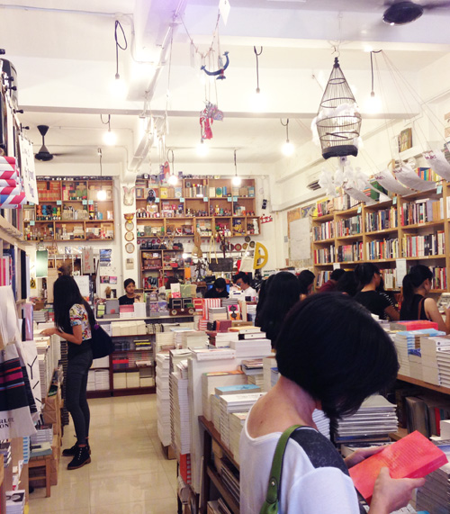
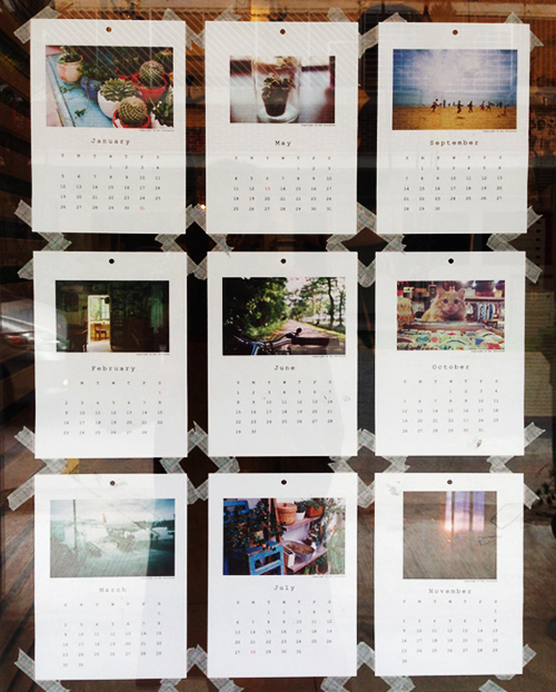
Books Actually is such a special bookstore. The owner does a wonderful job including local talent and curating authors and artists from around the world. Here’s a shot of the space and some art surrounding the store. On the inside of the front door, this photographic calendar was taped to the glass- a casual presentation that seems harmlessly cool, but in reality is a big deal for the perfect, clean-cut nature of Singaporean retail.

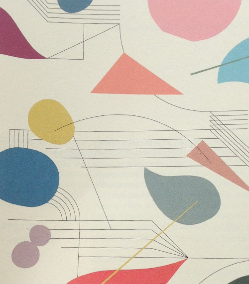
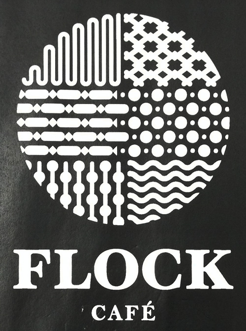
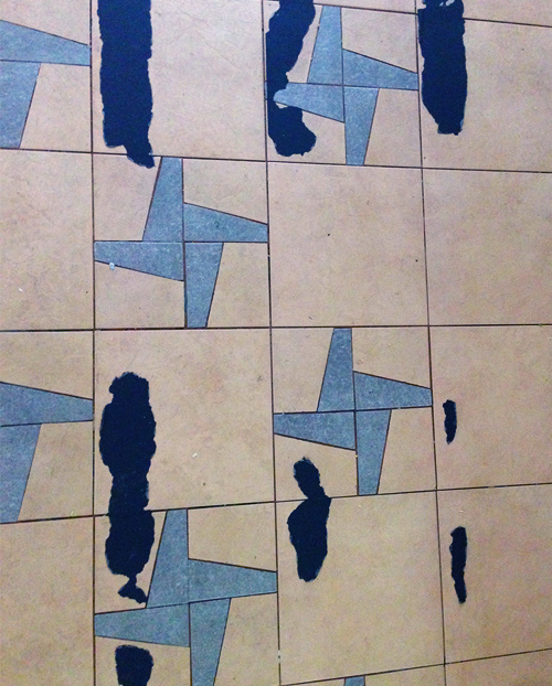
The pastel pattern at the top is a promo piece for Noise Singapore, a festival devoted to the 35 and under art world. It’s nice to see that they’re beginning to cultivate and celebrate homegrown talent (finally). Then, there’s decaying tile (which I’ll always be a fan of) and the Flock Cafe logo…it’s fabulous. Subtly bold with a patterned collage, my type of branding.
 

Around the Globe, Visiting Singapore


singapore

If you do a compare/contrast of Singapore’s creative class over the past few years, there’s been significant leaps and bounds. My brother and sister-in-law (and now baby) moved there three years ago, and over time and yearly visits, I’ve slowly watched the pages turn. Things finally feel different, like design (beyond the brand) and the appreciation of innovation is weaving it’s way into side streets, cafes and local services.

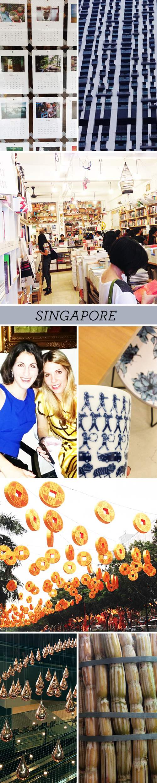
Makes sense, right? An economic and business hub can only cater to a singular culture for so long before expats and international influences mix things up. I think my brother-in-law, Steven, would agree that creatively, Singapore’s evolving into a melting pot of new ideas, catering to more than just food. Here are few photos from Books Actually, some public housing that looks architecturally interesting, Chinese New Year preparations, my sister-in-law and I on New Years Eve, sugarcane at a Hawkers Center and the most beautiful moving drop display I’ve seen at an airport.


Marni: Brooches, Bags & Merchandising


marni_broach2marni_ brianreamarni_accessorymarni_retail_singapore

I was in Singapore last month visiting my in-laws and their beautiful new baby, and during some down time, I popped into a few malls to check out the merchandising. Surprisingly, Takashimaya wasn’t as posh or put together as I was expecting. The care and perfection that’s adhered to in Japan seemed a bit lost on Orchard Road. After wandering across the street, attempting to avoid the ice cream vendors, I ended up at the Paragon Shopping Center, which was a sleek alternative, and an interesting window into the world of manicured luxury shopping in the east.

Though I did most of my browsing and purchasing at Muji, I gushed over every last accessory at Marni. Personally, it’s one of my favorite brands. There’s a sophisticated quirkiness to every collection that really resonates. The shopgirl wore her insect brooch in a very clever tomboyish way. It was so fabulous and unexpected, I asked her to pose for me. Also, Brian Rea’s collaborative pieces looked great in person and the space-age vibe of the overall layout felt somewhat modular in a web template kind of way.


Cross-Pollinating your Gradients


Finding a connection between the digital and physical spheres is a never-ending hunt for today’s forecasters. Whether you’re comparing the symbolic differences between RGB or CMYK or simply finding inspiration in either execution, important observations can be made when considering how one medium influences the other.

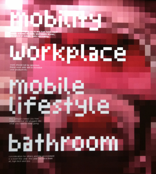
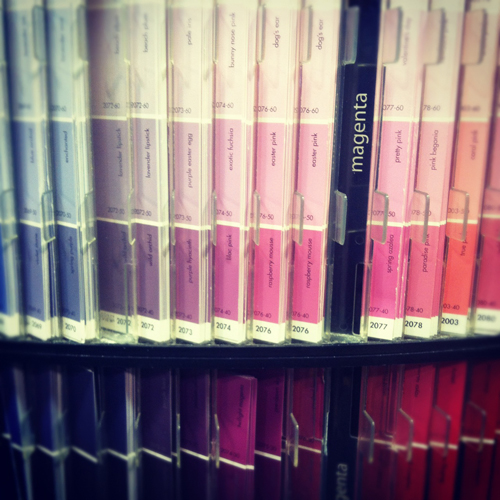
Here we have a pixelated display at the Red Dot Design Museum in Singapore. A blurry screen becomes textured art and the type conjures up early 90’s atari. If you follow our line of thinking and view Benjamin Moore’s paint chips immediately after, it’s easy to make a connection- they’re strikingly similar, but hold opposing conversations (and purposes).

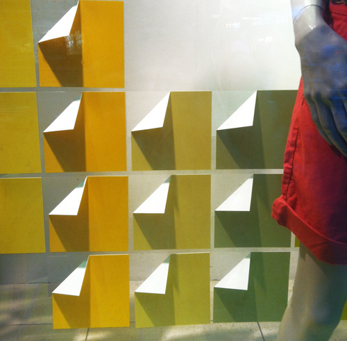
Now let’s move to the commercial realm. This is window display from the GAP on Fifth Avenue. It’s extremely economical- paper’s been folded and arranged in a grid. The gradient is the storyline and compliments the clothing.

Moving along to packaging, this method was recently the result of Sephora’s beauty collaboration with Pantone Universe. Pixels are again the focus. Mimicking the diversity within skin tones, the packaging amplifies the face and focuses on color, making us wonder if CMYK really wishes it were RGB.


Street Shots from Asia: Summer Spirals


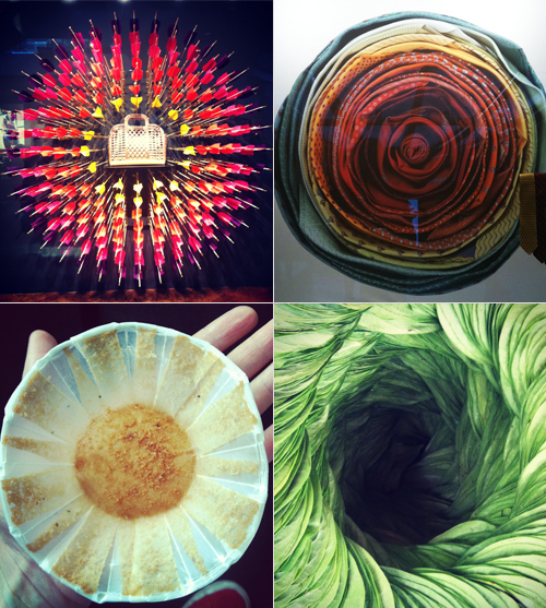
It’s easy to write about circles, we could probably devote an entire blog to their popularity, symbolism and frequency. Advertisers, packagers and artisans are forever reinterpreting the shape. Here are a few snapshots I took in Asia. The bullseye and handbag is currently the global campaign for Louis Vuitton and the hombre ties are from Alfred Dunhill – both were retail windows at the Marina Bay Sands in Singapore. The muffin wrapper is just a piece of beautiful trash and the cigar leaves are from a market in Bagan, Myanmar.


A Trip to Singapore & Myanmar


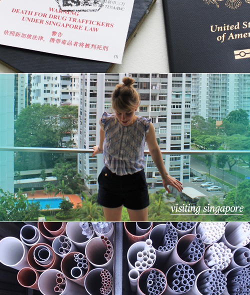
A year and a half ago, I went to Singapore to visit my in-laws and snapped about 500 photos. Top one’s pretty intense, isn’t it? As life would have it, my husband and I are heading back there this week as he’ll be speaking on a music panel about licensing and copyright law.

Since we’ll be on the other side of the world, we figured why not take advantage of the inter-asia airfares and visit a place where we can slow down, even if only for a few days. We’ve chosen Myanmar. I’ve read that it’s untouched and beautiful (and vegetarian friendly!) and I’m assuming it’s going to be an internet-free experience, though who knows…between the two of us, we both have trouble unplugging.

SO! Back to Pattern Pulp. We’ll continue posting, though things might be a bit lighter than usual. See ya in June.


Tracking Repetitive + Awesome.
On Instagram.