
Finding a connection between the digital and physical spheres is a never-ending hunt for today’s forecasters. Whether you’re comparing the symbolic differences between RGB or CMYK or simply finding inspiration in either execution, important observations can be made when considering how one medium influences the other.
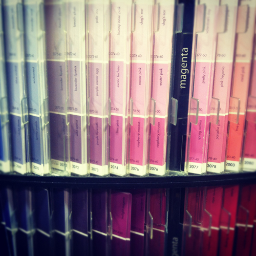
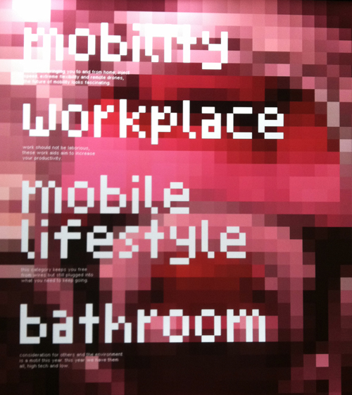
Here we have a pixelated display at the Red Dot Design Museum in Singapore. A blurry screen becomes textured art and the type conjures up early 90’s atari. If you follow our line of thinking and view Benjamin Moore’s paint chips immediately after, it’s easy to make a connection- they’re strikingly similar, but hold opposing conversations (and purposes).
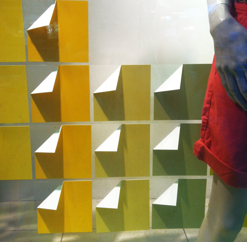
Now let’s move to the commercial realm. This is window display from the GAP on Fifth Avenue. It’s extremely economical- paper’s been folded and arranged in a grid. The gradient is the storyline and compliments the clothing.

Moving along to packaging, this method was recently the result of Sephora’s beauty collaboration with Pantone Universe. Pixels are again the focus. Mimicking the diversity within skin tones, the packaging amplifies the face and focuses on color, making us wonder if CMYK really wishes it were RGB.
