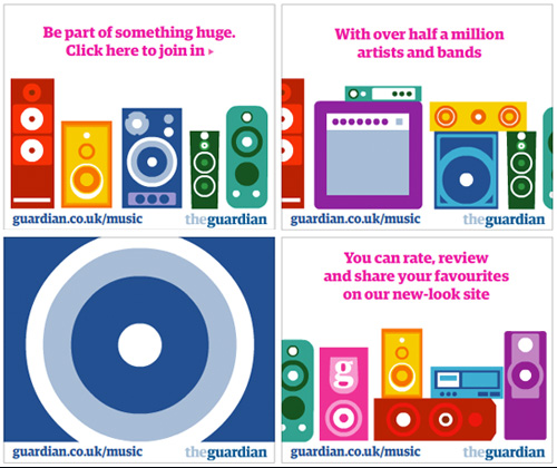
While reading PSFK this week, The Guardian banner caught my eye. The color was vibrant, the lines crisp and the theme, playful. With the design direction and ad buy, it appears as though the newspaper’s aiming for a younger audience.
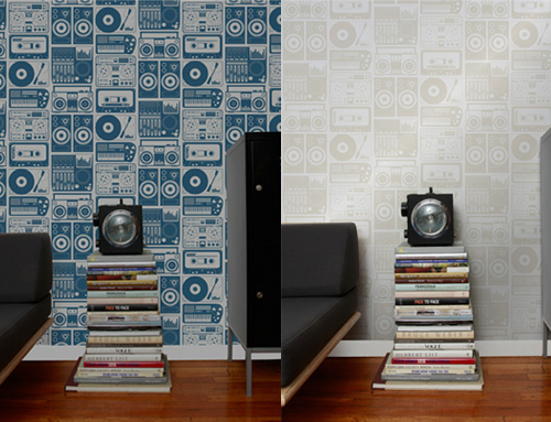
Interestingly, the stereo graphics mimic Aimee Wilder’s analog nights wallpaper. So much so it makes me wonder if the two collaborated on the latest execution. What do you think- do you like the home to digital translation?