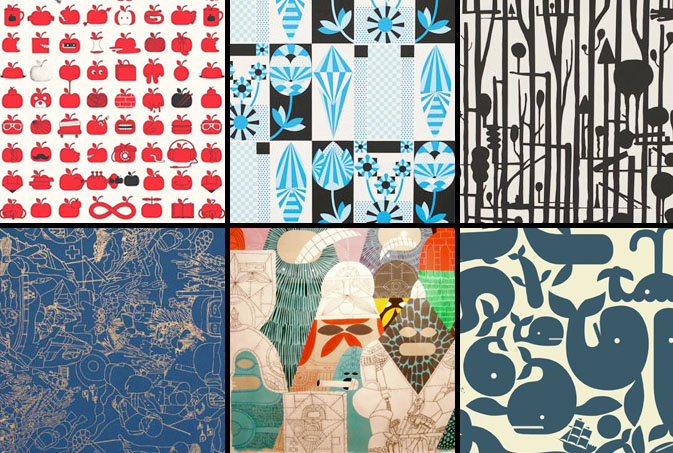
Geoff McFetridge is a true design pioneer, not to mention a wicked multi-tasker. “He is part of a new generation of designers who are eager to leap the old divides between image and product, design and art, the flat page and the moving image,” says Paul Thompson, director of the Smithsonian’s Cooper-Hewitt, National Design Museum. Patten Pulp caught up with McFetridge to talk about his design process, as well as Pottok, the wallpaper company that he founded with his wife Sarah. Pottock marries McFetridge’s unique pattern skills with environmentally-friendly papers and water-based inks. The abstract and breathtaking results have papered walls from The Montalban Theater in Hollywood to the well-known Colette boutique in Paris. Check out our Q+A for a glimpse into the mind of this skateboarding wunderkind.
* * *
PP: What websites do you generally start your day with-do you have a daily routine for news/blog/information consumption?
GM: I listen to npr for news. Friday Saturday Sunday we get the New York Times. If there is a site I check in the morning it is probably Cycling News, then Velonews. I take in a lot of useless cycling information.
PP: How did you discover your talent and how has it evolved over your career?
GM: I liked to draw as a kid. I liked to draw more than almost anything. It was not important if I was talented, I drew so much that I was bound to get good. I still improve. I look at work I did a few years ago and notice how much better my new work is.
PP: Do you discuss your work with other designers? If so, how does that impact your creation process?
GM: I am not very connected with other designers. I have an assistant who I bounce most things off of. He is a designer, and has different but similar tastes to me, so that helps. When I need to pull out the big guns I show things to my wife, Sarah. She runs Pottok and has a cold eye for quality.
PP: Where do you usually work on your patterns and what is your preferred method of creation + execution?
GM: Everything starts as handwork. All work I do starts as sketches and notes to myself in large coil notebooks. I then start to draw out some actual forms on loose paper. A lot of the designs defined by how they are made. Almost every pattern I do I approch differently. One is made out of paint that I dripped on a board and then turned into a forest. A few are based on intricate drawings. The repeat for these was worked out with abstract shapes on the computer, I then drew the complex drawing over the repeating design so that it would repeat properly. A lot of the most popular designs are very graphic. Those designs are drawn entirely on the computer. This is a process of drawing, tracing, and printing out in order to get things right. The final step of the process is either hand cutting film or getting the film output.
PP: When is the last time you took a professional/creative risk?
GM: I think that most days I take a little risk. Every project I accept I consider a risk. I am such a small studio (me and an assistant) that I have to chose projects and shows wisely. I do not have a lot of time to waste.
Creatively? I feel like I challenge myself by constantly adapting and developing my style. I rarely go for what I know works well. That is a type of risk, not exactly a risk, but maybe not totally playing it safe.
PP: Do you incorporate commercial trends into your work and if so, is this a factor that drives your design?
GM: No. My work is generally based on other work I have done, its an evolving process.