Pattern Pulp

Color, Patterns & Collage


patterns and plaid_patternpulp

Whether you’re a fan of bold brights, muted tones, photography or flat design, all of these styles have been combined in the imagery above to create beautiful succinct collages.

The fabric swatch pile-up represents the latest of the season, citing a menagerie of reds, oranges and salmons. The Soho House graphic by Craig and Karl emits an entirely different vibe, while using a similar plaid palette. While the saturation is certainly turned up on the converse illustration, it’s easy to make comparisons between the two worlds – and see how slight variations can translate across fashion and marketing platforms. Which do you gravitate towards?
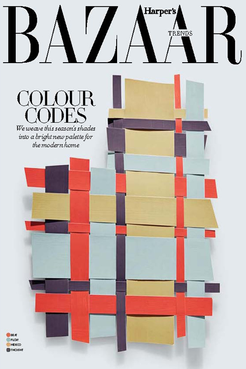
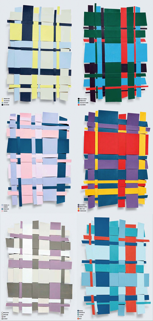
 

Interior Color Stories from Dubai


1kate_lewis-harpersbaazar_dubai 2kate_lewis-harpersbaazar_dubai

Paging through instagram this morning, I came across the work of Kate Lewis. Lewis is a photographer living in Dubai with a gifted eye for chic, modern, magazine-worthy moments. She recently shared these still life color collages from the March edition of Harper’s Baazar Interiors on her tumblr. They’re inspiring in more ways than one, as they convey an interesting balance in color harmony while doubling as unexpected plaids, worthy of art or fashion. Do any of these translate to your home?


Resource & Swatch Inspiration


If you’re in the New York area experiencing this dreary afternoon, you might find a little joy perusing the Design Center at Philadelphia University’s tumblr.

I stumbled upon it thanks to Ana Montiel’s gorgeous blog, and found myself digging deep, wading through swatch after swatch. The above pattern is brilliantly simple- it merges pointillism and geometric sewing textures.

The blog houses 200,000+ objects related to textiles and fashion, ranging from plaids and conversationals to animated gifs and embroideries.

The scans are pretty interesting, as you can see the pencil marks, stains and cataloging system that’s been implemented over time…at least prior to the internet.

Have a look and let us know which ones you love.


Trend: Translucent Plaids


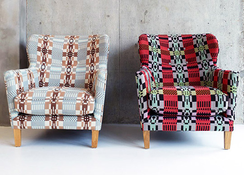
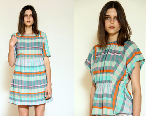
I’ve been into translucent plaids lately and when I stumbled upon Vittorio J’s Benson variety, I was drawn to the versatility of the pattern.

We’ve seen versions of this in home from Donna Wilson with the Eadie Welsh Blanket Armchair

and in Women’s fashion from Ace&Jig. Which color combination’s your favorite?


A Plaid Facelift for Babies


Every once in a while I’m tasked with designing baby patterns. While the American market predictably likes it’s pinks, blues, yellows and browns, categorized as barn animals, hearts or stars, it’s refreshing to see another take on the topic. Ratzer, a Danish home goods company’s recently sold out of their plaid baby line. The layout’s ethereal and soft in a very modern kind of way. I love the asymmetrical patchwork. What do you think?


Men's Fashion: Styling Textures


Over the past 12 months I’ve collected lots of suiting swipes. Though the editorial’s not terribly current, the textures are timeless. Styled and shot for Dazed & Confused, Another Man, Calvin Klein and Zink, the black and white pairings are interchangeable, simplistic and a nice mixture of high and low design. Which patterns will you be wearing this Fall?


Tracking Repetitive + Awesome.
On Instagram.