Pattern Pulp

Follow-up: Spin It, Web Cam Style


Oh, the proverbial question: Which came first, the chicken or the egg? The debate can go around and around. Much like the debates of who inspired whom, what inspired what, and where on earth do ideas come from. And of course, how do they become adopted by society and wind up as trends.
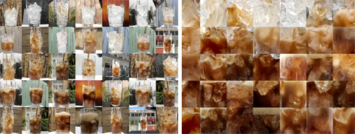
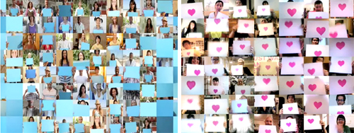
Because, we think we called it via our Interior Design Takes a Spin feature: people, they like change. They also like pixels. And in this case, web cams. We recently spotted Pepsi’s Refresh Project, One People tv spot, where a variety of people on their web cams interact with one another. Each paper conveys a pixelated vibe, and as objects are “magically” passed between squares, the concept is unified as global sharing. Naturally, we delighted at the synchronicity to our fun interior finds. Of course, in that ad’s comment section, we were then led to the Japanese band, Sour’s music video, Hibi no neiro” which has a very, very similar idea and was posted in July before Pepsi’s ad was released.
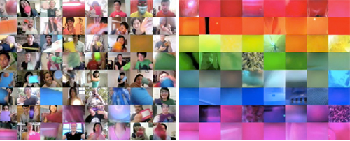
It’s speculated that Pepsi was heavily inspired by Sour’s music video which involves using the band’s fans in a fun series of web cam adventures. It’s not impossible to find other videos using a similar concept, though not necessarily as well executed as these two. In fact, watching these videos sparked the thought of another web sensation, Chat Roulette, where anyone can log online and through their web cam talk to people from around the world. They can switch to someone else quickly just by pressing a button. It’s Spinning It: People Style.  Maybe they’re all inspired by our increasing hunger for the new and the next, the impatience it inspires, and our desire for change. Now.

Coverage by: Emily Gup
Trend: Interior Design Goes for a Spin


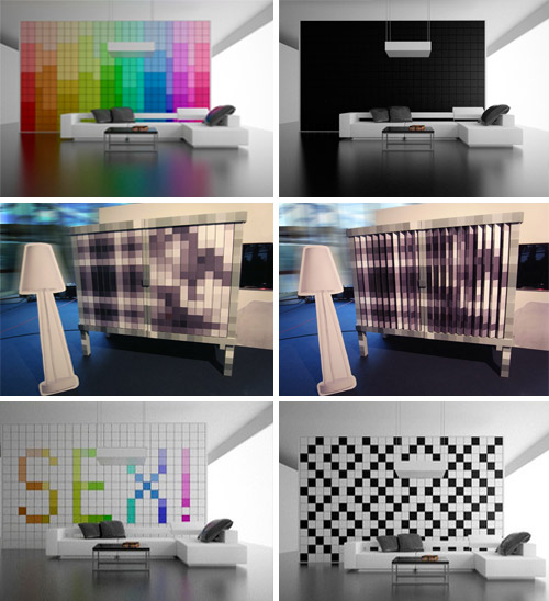
It has always been a personal fantasy of mine to be able to change the color of things at whim. It’s fairly easy when it comes to personal adornment, however interiors present a few laborious challenges. You can imagine the delight and surprise I felt when I saw Amirkhan Abdurakhmanov’s Change It wall. The wall uses triangular pieces, with each side representing a different color. The pieces can be rearranged to create a variety of looks, emitting a pixelated vibe. The mechanism this uses is reminiscent of the changing billboards we used to drive past on the South Florida highways. My delight at Abdurakhmanov’s concept isn’t unique, as this particular piece has been sweeping the web.

The designs immediately remind me of the Swedish design team, Front, and their Changing Cabinet, which we mentioned in a weekly round-up not too long ago.  The team won the title “Designer of the Year 2010” from the German magazine, A&W at the Imm Cologne Furniture Fair 2010. Their Changing Cabinet uses a similar mechanism, and so, we are left to wonder: do we smell a trend coming on?

Coverage by: Emily Gup

Print: Environmental Prisms


prism-pop

Just as chefs have an intimate relationship with their food, graphic designers are often tied to their pixels.  Much of the time these creative atoms are invisible at final execution, however lately, as our collective romance with the digital world has grown, so has the size of these geometric marks.  Lisa Toff, the blogger behind MyConey, exemplifies this design style with her recently founded card company, prismPOP.  Using bright vectors and soy inks to communicate her illustrations, Toff proves that you can be environmentally conscious while making a bold creative statement.

Toff will be showcasing her latest collection in Brooklyn this Sunday at the Handmade Cavalcade in addition to the Renegade Craft Fair in early June.  For 20% off your next order (on etsy or in person), sign up for the mailing list and reference Pattern Pulp  – you’ll receive a coupon via e-mail.

Follow-up: Digital Dividers


cristian-zuzunaga

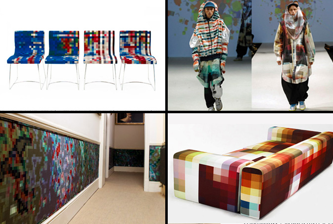
Cristian Zuzunaga and his pixilated prototypes have gained notable buzz as of late.  Similar to Kashiwasato’s vibrant animations, Zuzunaga’s printed textiles provide a softer, more tactile alternative to digital geometry.  Each work is heavily influenced by architecture in addition to the metropolitan landscapes Zuzunaga has traveled to, including Barcelona, Paris, London and Shanghai.  Each product, be it a chair, couch, wall covering or jacket showcases a playfully abstract vibe, providing an intricate snapshot that’s as detailed as it is abstract- eye candy for the artistic nerd.

Tracking Repetitive + Awesome.
On Instagram.