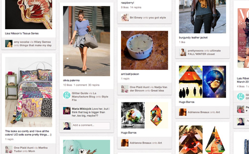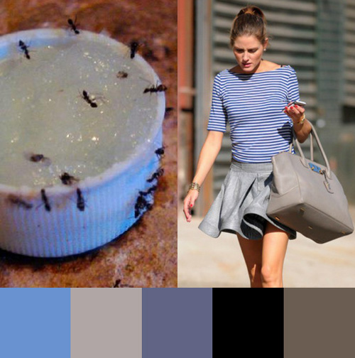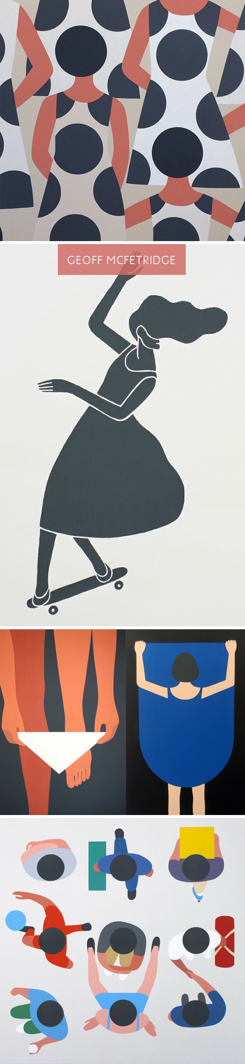
Lately, I’ve been spending a lot of time on Pinterest. Part of it’s due to a few social media assignments for various clients, and the other part is a renewed interest in home decor and dying techniques. Interestingly, Geoff McFetridge, an artist I’ve always loved, has been populating my feed quite a bit. Much of his recent work reminds me of a style I’m used to seeing in Olimpia Zagnoli‘s illustrations. When you take a closer look though, each artist may use bold, abstract shapes, though the story lines are extremely different.
McFetridge’s recent work feels quite sexualized when you view the grouping together. Men are men, and women are welcoming of men. At first, you don’t think much of it, as the perspective and lack of detail throws you off. The design feels quite simple, but the longer you sit with it, the complexities and storyline grows. Themes of exposure, individuality, disguise and personal space seem to be markers of this series. In comparing the works side by side, you notice the difference in artistic nuance.
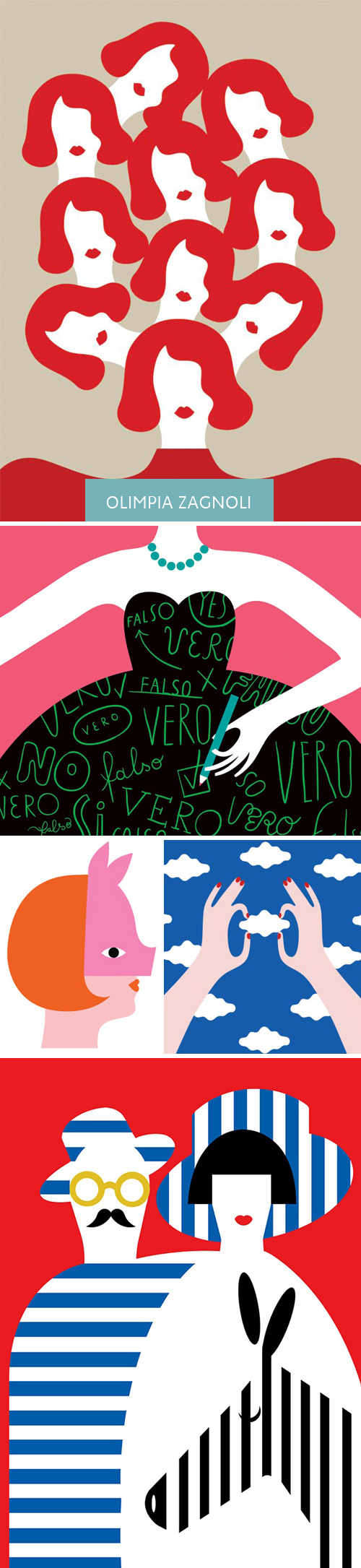
Zagnoli’s woman has a coyishness to her that feels defiant. She seems stylish and quirky, and an equal player amidst male counterparts. Her shapes and color palette have greater contrast and present what feels like an uptown woman (where McFetridge’s female feels younger and more exploratory of herself). I have to believe neither artist wants to be compared to one another, but when works have been pinned alongside one another, it’s hard not to notice a narrative and comment on the parallels and differences. Curious, what do you all think?