Julia Rothman is one of the most talented and original pattern designers in today’s marketplace. I had the pleasure of catching up with her at “Design by the Book,” a collaborative event hosted by The New York Public Library and Grace Bonney of Design*Sponge. Rothman has a the ability to beautify ordinary objects, using her unique style of illustration and layout to create whimsical repeats. Her work has been featured in countless publications and dons home goods of every variety. Check out our Q+A for a glimpse into her daily routine.
* * *
PP: What websites do you generally start your day with-do you have a daily routine for news/blog/information consumption?
JR: Design Sponge, Print&Pattern, Poppytalk, Oh Joy!, The Post Family, Grain Edit always start my day. And the NYTimes for news of course.
PP: Do you discuss your work with other designers? If so, how does that impact your creation + execution process?
JR: I am on the video phone with Jenny Volvovski and Matt Lamothe, my Also partners all day every weekday. They see everything I am working on and give a constant critique on my work. That is always helpful. Sometimes they notice ways to improve my design that I would have never thought of. I think it’s always helpful to have designers you trust giving you feedback. You don’t always have to listen, but at least you are presented with other points of view.
PP: Where do you usually work on your patterns and how much time is devoted to illustration vs computer layout?
JR: I start with drawings I make with a pen in my sketchbook. I usually work on those hanging around my house, usually lounging on my couch. The time I spend making drawings varies but it’s usually the majority of the work. After the drawings are all done I go to my office and scan them in at high resolution. After that I manipulate and color the drawings using Adobe Illustrator.
PP: How has your work evolved over your career?
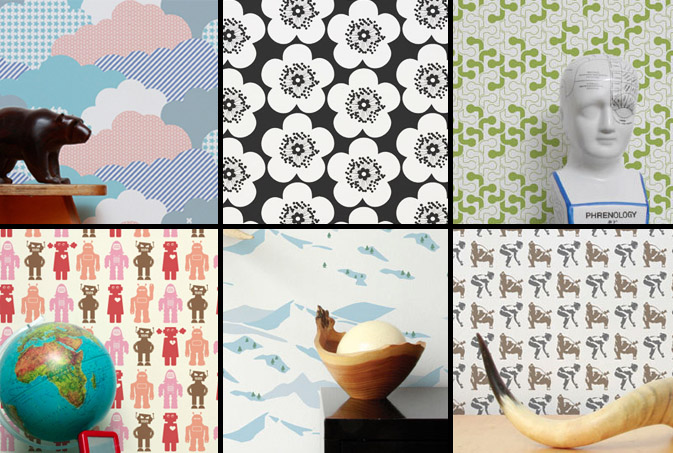
JR: In the beginning I was making drawings and then scanning them in and trying to make them into patterns. Over time when I decided making patterns was where I wanted to focus, I made drawings keeping in mind how they would later repeat. And then eventually when I started making specific products- wallpaper, mugs, stationery, it had to evolve one step even further. I had to give scale, colors and subject matter even more consideration for how it would specifically look on that object. For example, when I was making patterns to build up a portfolio I wasn’t worrying about the amount of colors. I put in as many as I wanted. But working recently on my wallpaper designs for Hygge&West, I had to limit my colors to three or less which was a fun challenge.
PP: What are some of your favorite creations/mediums/color palettes?
JR: I recently worked on a project organized by Design Sponge and the New York Public Library and made a very detailed navy men pattern. I was inspired by a book of uniforms and symbols of navy officers from around the world. I really love how it came out. I also recently made two patterns of vintage office supplies for Galison, a stationery company. I am really excited to see how those patterns get applied to a variety of products. They come out this Spring!
When I am painting I always use gouache. I love how flat matte the paint gets. It’s also similar to the flatness in silkscreen, another favorite medium.
One of the most often criticisms I get is about my color palettes. I tend to use really muted colors. Often art directors ask me to brighten up my colors. I’m more attracted to subtle tones with pops of brightness here or there.
PP: How do you incorporate commercial trends into your work- is this a factor that drives your design?
JR: I try not to think about trends too much. I make designs I think will be interesting whether or not they are popular themes or palettes at that moment. I’m sure with the amount of designs I look at on blogs every day, trends affect what I do, but it’s not on purpose.
PP: Do you have any advice for younger designers who are just getting started?
JR: I always tell new designers to be pro-active about promoting themselves. Nothing is going to come to you. You can be an incredible designer, but nobody will know that until you show them. And if the first person doesn’t think you’re great, don’t get discouraged. Maybe the next person will, or the next one after that.