
Pattern Pulp

Interview: Gerard Gang


gerard-gang21

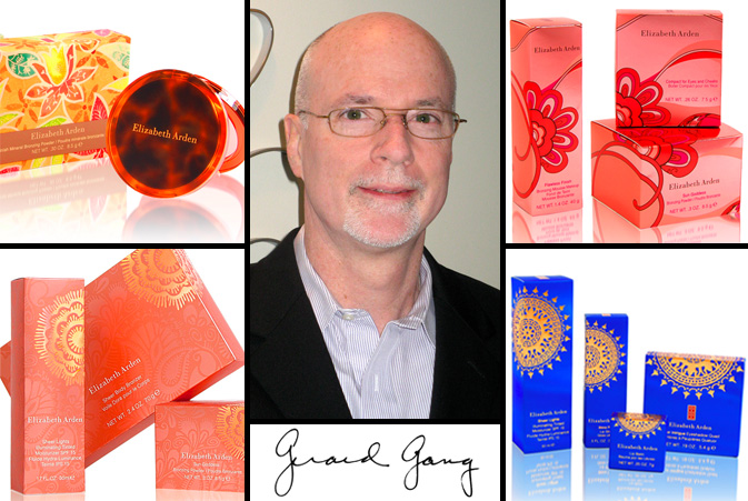
Pattern Pulp has had the pleasure of collaborating with Gerard Gang and the team at Lukasiewicz Design for the past three years.  Gang’s creative vision and design aesthetic is as experimental as it is polished.  Combining inspirational patterns and varied printing techniques, Gang has excelled at creating innovative packaging solutions for his fragrance and cosmetic clients for over twenty five years. When designing seasonal updates for mega brands, there’s a lot on the line and Gang hones in on relevant trends, commercializing them with true sophistication. Check out our Q+A for a glimpse into Gang’s creative process and how he stays ahead of the curve.

*            *            *

PP:  What websites do you generally start your day with-do you have a daily routine for news/blog/information consumption?

GG: I am a more traditional researcher. My consumption of information generally is not under a daily routine of surfing the internet. Most of my research is done through textile houses, Crate and Barrel, Grain Edit, Fashion Trends Letter and Shutterstock. I am a big periodical browser. Finding insight through magazines like Traditional Home, House Beautiful, Martha Stewart and Country Living. These sources allow me to hold it in my hand and find inspiration in a more tactile way.

PP: How did you discover your talent and how has it evolved over your career?

GG: I have always been interested in fashion, patterns and textures. In my early teens, I worked on a farm. There, I developed an eye for color and textures. Nature has a way of guiding us; teaching the basics of color, shape and texture. Once working in the graphic profession after college, my interest in patterns continued to develop. Patterns are a way of life – look at stones along a shore/bricks along a path/materials woven into a bird’s nest. We are surrounded by patterns, forming their own source of inspiration.

PP:  Please explain your design process when approaching new projects and pitches.

GG: Within moments of a new project my mind begins to whirl. Thoughts and visual memories take me off on a path. I keep a large volume of sourced materials. Anything that has caught my eye, combinations of color, patterns, dresses, jewelry and flowers, are torn out and gathered into binders. This is the time I also reach out to the internet, gathering additional reference to create the designs.

PP: Where do you usually work on your patterns and what is your preferred method of creation + execution?

GG: I am “old world” in using a pen, cutting and splicing art and drawing to put my thoughts together. There is a wonderful patina that is created using this method which the computer cannot achieve. The computer is a powerful tool once the initial idea is in place. I think back to the days of creating patterns by hand. Endless drawing, photo- stating and piecing to create a pattern or art. Then days to separate it by hand for production.

PP:   When is the last time you took a professional/creative risk? Please explain.

GG: Each day is a risk. We should always challenge ourselves. One should always look for the idea to push things over the top.

PP:   How do you incorporate commercial trends into your work and is this a factor that drives your design?

GG: Trends in the fragrance/cosmetic industry are vital resources. The goal is to create the trend and for others to follow. The periodicals, internet sources, catalogues and the fashion world give me the insight to work with trends. It is a personal flair which combines these two worlds.

Trend: Graceful Graffiti


shu-umera

Every artist loves a happy accident. For those who are unfamiliar with this term, a happy accident is an unexpected and unintended creative mistake that ends up being more brilliant than your day’s work. For those in search of a tool that offers a degree of uncertainty and requires little to no prep, spray paint is the way to go.  Many designers have taken note, as this technique has gained momentum in creative studios throughout the globe. Curiosity, the Japanese brainchild of Gwenael Nicolas and Reiko Miyamoto, was established in 1998 and caters primarily to the design needs of luxury clients. Combining saturated pigments with Shu Uemura‘s eau de toilette collection, Curiosity’s bottle art emulates the textural results of a prolonged spray. 

abccarpet-stolivodka

ABC Carpet gets a lot of airtime on Pattern Pulp.  Their retail installments set an industry standard and usually showcase an organic interpretation of modern materials. Their latest window display accentuates plant growth with the use of neon paint and an imperfect stencil. Adding russian flair and gold pigment, Stoli’s recent marketing campaign revives it’s expressionist roots, stenciling illegible phrases alongside chic photography.

bumble

Tapping academic and artistic references, John Powell’s 1990 MIT exhibit, Partial Lines, uses holographic installations to convey depth and plane.  Utilizing a similar technique for their hair powder packaging, the creative ingenues at Bumble and Bumble encase their alternative shampoos in subtle spray dust.  Tying this collection together, silhouette graffiti, such as this colorless image, is a careful execution of expressive markings paired with restrictive boundaries.

Packaging: Eau De Patterns


sula-wvillagewall

We’re all guilty of the duty-free pit stop. It’s nearly impossible to resist spritzing yourself before boarding an international flight, particularly when you’ve got twenty minutes to kill.  Today Pattern Pulp is exploring perfumes that are slightly under the radar.  Scents that take a bit of exploring to find, yet are true favorites among their fan base.  Each of these brands has taken a similar stab at adorning their packaging with intricate florals, a common theme throughout the beauty industry. Sula, a side project of Susanne Lang, a Canadian parfumerie, is an affordable scent that intertwines theme-specific patterns with asymmetrical negative space. In an attempt to trace organic steps to this endpoint, real life inspiration can be found on this Jane Street apartment building as branches span the cement in upward growth.

harris-tocca-tsila

Miller Harris’s signature floral etchings are equal parts raw and luxurious.  Following suit, Tocca, known for their understated elegance, has feminized tattoo illustrations for their latest line of fragrances.  Tsi-la Organics, a new player to the team, combines delicate florals with darker tones, enclosing their bottles in a signature black lotus box covered with spot varnish monochromatic detailing.

fresh2

Fresh has been producing beautifully intricate packaging for as long as I can remember.  Incorporating delicate details such as wire, metallic thread and jade colored pebbles, the outer mementos are are as appealing (if not more) than the actual product- a successful marketing move when alluring first time buyers and gift recipients.

Packaging: Carrying Patterned Protection


planned-parenthood1

Though today’s post could easily have been grouped in with yesterday’s brights, I felt like it deserved the spotlight. Proper Attire, Planned Parenthood’s latest campaign, addresses the issue of unwanted pregnancies and sexually transmitted diseases among 18-25 year olds.  While viewing Fangohr‘s latest projects, I stumbled upon this website and was awestruck by the clever and creative packaging.  Though simple, this campaign is a groundbreaking idea.  Strategically directed by the creative thinkers at Naked, Proper Attire is a fashionable approach to protection.  The condoms have been positioned as a must-have fashion accessory that women would be proud to carry and retailers would be willing to sell.  Let’s hope people’s penchant for vanity leads to better decision making.

Collections:

planned-parenthood2

Yigal Azrouel’s collaboation with Proper Attire can be found at Bungalow 8, W Hotels The Store, NY Fashion Week and his online store.  The general collection is a product of Planned Parenthood.

Fashion: Bold and Optimistic?


diane-von-furstenburg2

Diane Von Furstenberg’s latest window display showcases mismatched patterns and fabric textures throughout her dress and bag collections.  Referencing bright and iconic summer shapes, reminiscent of j.crew flip flops and Tory Burch tunics, DVF’s approach to the upcoming season is blaringly optimistic.  That being said, I’d be curious to see how the recession translates into next year’s spring/summer collection, as today’s economical dip was hardly a factor when these ensembles were designed over a year ago.

L.A. Styles

halsea21

While in Silverlake last month, I stumbled across Sally Bartz’s collection of handbags under her newly founded company, Halsea.  Inspired by west coast colors and summer icons, Bartz’s crab monograms and bamboo squares decorate luggage, tote and weekend bags, providing a breath of fresh air from LA’s hipster styles.

London Styles

jensen-getwellman

UK designer, Peter Jensen has a playful eeriness to his work.  While he’s an acquired taste for some, his playful pairing of graphics and tailoring requires introspective buying on the customer’s part. This parrot pattern is representative of Jensen’s homage to the animal kingdom.  Carl M. Wellman infuses Brazilian, Italian, English and Japanese floral themes with biodegradable packaging for Le Marchand Du Cacao.  A stunning combination of high and low materials.

Tracking Repetitive + Awesome.
On Instagram.