
Pattern Pulp

Tuesday's Gallery Picks


gallerypicks_patternpulp115

In this week’s gallery picks, we’re celebrating America.

*            *            *

1. Over the period of one year, San Francisco based artist John Chiara made numerous trips to Coahoma County, Mississippi, located in the town of Clarksdale. The photographs made during this time showcase the rich quality of the Mississippi earth with subtle notes of local history at Rose Gallery
2. Someday is Now: The Art of Corita Kent is the first full-scale exhibition to survey the entire career of pioneering artist and designer Corita Kent. Her vibrant, Pop-inspired prints from mine a variety of secular and religious sources and using the populist printmaking medium to pose philosophical questions about racism, war, poverty, and religion. Her work was widely recognized for its revolutionary impact and remains an iconic symbol of that period in American history at Pasadena Museum of California Art
3. New York View celebrates a selection of work by artists, illustrators and graphic designers who have been commissioned by the MTA to design posters and who have been selected to create permanent public work for the MTA system. We examine the way the artists move from pen and paper to more durable materials like glass, mosaic and stainless steel as work is translated to become a permanent fixture in the neighborhoods of New York at Society of Illustrators
4. Kelly Franklin & Carol Jarvis’s show, “Poor Richard”, is an ode to the writings of Benjamin Franklin in his published work “Poor Richard’s Almanac” from the early to mid 1700’s. Many of these sayings about life and practical living have survived in everyday use, and just as many have been forgotten at Paradigm Arts
5. Comprising more than six hundred works, America Is Hard to See elaborates the themes, ideas, beliefs, and passions that have galvanized American artists in their struggle to work within and against established conventions, often directly engaging their political and social contexts at Whitney Museum of American Art
6. Known for his iconic street art pieces of playful children set in urban contexts, Bumblebee draws from a nostalgic love of childhood memory and its simplicity at Thinkspace Gallery
Gender & Paralleling Illustration Styles


GeoffMcFetridge_PatternPulp

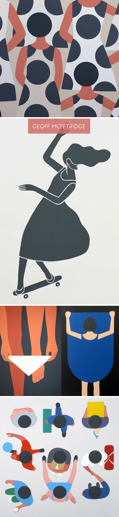
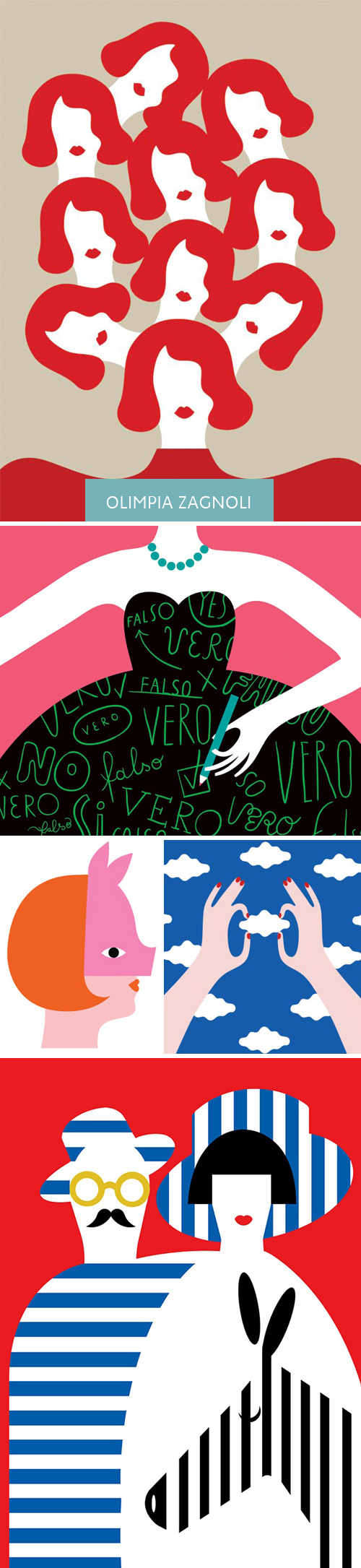
Lately, I’ve been spending a lot of time on Pinterest. Part of it’s due to a few social media assignments for various clients, and the other part is a renewed interest in home decor and dying techniques. Interestingly, Geoff McFetridge, an artist I’ve always loved, has been populating my feed quite a bit. Much of his recent work reminds me of a style I’m used to seeing in Olimpia Zagnoli‘s illustrations. When you take a closer look though, each artist may use bold, abstract shapes, though the story lines are extremely different.

McFetridge’s recent work feels quite sexualized when you view the grouping together. Men are men, and women are welcoming of men. At first, you don’t think much of it, as the perspective and lack of detail throws you off. The design feels quite simple, but the longer you sit with it, the complexities and storyline grows. Themes of exposure, individuality, disguise and personal space seem to be markers of this series. In comparing the works side by side, you notice the difference in artistic nuance.

Olimpia Zagnoli_PatternPulp

Zagnoli’s woman has a coyishness to her that feels defiant. She seems stylish and quirky, and an equal player amidst male counterparts. Her shapes and color palette have greater contrast and present what feels like an uptown woman (where McFetridge’s female feels younger and more exploratory of herself).  I have to believe neither artist wants to be compared to one another, but when works have been pinned alongside one another, it’s hard not to notice a narrative and comment on the parallels and differences. Curious, what do you all think?


The Colors of Summer


Living in New York, you can hardly ignore The New York Times and The New Yorker. I find both publications to be really enjoyable, not to mention illustratively informative and telling of the trends. A few weeks ago I pinned an Olimpia Zagnoli illustration from The New Yorker’s literary section. The simplicity in line, color and shape is reminiscent of patterns I personally enjoy. Fast forward to this past weekend, and The New York Time’s Book Review had an awfully similar layout. At first I wondered if it was an oversight, or perhaps a form of flattery, but after a little research, it looks like Zagnoli’s the artist behind both illustrations, proving this aesthetic and palette will be a summer literary mainstay.


Tracking Repetitive + Awesome.
On Instagram.