Pattern Pulp

Follow-up: Spin It, Web Cam Style


Oh, the proverbial question: Which came first, the chicken or the egg? The debate can go around and around. Much like the debates of who inspired whom, what inspired what, and where on earth do ideas come from. And of course, how do they become adopted by society and wind up as trends.
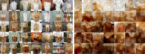
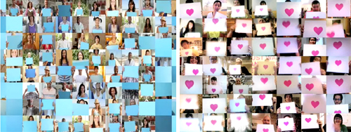
Because, we think we called it via our Interior Design Takes a Spin feature: people, they like change. They also like pixels. And in this case, web cams. We recently spotted Pepsi’s Refresh Project, One People tv spot, where a variety of people on their web cams interact with one another. Each paper conveys a pixelated vibe, and as objects are “magically” passed between squares, the concept is unified as global sharing. Naturally, we delighted at the synchronicity to our fun interior finds. Of course, in that ad’s comment section, we were then led to the Japanese band, Sour’s music video, Hibi no neiro” which has a very, very similar idea and was posted in July before Pepsi’s ad was released.
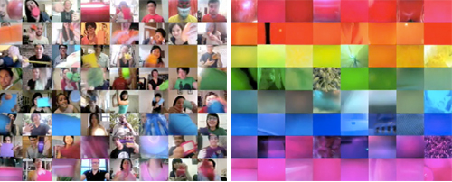
It’s speculated that Pepsi was heavily inspired by Sour’s music video which involves using the band’s fans in a fun series of web cam adventures. It’s not impossible to find other videos using a similar concept, though not necessarily as well executed as these two. In fact, watching these videos sparked the thought of another web sensation, Chat Roulette, where anyone can log online and through their web cam talk to people from around the world. They can switch to someone else quickly just by pressing a button. It’s Spinning It: People Style.  Maybe they’re all inspired by our increasing hunger for the new and the next, the impatience it inspires, and our desire for change. Now.

Coverage by: Emily Gup
Trend: Designing Frequencies


audiowaves-pattern

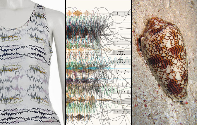
We seem to be taking our patterns back to the basics lately; finding new and interesting facets to things we see in everyday life — focusing on form rather than utility. Recently, we’ve been noticing an increase in the use of sound waves as a design element. With instant access to fresh new tunes served daily from music influencer sites such as RCRD LBL or Pitchfork, the general population has been able to “see” their music that was once invisible. Illustrating this concept in the most tactile of ways, Lorick’s SS ’09 collection romanticizes the audio file, while this New York Time’s info graphic proves that chaos and structure can be balanced with the simple use of argyle. This cone shell forces us to acknowledge nature’s ongoing influence, making us ask- what came first the ocean wave or the sound wave?

Additional contributions by: Emily Gup

Follow-up: Linear Jumbles


depechemode

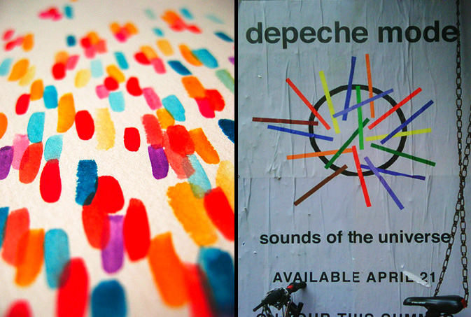
It’s always fascinating to track overlapping color palettes.  Now that we’re in the thick of spring and bright colors have again become the norm, it’s worth noting that linear jumbles are continuing to pop up around town and throughout the web.  This gouache painting by Pattern Pulp favorite, Amy Soczka, appeared on her blog, Things That Make My Day about a month ago.  Her delicate strokes have a tactile, organic vibe that are particularly heightened beside Depeche Mode’s album art, Sounds of the Universe.  Though it’s doubtful that the designers involved tapped each other for inspiration, it’s no coincidence that their environmental influences overlapped.

Music: A Look at Santogold's Closet


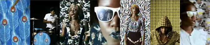
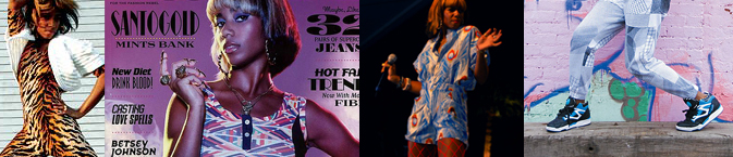
Every once in a while, an artist comes along with so much charisma and personal style, that they don’t need a stylist or any professional help getting dressed, or showcasing their creative opinion. Santi White does this quite well- across multiple platforms. Her personal style and alternative attitude is showcased in Lights Out, her lastest singles release from Downtown Records. Below you’ll find a few other examples of Santogold’s personal style- a fresh approach to 80’s fashion, with unpredictable pop.

santogold-styles

santogold-styles2

Tracking Repetitive + Awesome.
On Instagram.